df <- data.frame(group = c("A", "B", "C"), share = c(0.45, 0.30, 0.25))
ggplot(df) +
  geom_bar(aes(group, share), stat = "identity", fill = "steelblue") +
  scale_y_continuous(labels = label_percent())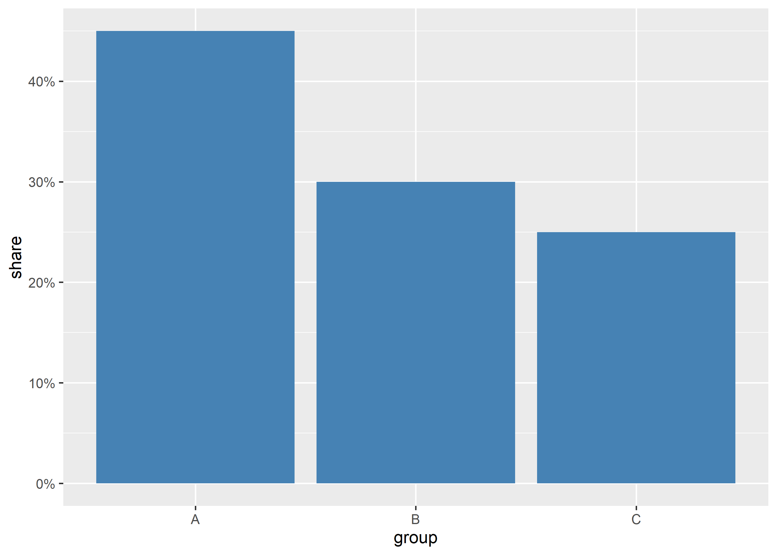
In this chapter, we will format axis labels with the scales package, use colorblind-safe viridis palettes and check contrast for accessibility.
Raw numbers like 150000 slow readers down. Formatted labels ($150k, 45%) and palettes readable by colorblind viewers make charts instantly legible to everyone.
Red-green contrasts are invisible to the most common form of colorblindness. Never encode critical groups with a red-versus-green scale alone.
label_percent() turns 0–1 fractions into readable percentages:
df <- data.frame(group = c("A", "B", "C"), share = c(0.45, 0.30, 0.25))
ggplot(df) +
geom_bar(aes(group, share), stat = "identity", fill = "steelblue") +
scale_y_continuous(labels = label_percent())
label_dollar() formats currency axes:
sales <- data.frame(month = 1:6, revenue = c(12000, 15000, 13500, 18000, 21000, 19500))
ggplot(sales) +
  geom_line(aes(month, revenue), linewidth = 1) +
  geom_point(aes(month, revenue), size = 2) +
  scale_y_continuous(labels = label_dollar())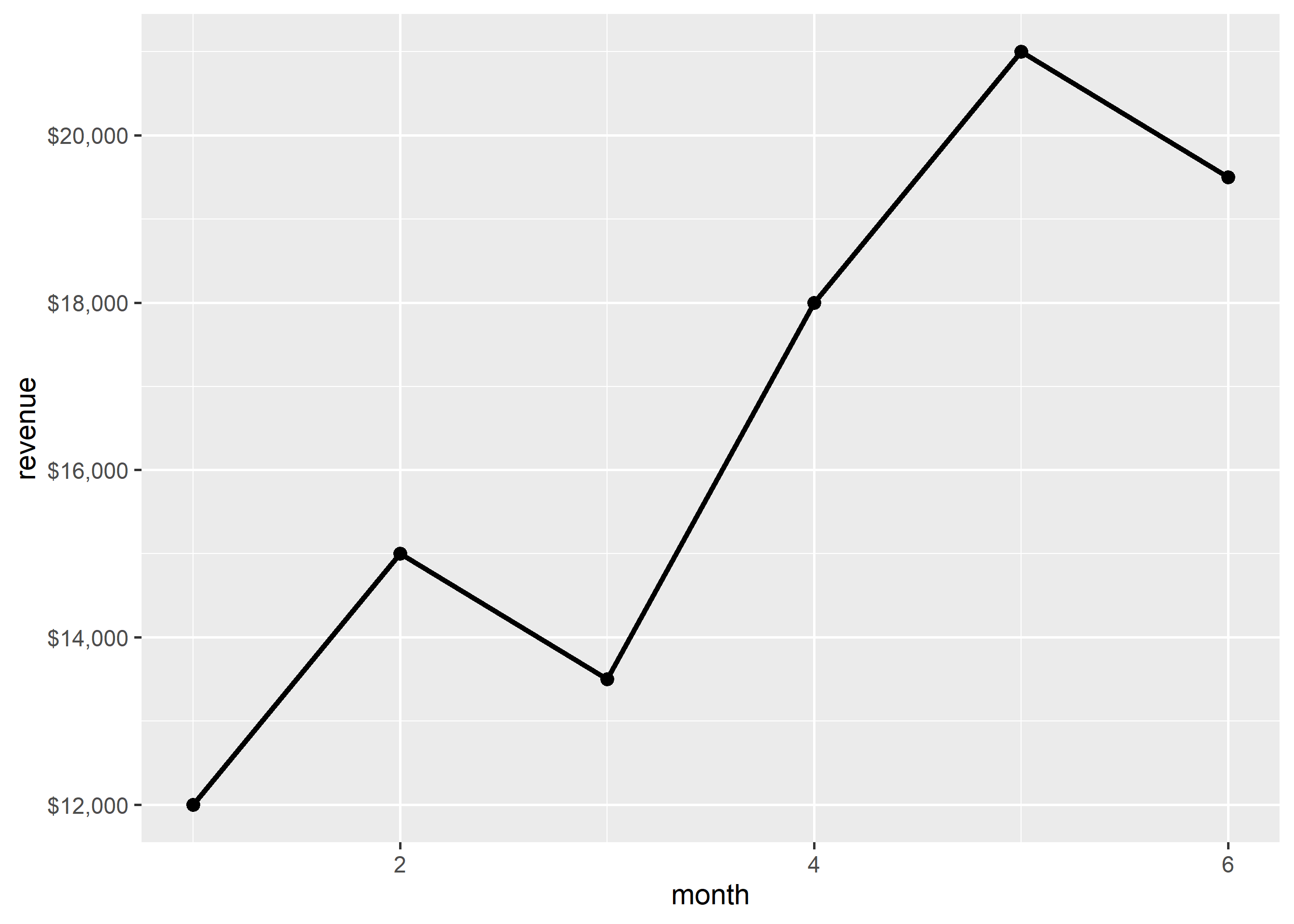
label_comma() keeps large counts readable:
counts <- data.frame(year = 2019:2024, users = c(120000, 150000, 148000, 190000, 230000, 265000))
ggplot(counts) +
  geom_bar(aes(factor(year), users), stat = "identity", fill = "steelblue") +
  scale_y_continuous(labels = label_comma())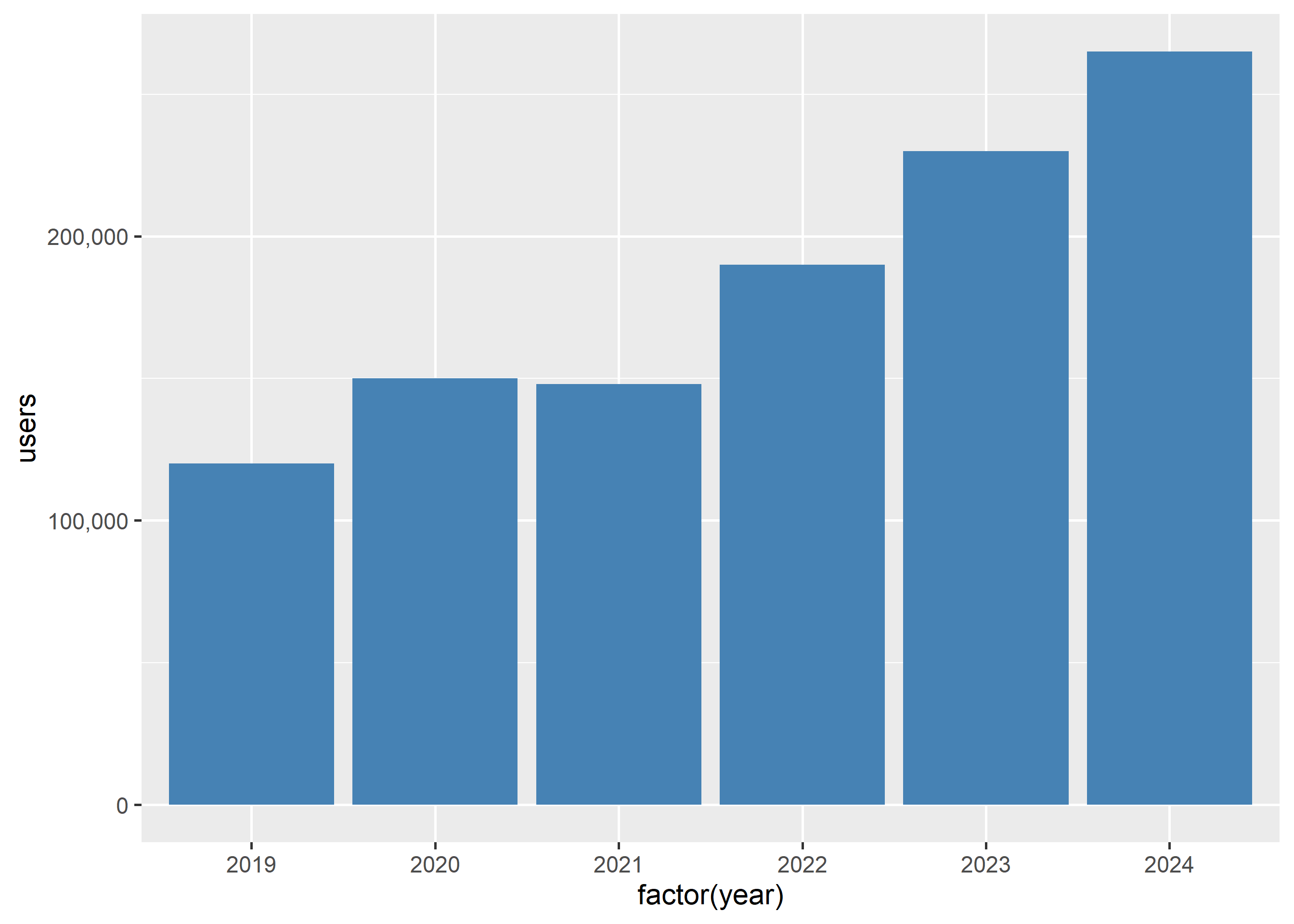
Viridis palettes are perceptually uniform and readable by most colorblind viewers. Use them for continuous fills:
ggplot(mtcars) +
  geom_point(aes(disp, mpg, color = hp)) +
  scale_color_viridis_c()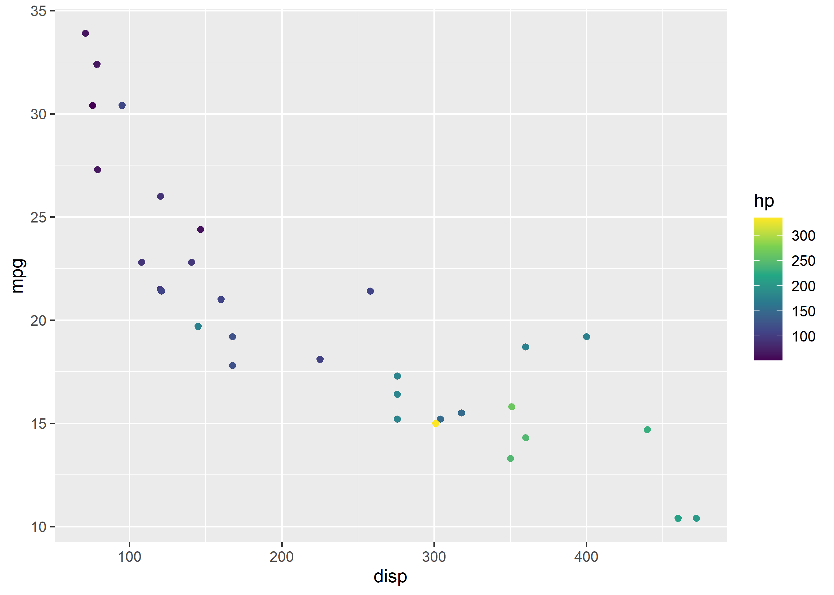
And for discrete groups:
ggplot(mtcars) +
  geom_point(aes(disp, mpg, color = factor(cyl))) +
  scale_color_viridis_d()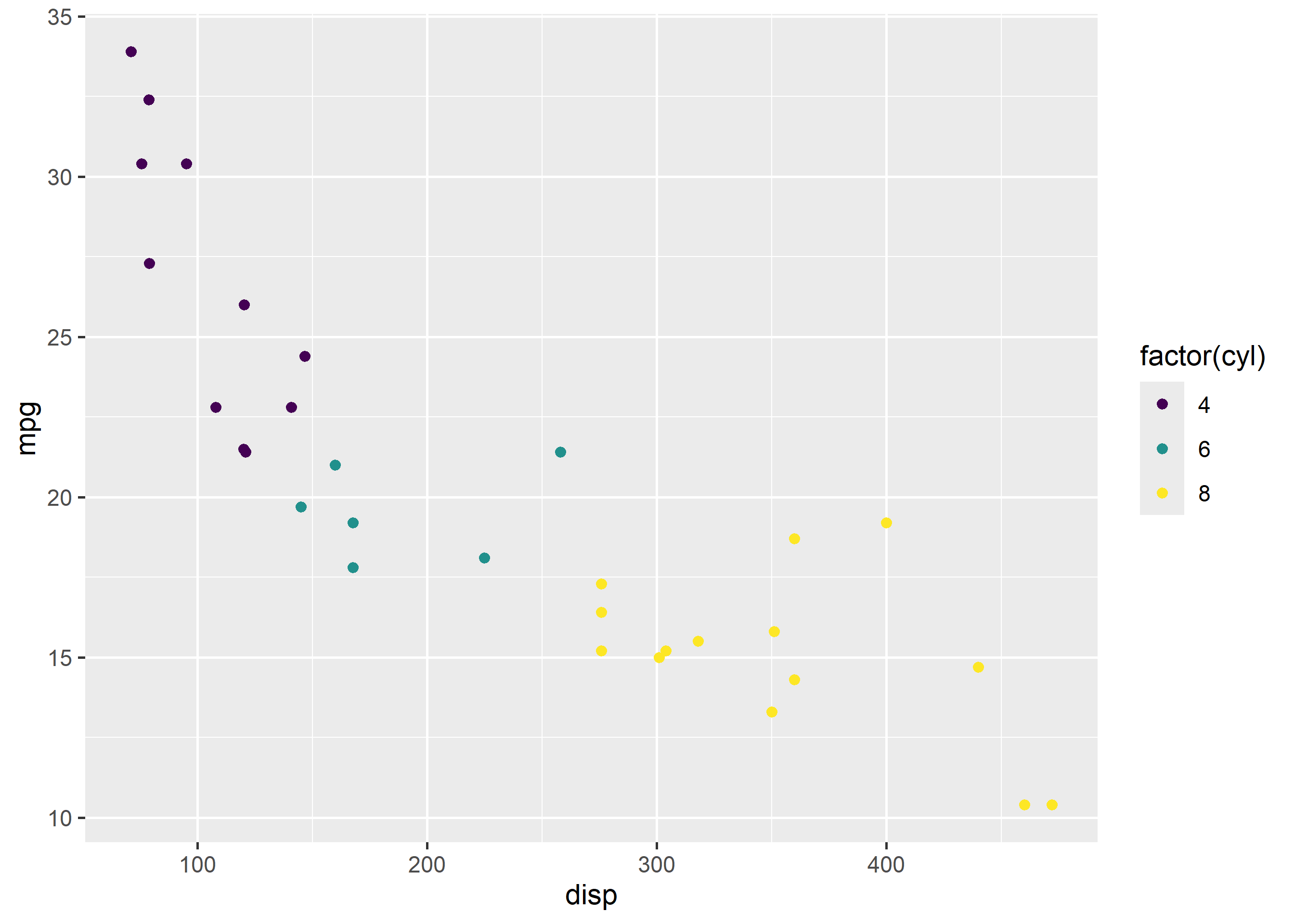
Before publishing, verify your figure in grayscale: print it or desaturate it. If groups are still distinguishable by luminance, the contrast passes. The scale_*_viridis_*() palettes pass this test by design; hand-picked pastels often fail it.