ggplot(mtcars) +
  geom_bar(aes(factor(cyl), fill = factor(gear)), position = position_dodge(width = 0.8))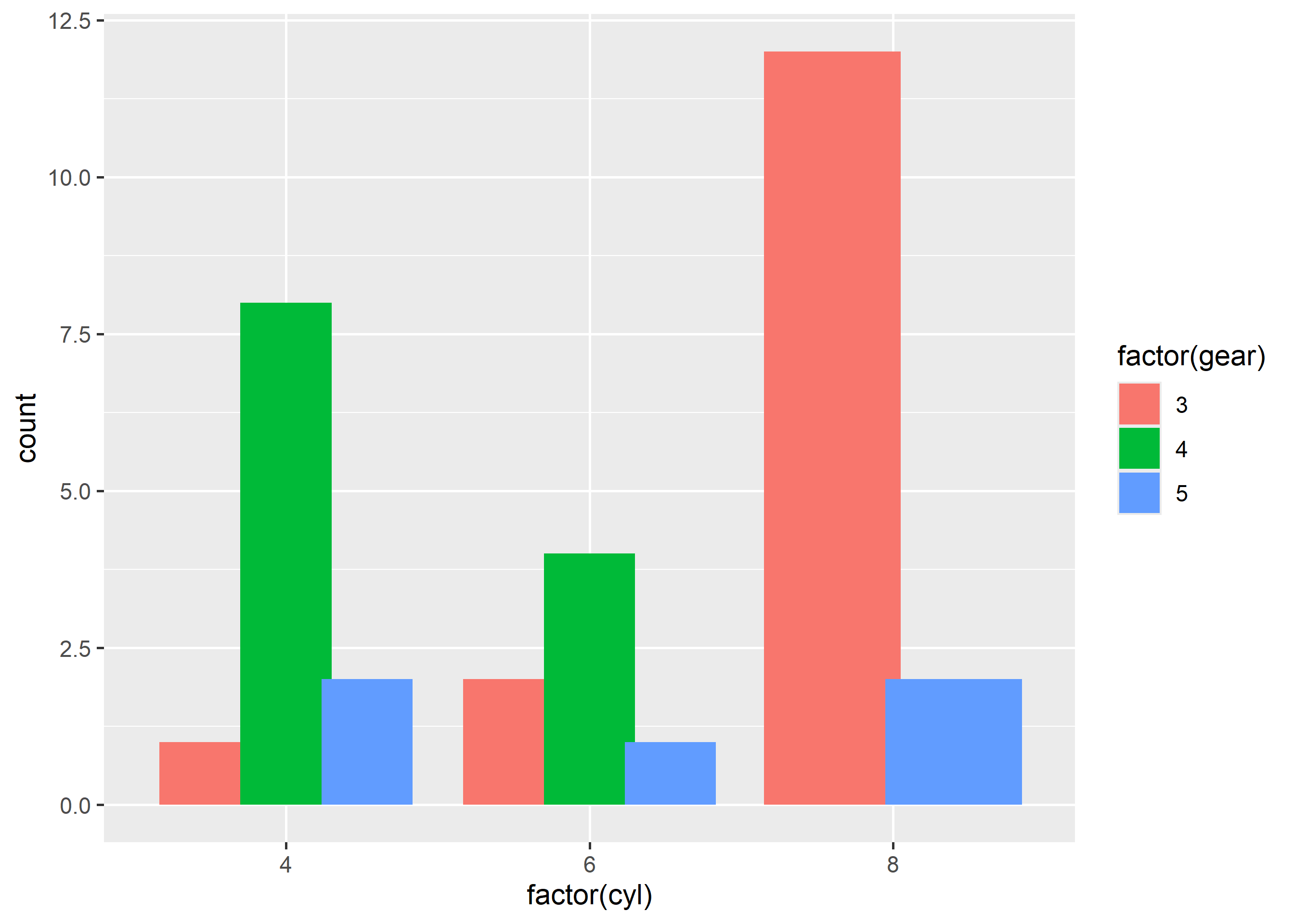
In this chapter, we will fine-tune how ggplot2 arranges and transforms marks: parametric position adjustments, summary statistics and modern stat mapping syntax.
Defaults get you 80% there. Tuning position_dodge() widths, position_jitter() spreads and stat_summary() aggregations takes a plot from roughly right to exactly right.
String shorthands like position = "dodge" hide their parameters. Use the position_*() function form whenever you need to tune width, height or stacking behavior.
Grouped bar plots dodge side by side. Control the gap with width — smaller values widen the gap between groups.
ggplot(mtcars) +
geom_bar(aes(factor(cyl), fill = factor(gear)), position = position_dodge(width = 0.8))
Jitter spreads overlapping points. Set width to spread horizontally and height = 0 when the y axis is exact and must not be distorted.
ggplot(mtcars) +
  geom_point(aes(factor(cyl), mpg), position = position_jitter(width = 0.2, height = 0))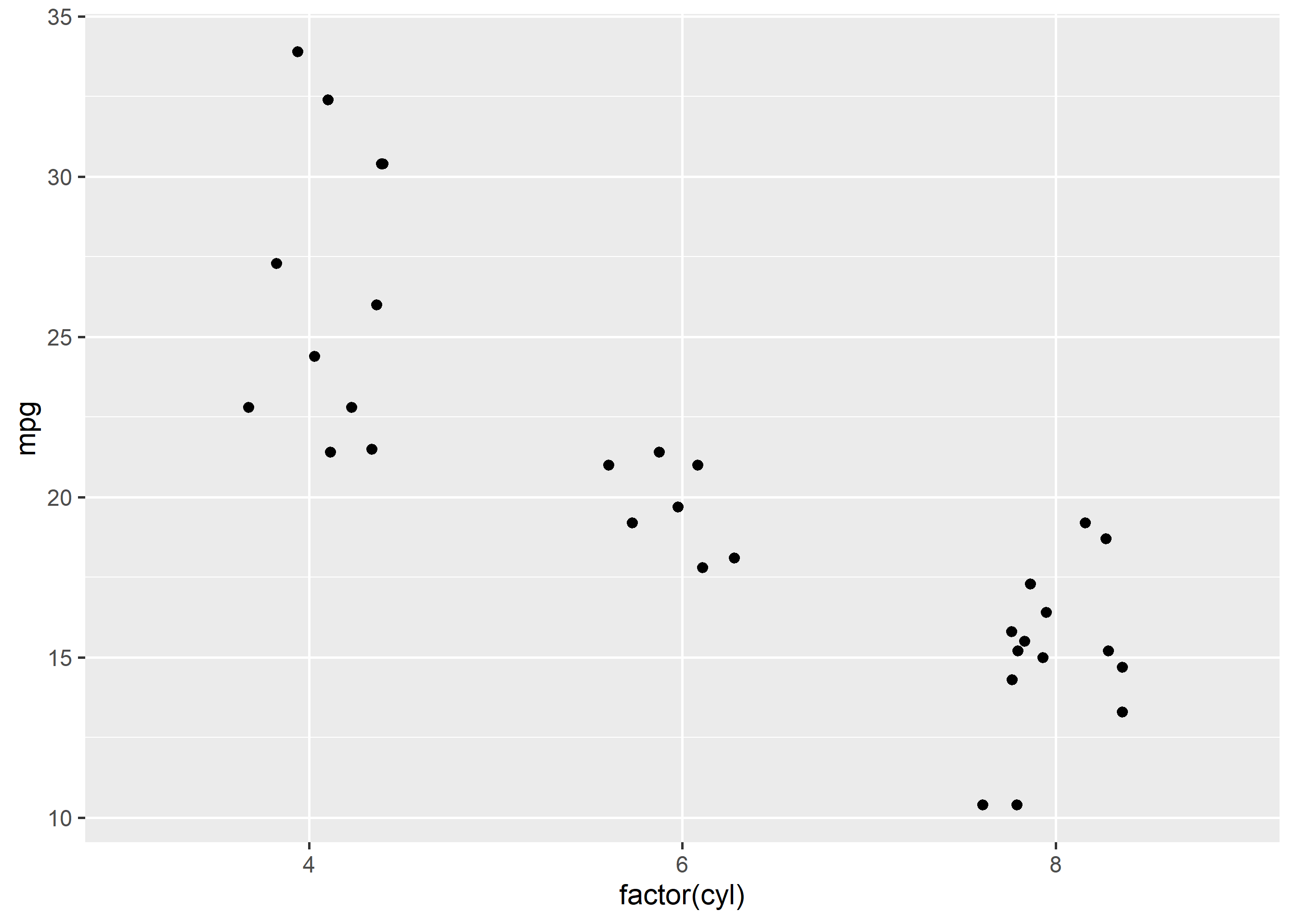
geom_jitter() is a shortcut with the same arguments:
ggplot(mtcars) +
  geom_jitter(aes(factor(cyl), mpg), width = 0.2, height = 0)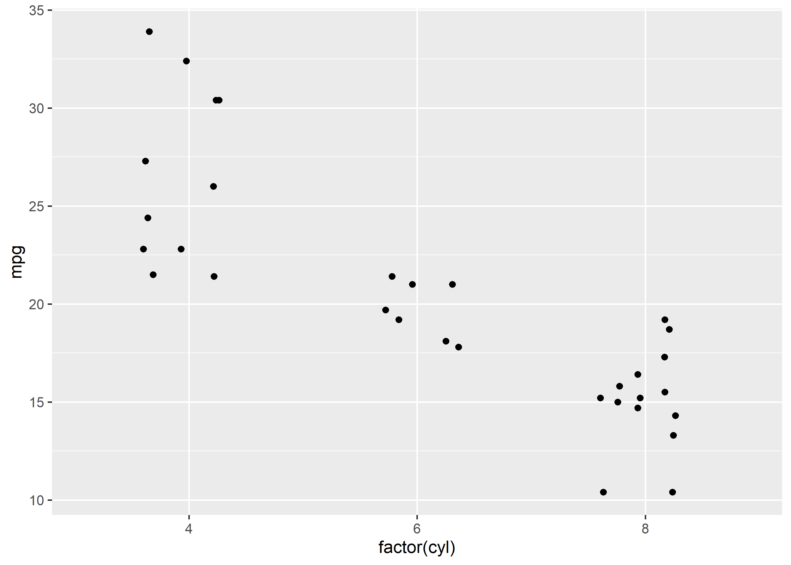
position_stack() piles bars (the default for geom_bar()). Use it explicitly when combining stacked bars with labels:
ggplot(mtcars) +
  geom_bar(aes(factor(cyl), fill = factor(gear)), position = position_stack())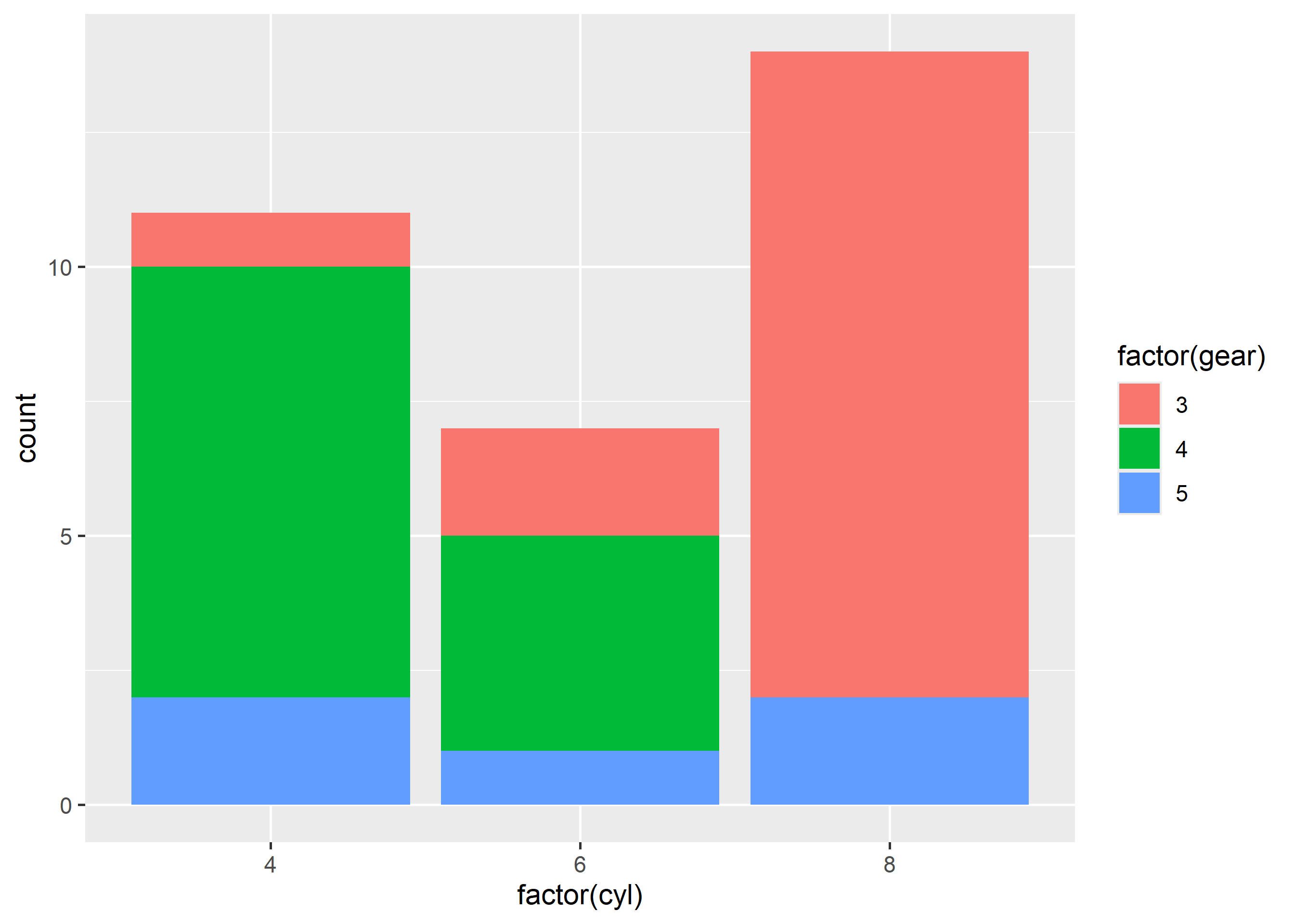
stat_summary() aggregates y values per x group on the fly. Here we plot mean horsepower per cylinder count:
ggplot(mtcars) +
  stat_summary(aes(factor(cyl), hp), fun = mean, geom = "bar", fill = "steelblue")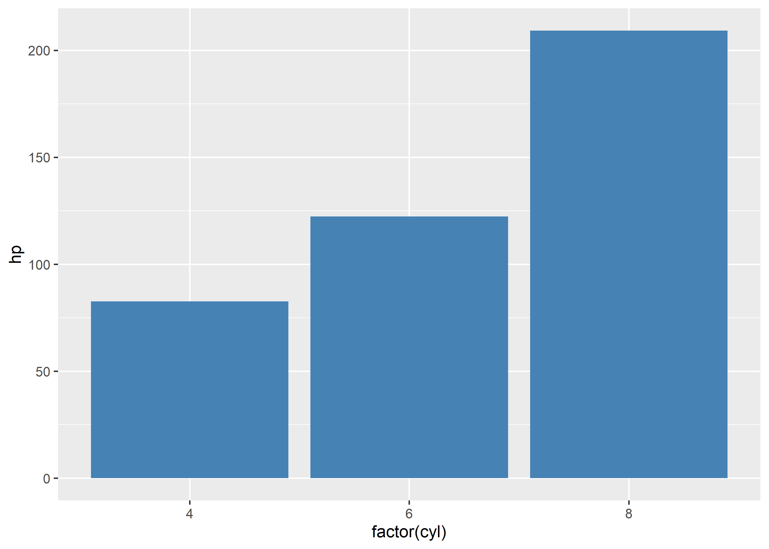
Add spread with fun.min and fun.max:
ggplot(mtcars) +
  stat_summary(aes(factor(cyl), hp), fun = mean, fun.min = min, fun.max = max,
    geom = "pointrange", color = "steelblue")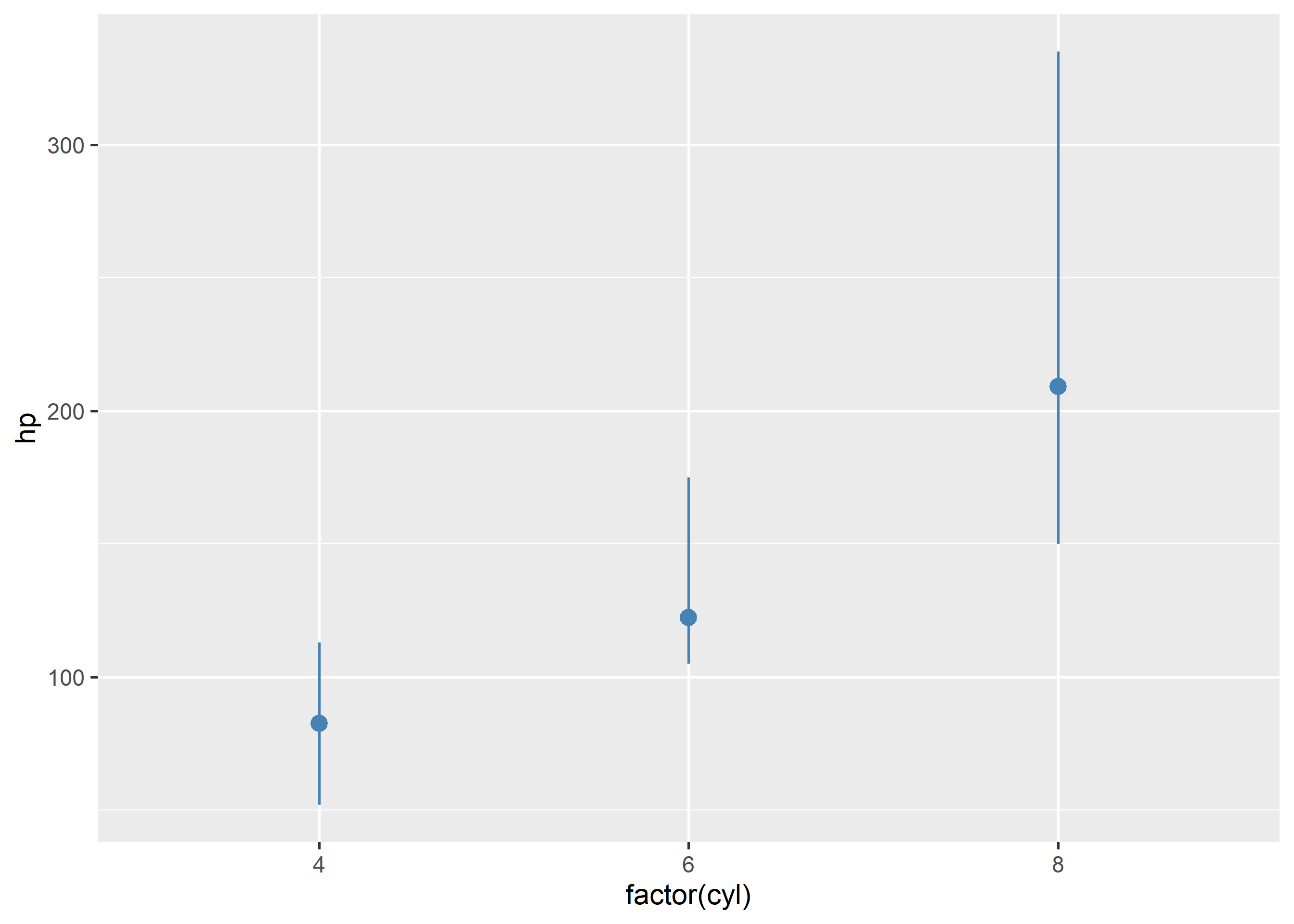
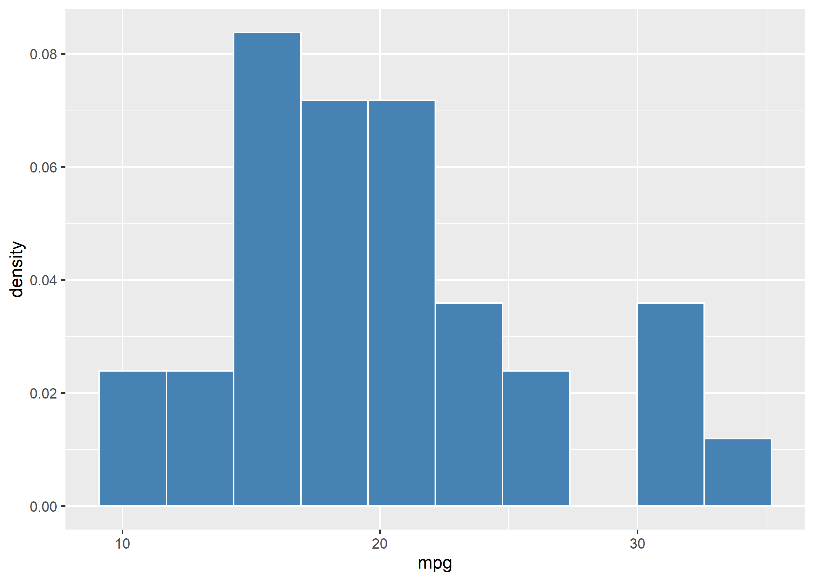
Computed statistics must be mapped with after_stat(). The old ..count.. syntax is deprecated. Here density is mapped on a histogram:
ggplot(mtcars) +
  geom_histogram(aes(mpg, y = after_stat(density)), bins = 10,
    fill = "steelblue", color = "white", linewidth = 0.5)