ggplot(mtcars) +
  geom_point(aes(disp, mpg))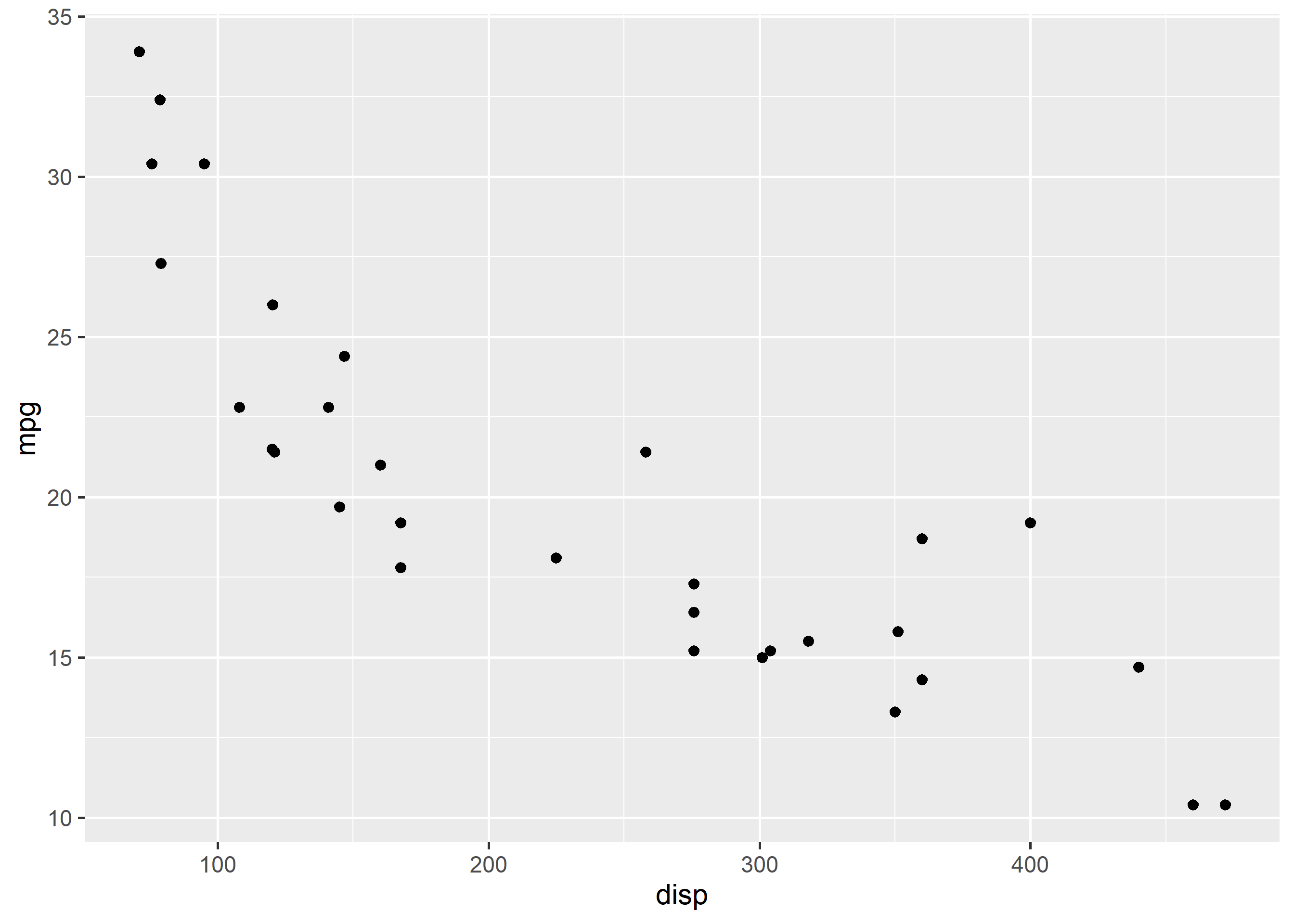
Scatter plots reveal the relationship between two continuous variables: direction, strength and outliers.
Overplotting hides density; use alpha transparency or jitter when points pile up.
In this chapter, we will:
As we did in the previous chapter, let us begin by creating a scatter plot using
geom_point() to examine the relationship between displacement and miles per gallon using the mtcars data.
ggplot(mtcars) +
geom_point(aes(disp, mpg))
Edit the code below and press Run. It executes entirely in your browser via WebR — no R installation needed. The runtime (~30 MB) downloads once, on this page only.
If you want to avoid over plotting, use the position argument and supply it the value 'jitter'. It adds random noise to a plot and makes it easier to read.
ggplot(mtcars) +
  geom_point(aes(disp, mpg), position = 'jitter')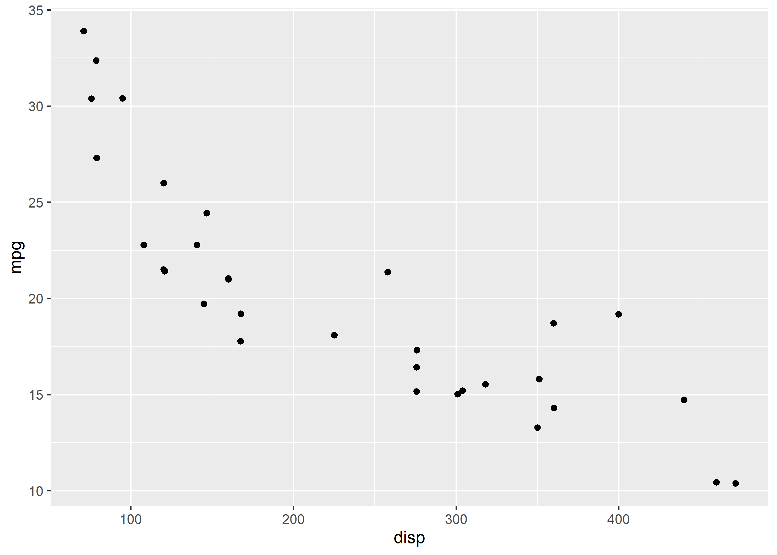
Another way to avoid over plotting is to use geom_jitter().
ggplot(mtcars) +
  geom_jitter(aes(disp, mpg))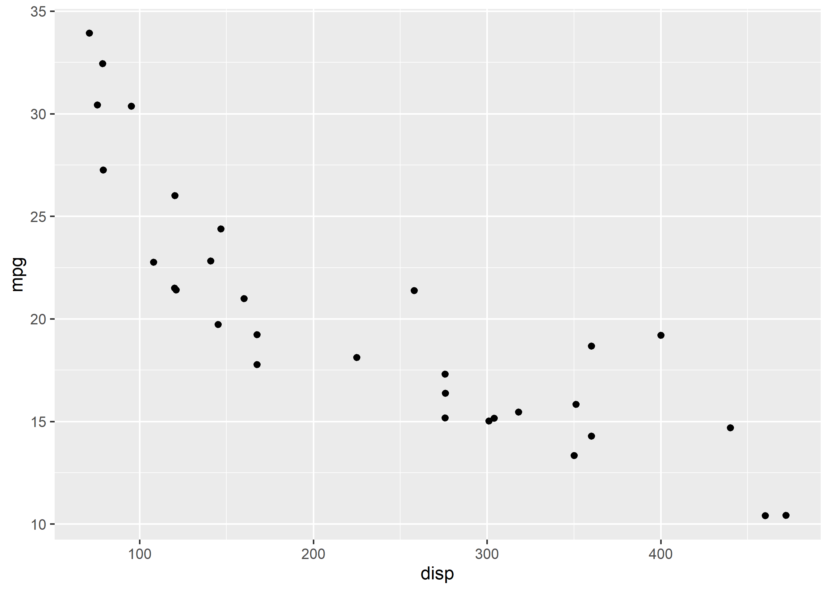
Now let us modify the appearance of the points. There are two ways:
aes()To modify the color of the points, you can use the color argument and supply it a valid color name. In the below example, we change the color of the points to 'blue'. Keep in mind that the color argument should be outside aes().
ggplot(mtcars) +
  geom_point(aes(disp, mpg), color = 'blue', position = 'jitter')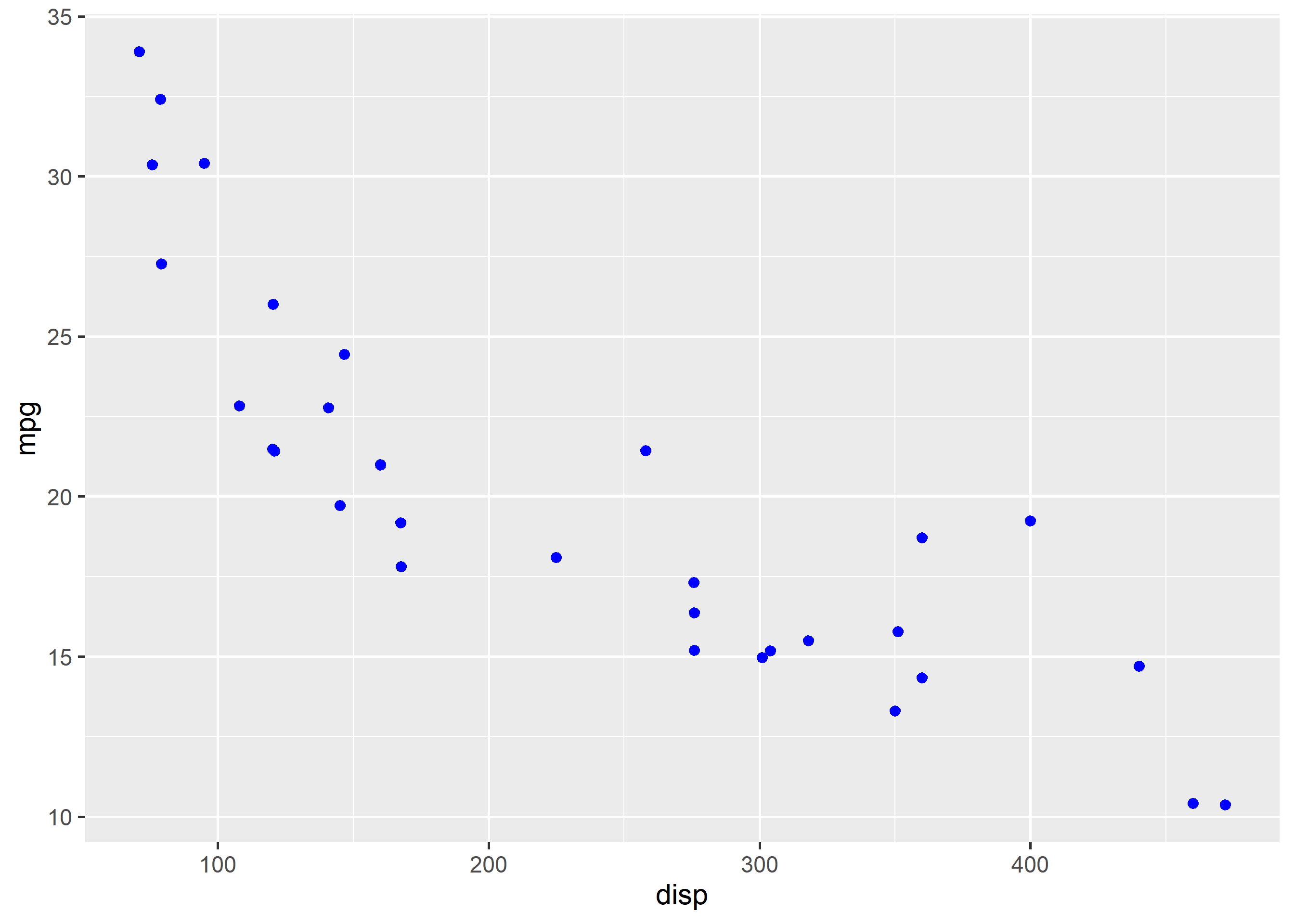
The transparency of the color can be modified using the alpha argument. It takes values between 0 and 1.
ggplot(mtcars) +
  geom_point(aes(disp, mpg), color = 'blue', alpha = 0.4, position = 'jitter')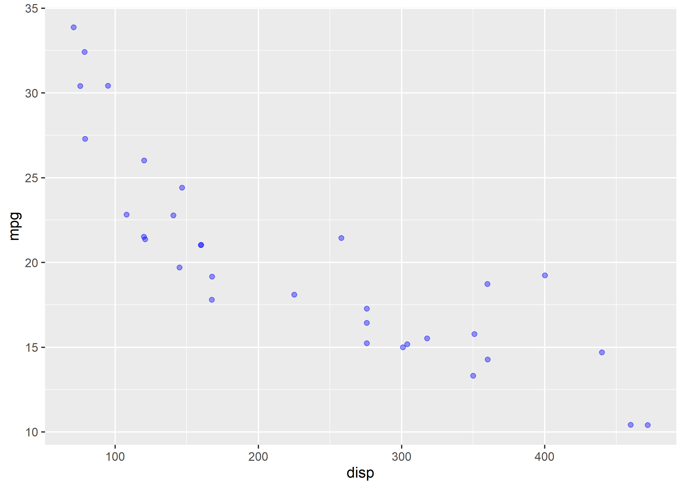
The shape of the points can be modified using the shape argument. It takes values between 0 and 25.
ggplot(mtcars) +
  geom_point(aes(disp, mpg), shape = 3, position = 'jitter')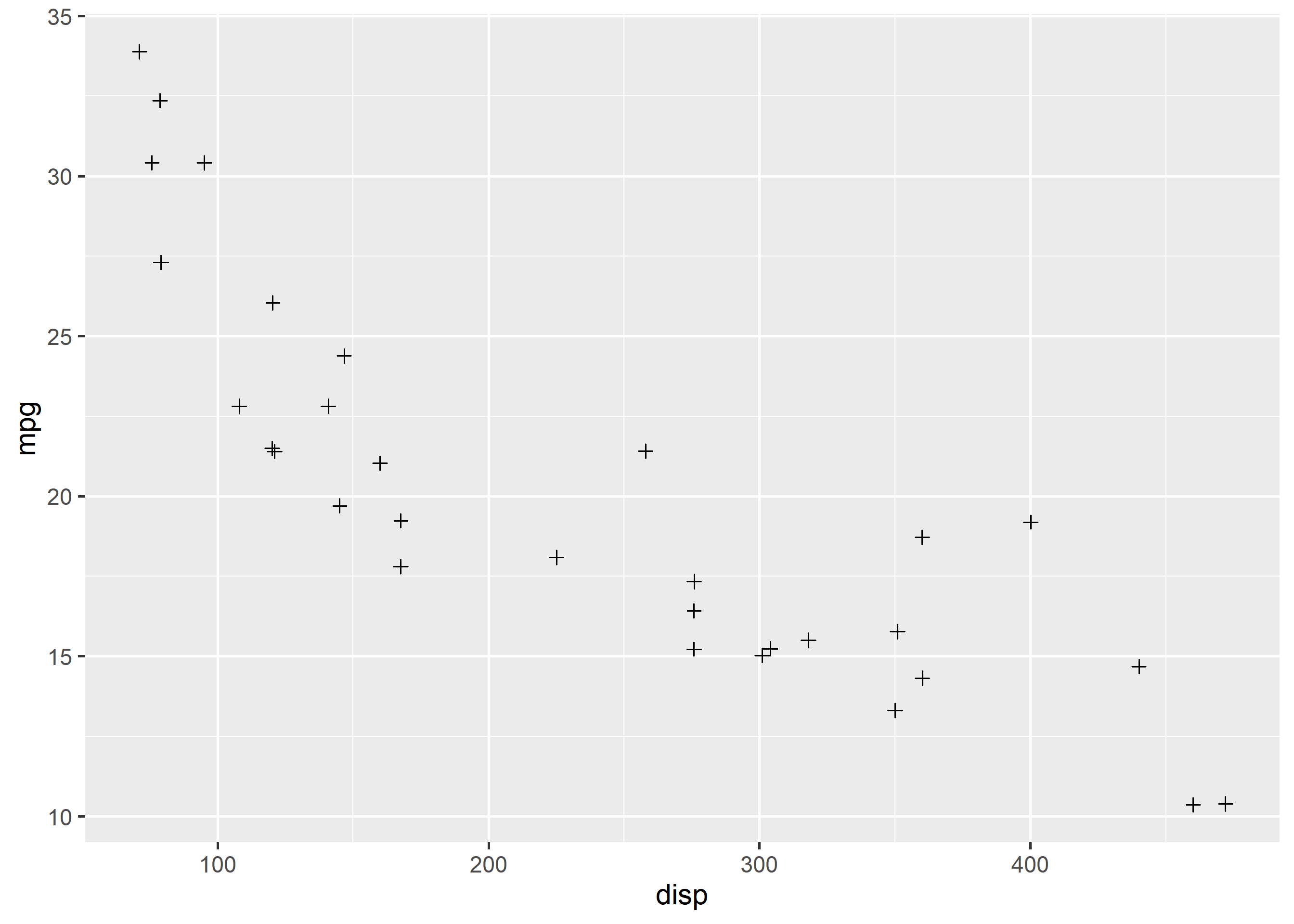
The size of the points can be modified using the size argument. It can take any value greater than 0.
ggplot(mtcars) +
  geom_point(aes(disp, mpg), size = 3, position = 'jitter')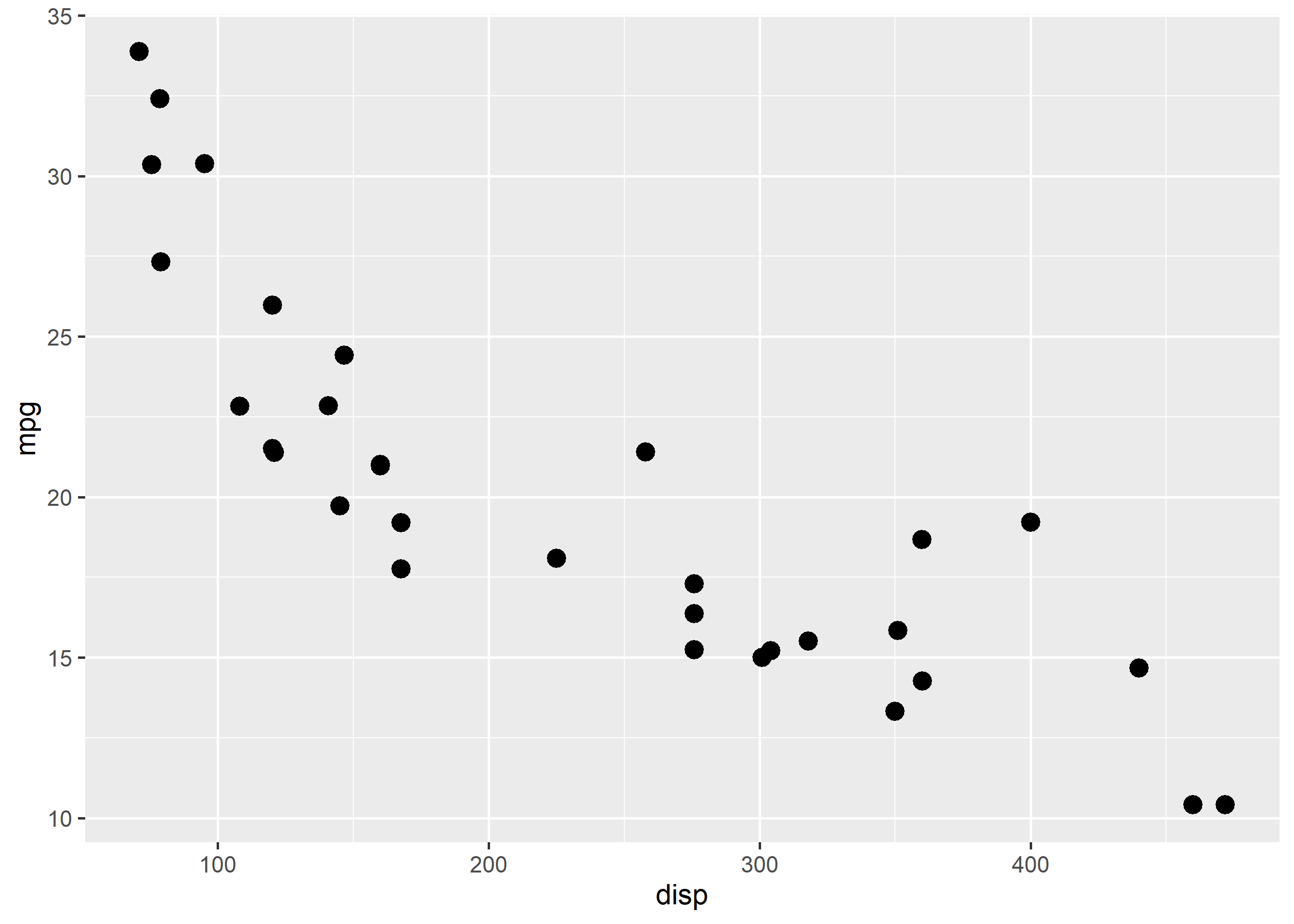
So far, we have specified values for color, shape, size etc. Now, let us map them to variables using aes().
You can modify the color of the points by mapping them to a variable using aes(). It allows you to examine the relationship between two continuous variables at different levels of a categorical variable.
ggplot(mtcars) +
  geom_point(aes(disp, mpg, color = factor(cyl)),
             position = 'jitter')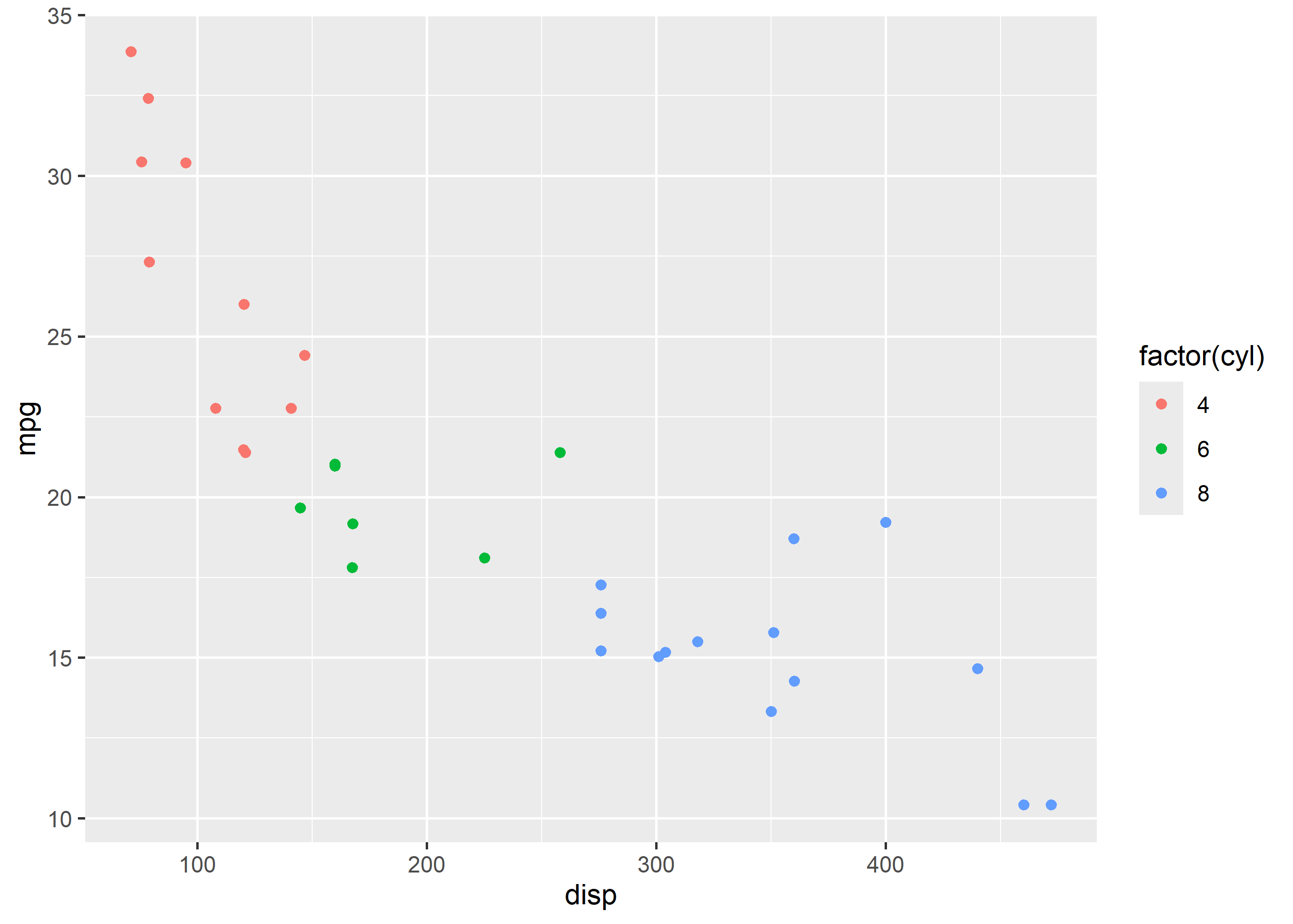
The color can be mapped to a conitnuous variable as well and in this case you will be able to examine the relationship betweem two continuous variable for a range of value of a third variable.
ggplot(mtcars) +
  geom_point(aes(disp, mpg, color = hp),
             position = 'jitter')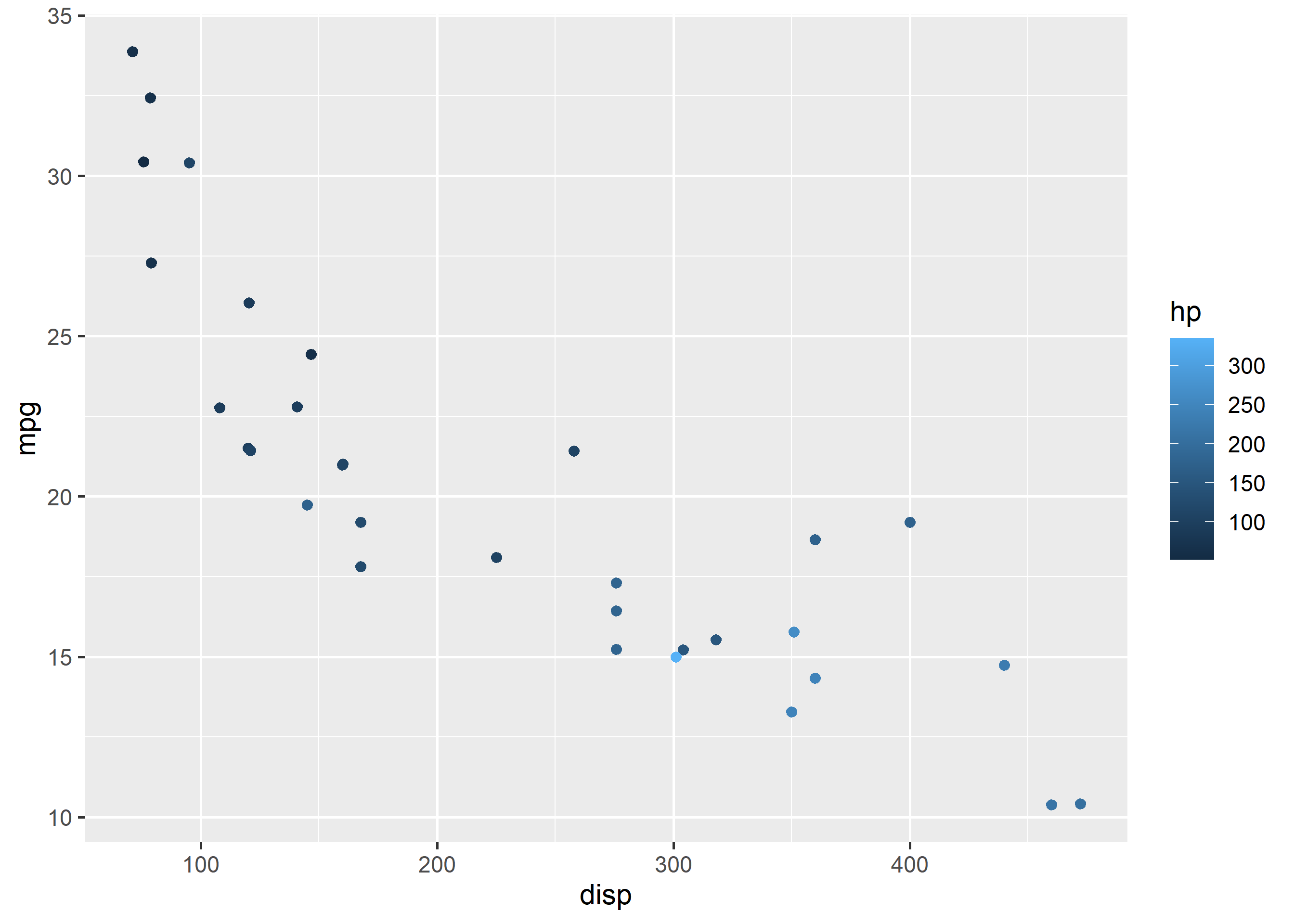
Shape can be mapped to categorical variables. In the below example, we use factor() to convert cyl to categorical data before mapping shape to it. ggplot2 will throw an error if you map shape to a continuous variable.
ggplot(mtcars) +
  geom_point(aes(disp, mpg, shape = factor(cyl)), position = 'jitter')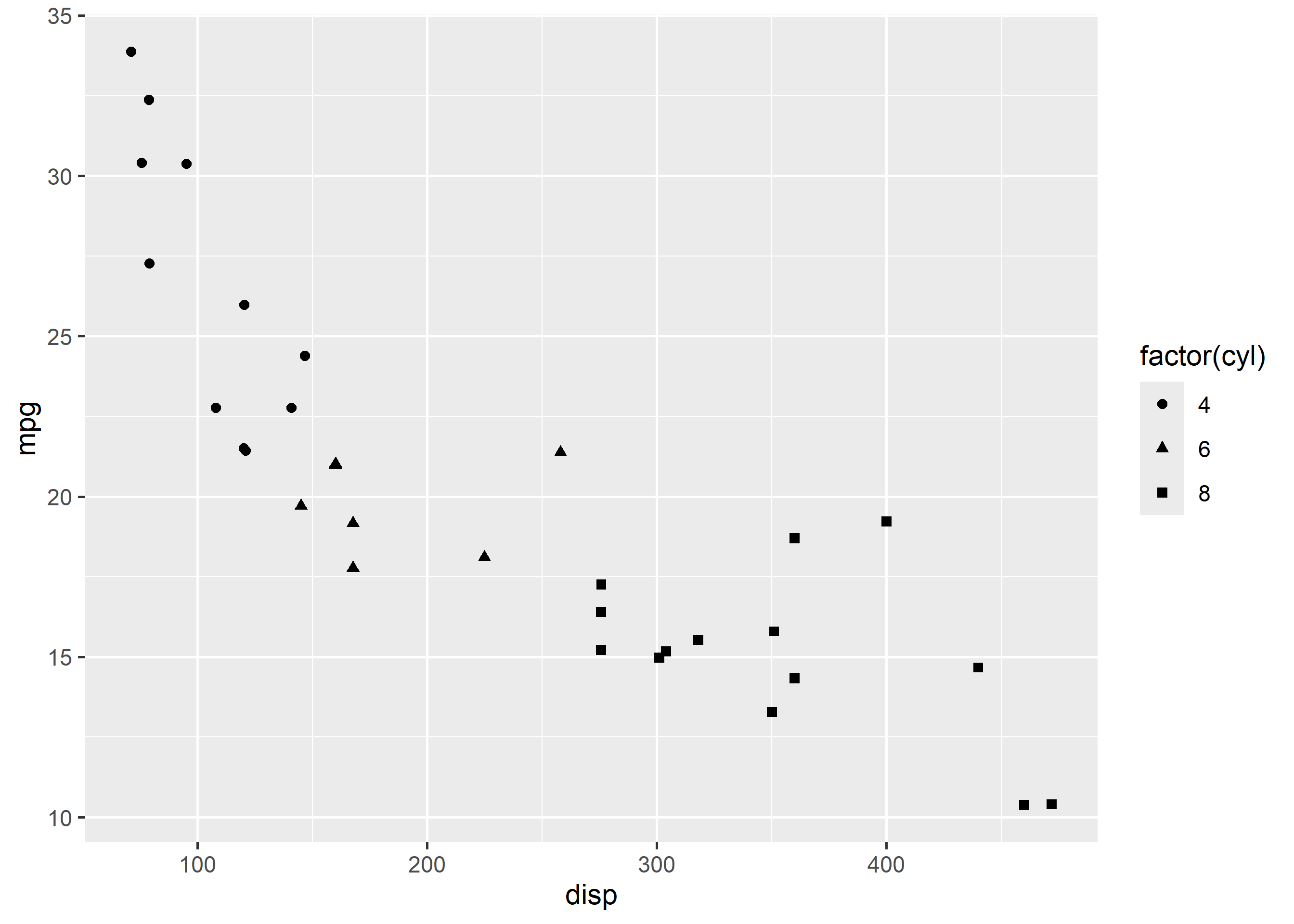
Size must be always mapped to continuous variables. In the below example, we have mapped size to hp variable.
ggplot(mtcars) +
  geom_point(aes(disp, mpg, size = hp), color = 'blue', position = 'jitter')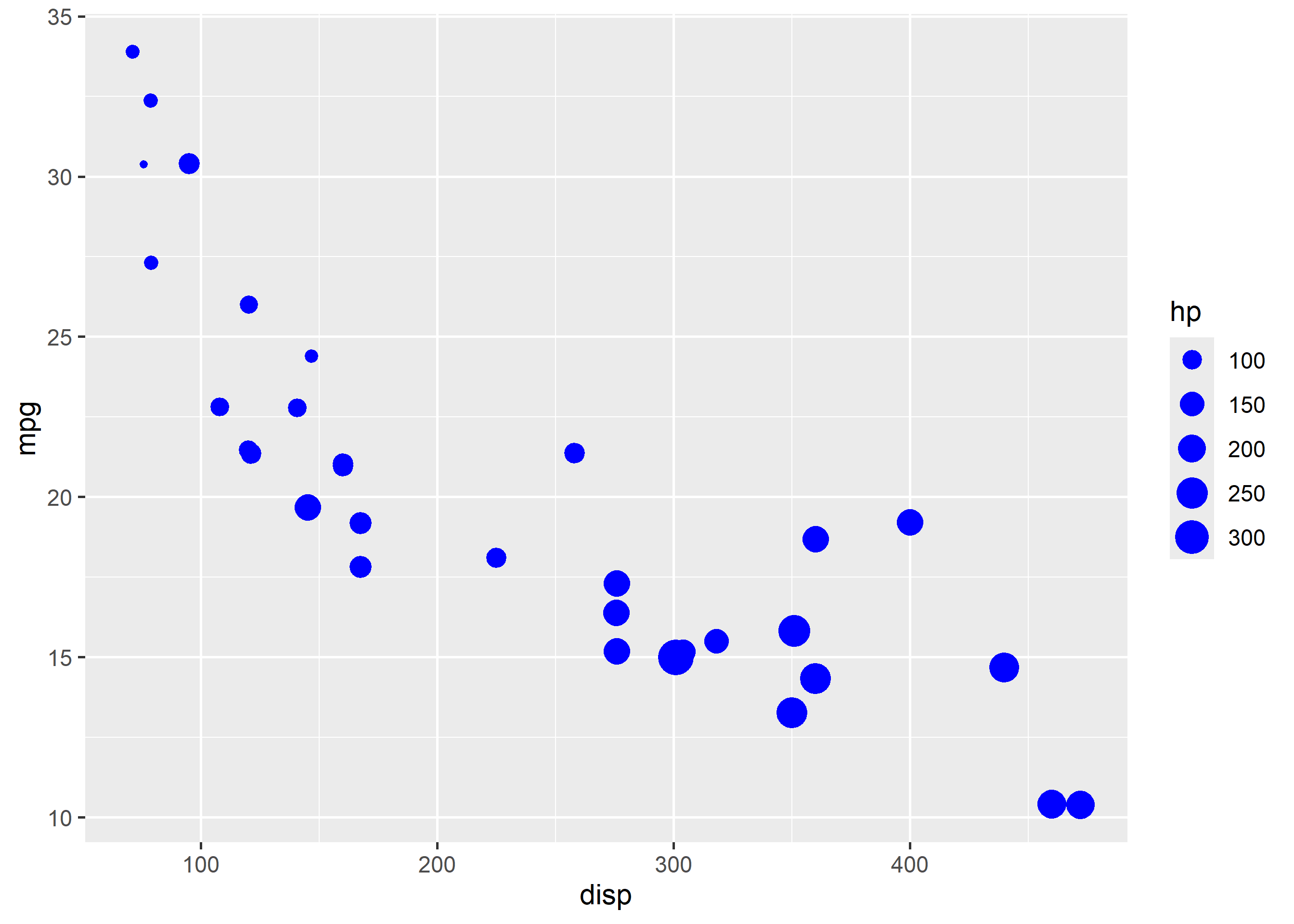
If you map size to categorical data as shown in the below example, ggplot2 will throw a warning.
ggplot(mtcars) +
  geom_point(aes(disp, mpg, size = factor(cyl)), color = 'blue', position = 'jitter')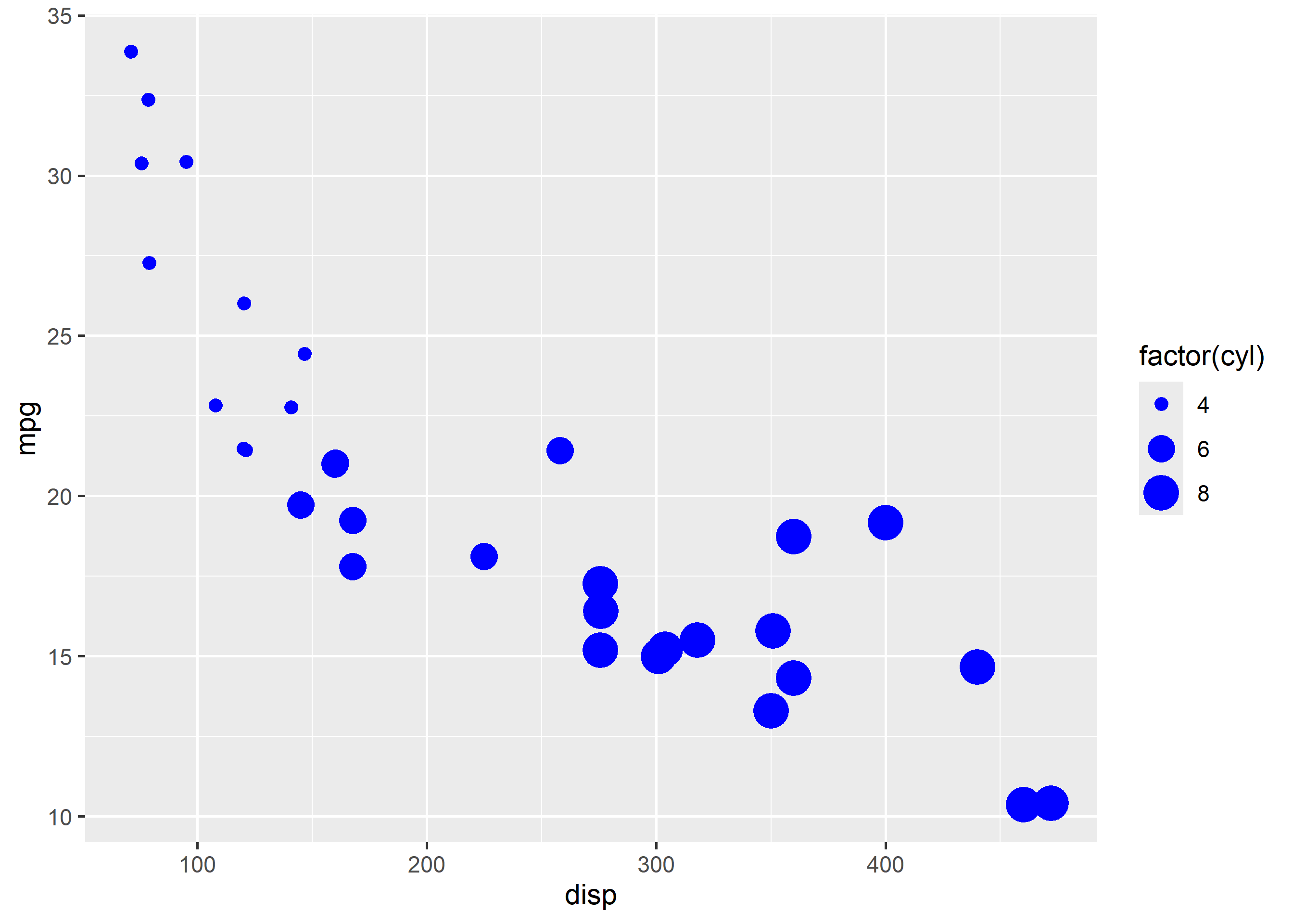
geom_smooth() allows us to fit a regression line to the plot. By default it will use least squares method to fit the line but you can also use the loess method. In the below example, we fit a regression line using the least squares technique by supplying the value 'lm' to the method argument.
ggplot(mtcars, aes(disp, mpg)) +
  geom_point(position = 'jitter') +
  geom_smooth(method = 'lm', formula = y ~ x, se = FALSE)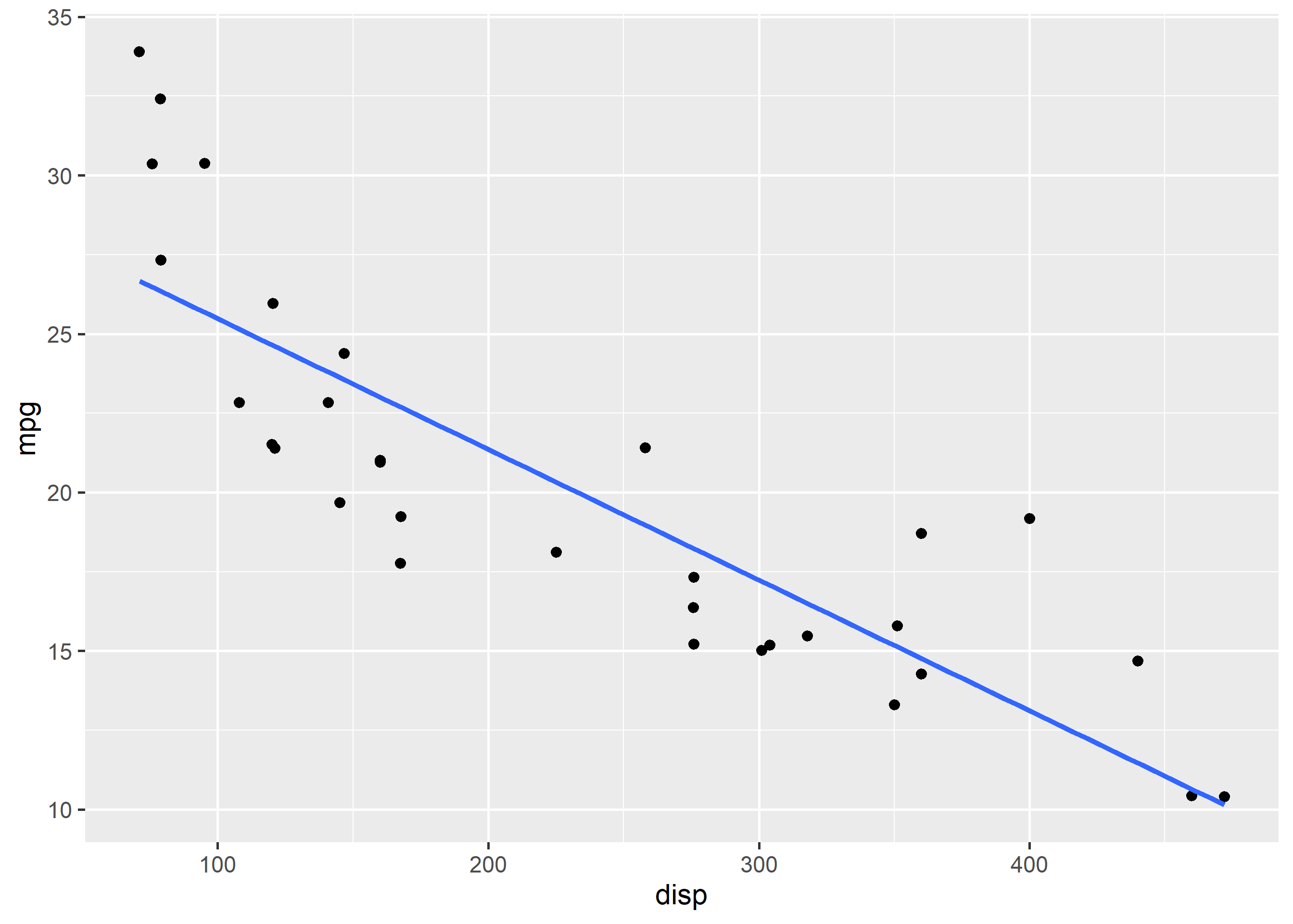
The se argument will add a confidence interval around the regression line, if set to TRUE.
ggplot(mtcars, aes(disp, mpg)) +
  geom_point(position = 'jitter') +
  geom_smooth(method = 'lm', formula = y ~ x, se = TRUE)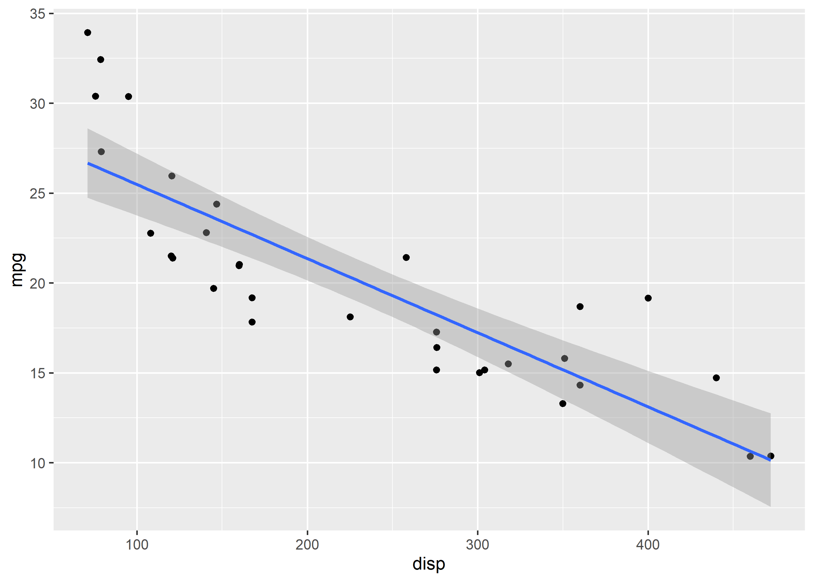
In the below example, we use the loess method instead of the default least squares method to fit the regression line.
ggplot(mtcars, aes(disp, mpg)) +
  geom_point(position = 'jitter') +
  geom_smooth(method = 'loess', formula = y ~ x, se = FALSE)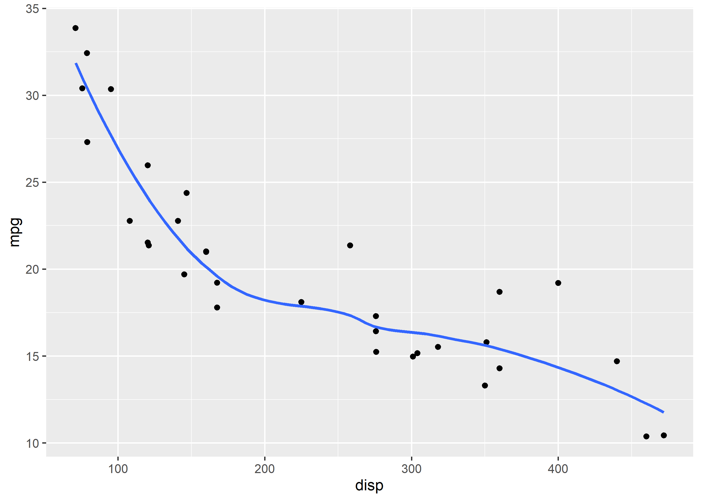
If you know the intercept and the slope of the line, you can use geom_abline(). Let us regress mpg over disp and then use the result to add the line.
lm(mpg ~ disp, data = mtcars)
Call:
lm(formula = mpg ~ disp, data = mtcars)

Coefficients:
(Intercept)         disp
29.59985 -0.04122 ggplot(mtcars, aes(disp, mpg)) +
geom_point(position = 'jitter') +
geom_abline(slope = -0.04122, intercept = 29.59985)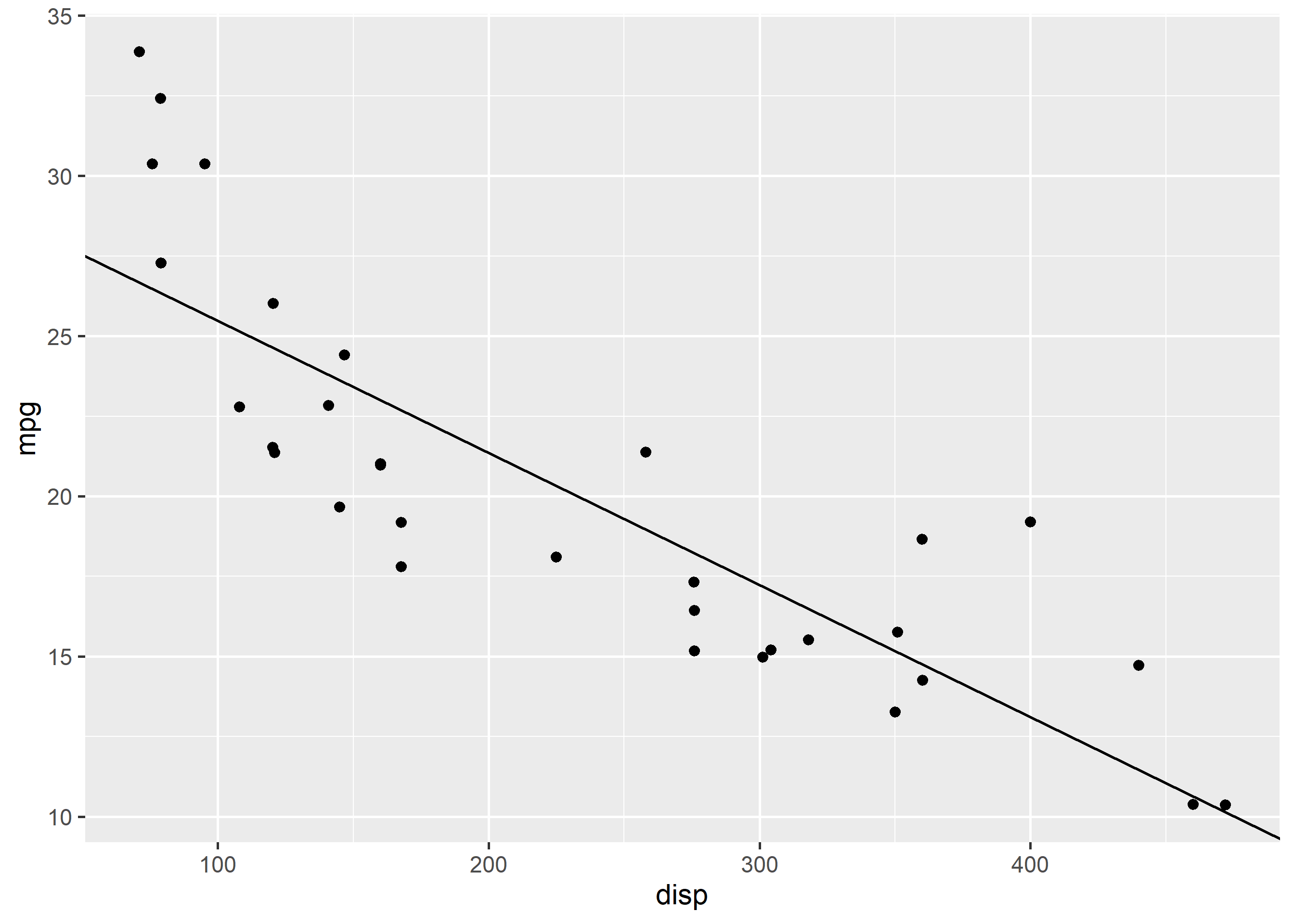
disp vs mpg points by cylinders with a plain Cylinders title.geom_smooth(): explicit formula = y ~ x, no confidence band.theme_minimal().Worked solutions in solutions/scatter.md (attempt first).