ggplot(mtcars) +
  geom_point(aes(disp, mpg))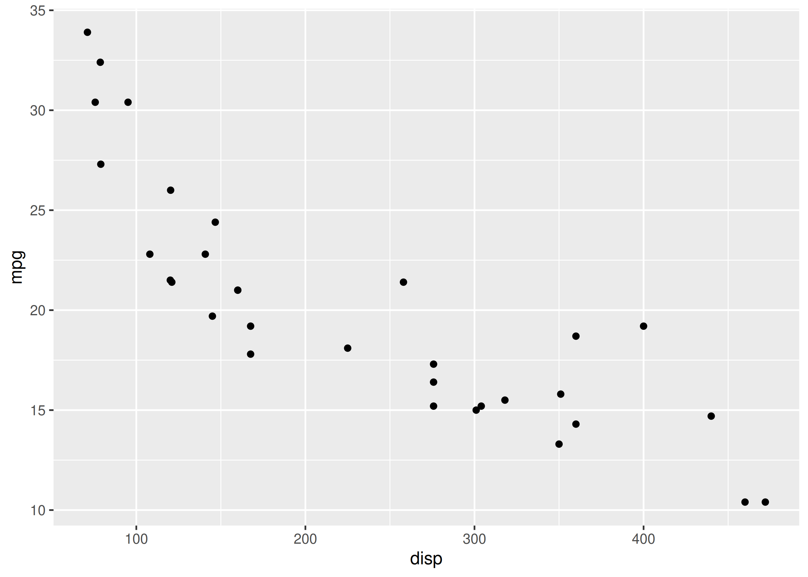
In this chapter, we will learn how to modify the X and Y axis using the
Axis scales, breaks and labels decide what readers can read off the chart.
Fighting default breaks with manual limits can clip data; prefer coord_cartesian() to zoom without dropping.
following functions:
scale_x_continuous()scale_y_continuous()scale_x_discrete()scale_y_discrete()If the X and Y axis represent continuous data, we can use scale_x_continuous() and scale_y_continuous() to modify the axis. They take the following arguments:
Let us continue with the scatter plot we have used in previous chapter.
ggplot(mtcars) +
geom_point(aes(disp, mpg))
The name argument is used to modify the X axis label. In the below example, we change the X axis label to 'Displacement'. In previous chapters, we have used xlab() to work with the X axis label.
ggplot(mtcars) +
  geom_point(aes(disp, mpg)) +
  scale_x_continuous(name = "Displacement")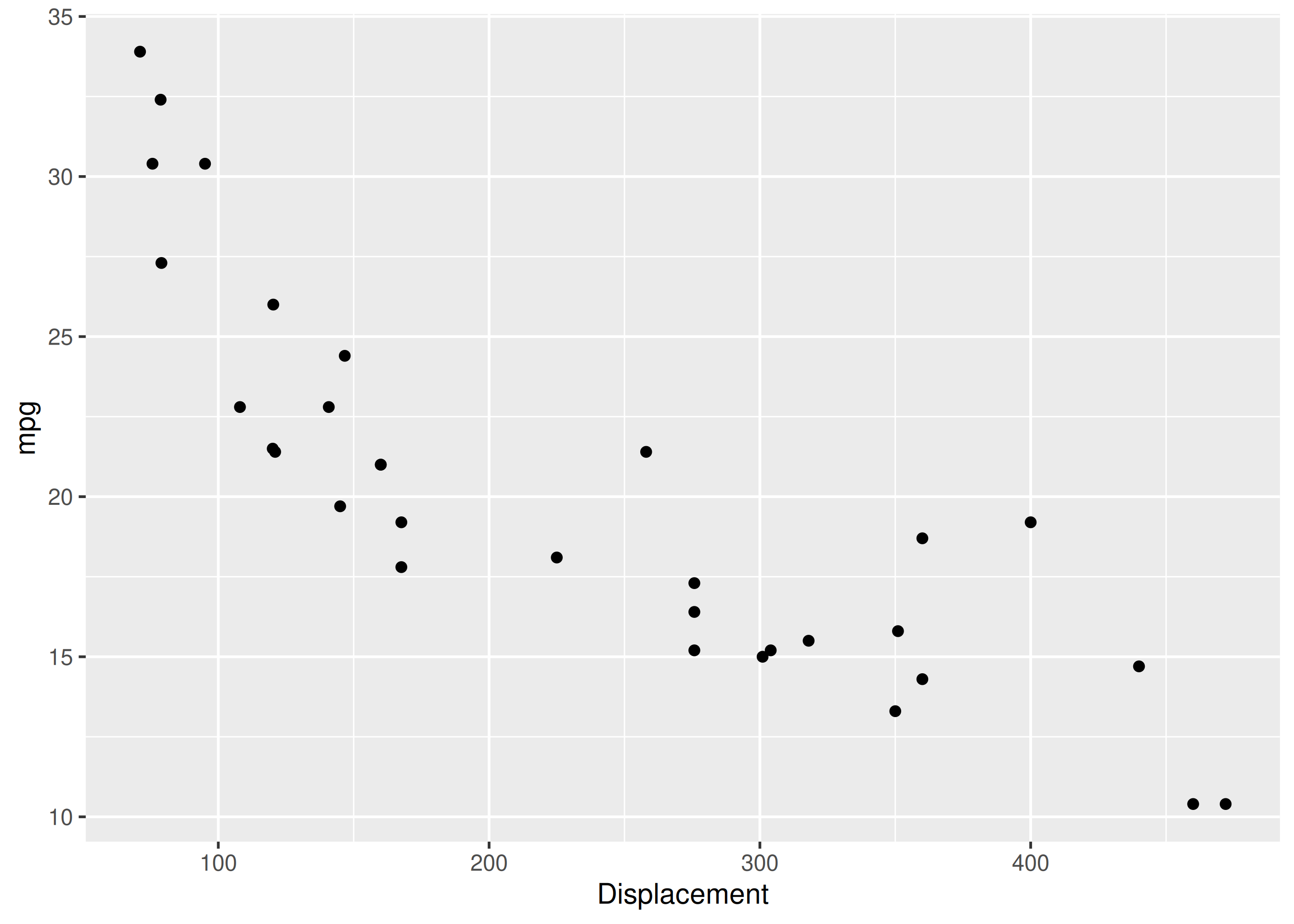
To modify the range, use the limits argument. It takes a vector of length 2 i.e. 2 values, the lower and upper limit of the range. It is an alternative for xlim().
ggplot(mtcars) +
  geom_point(aes(disp, mpg)) +
  scale_x_continuous(limits = c(0, 600))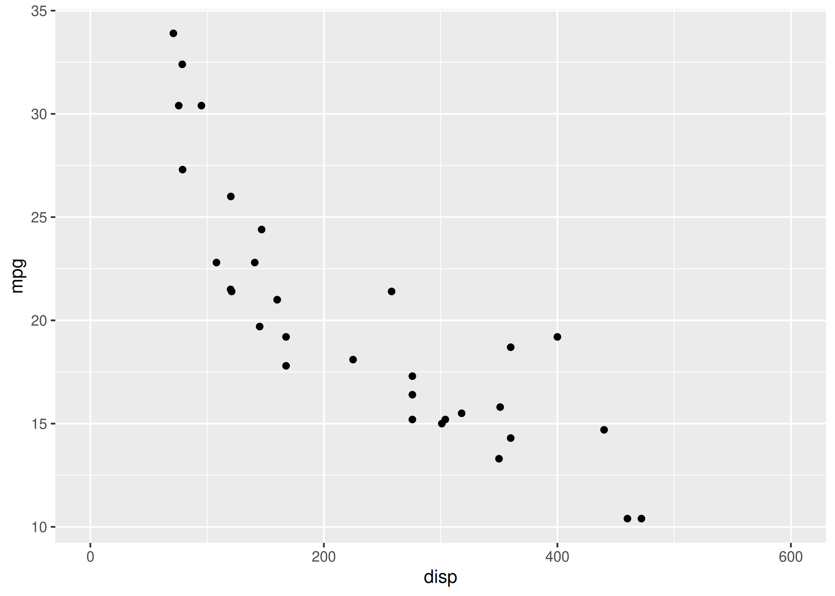
In the above plot, the ticks on the X axis appear at 0, 200, 400 and 600. Let us say we want the ticks to appear more closer i.e. the difference between the tick should be reduced by 50. The breaks argument will allow us to specify where the ticks appear. It takes a numeric vector equal to the length of the number of ticks.
ggplot(mtcars) +
  geom_point(aes(disp, mpg)) +
  scale_x_continuous(breaks = c(150, 300, 450))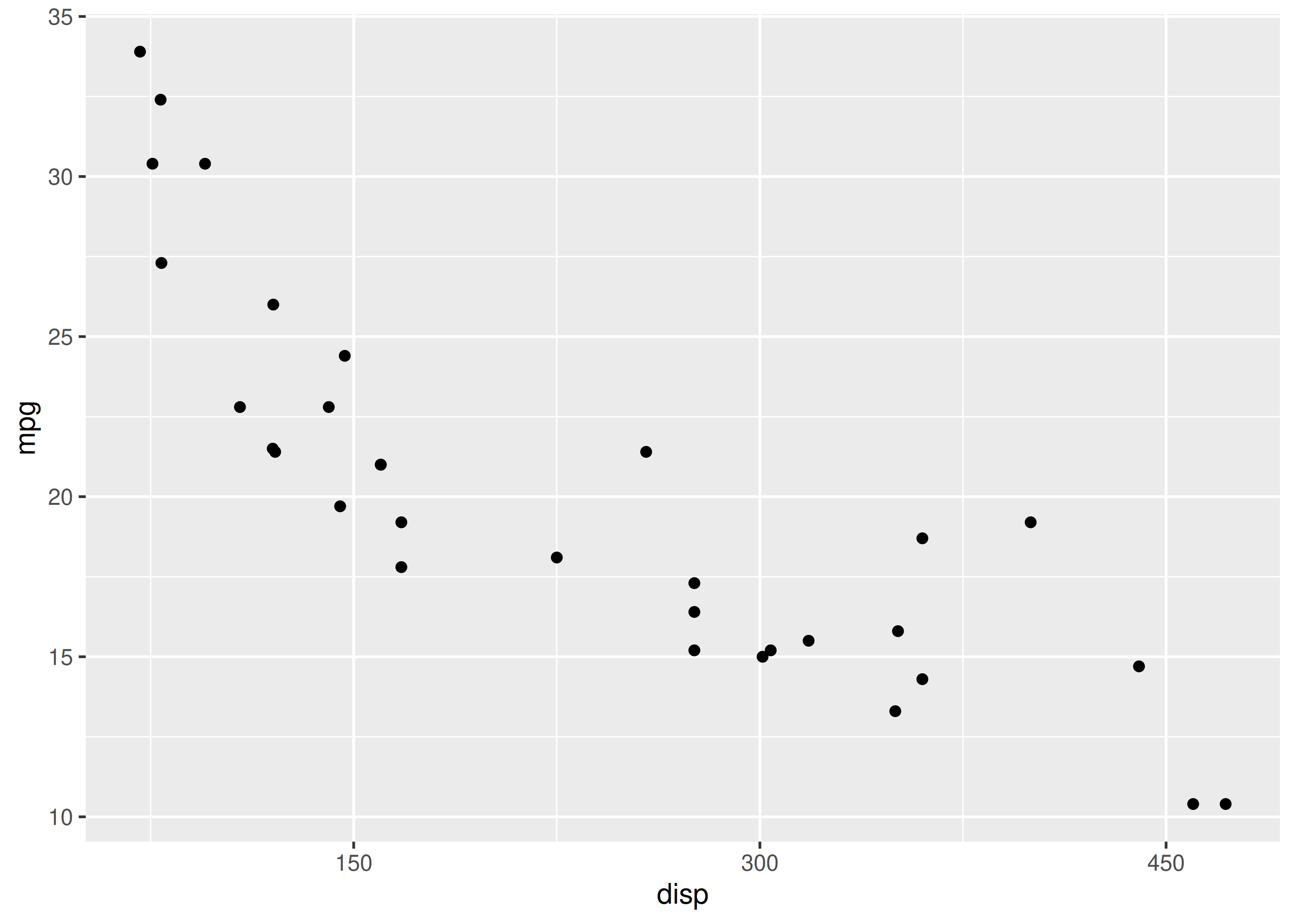
We can change the tick labels using the labels argument. In the below example, we use words instead of numbers. When adding labels, we need to ensure that the length of the breaks and labels are same.
ggplot(mtcars) +
  geom_point(aes(disp, mpg)) +
  scale_x_continuous(breaks = c(150, 300, 450),
    labels = c('One Hundred Fifty', 'Three Hundred', 'Four Hundred Fifty'))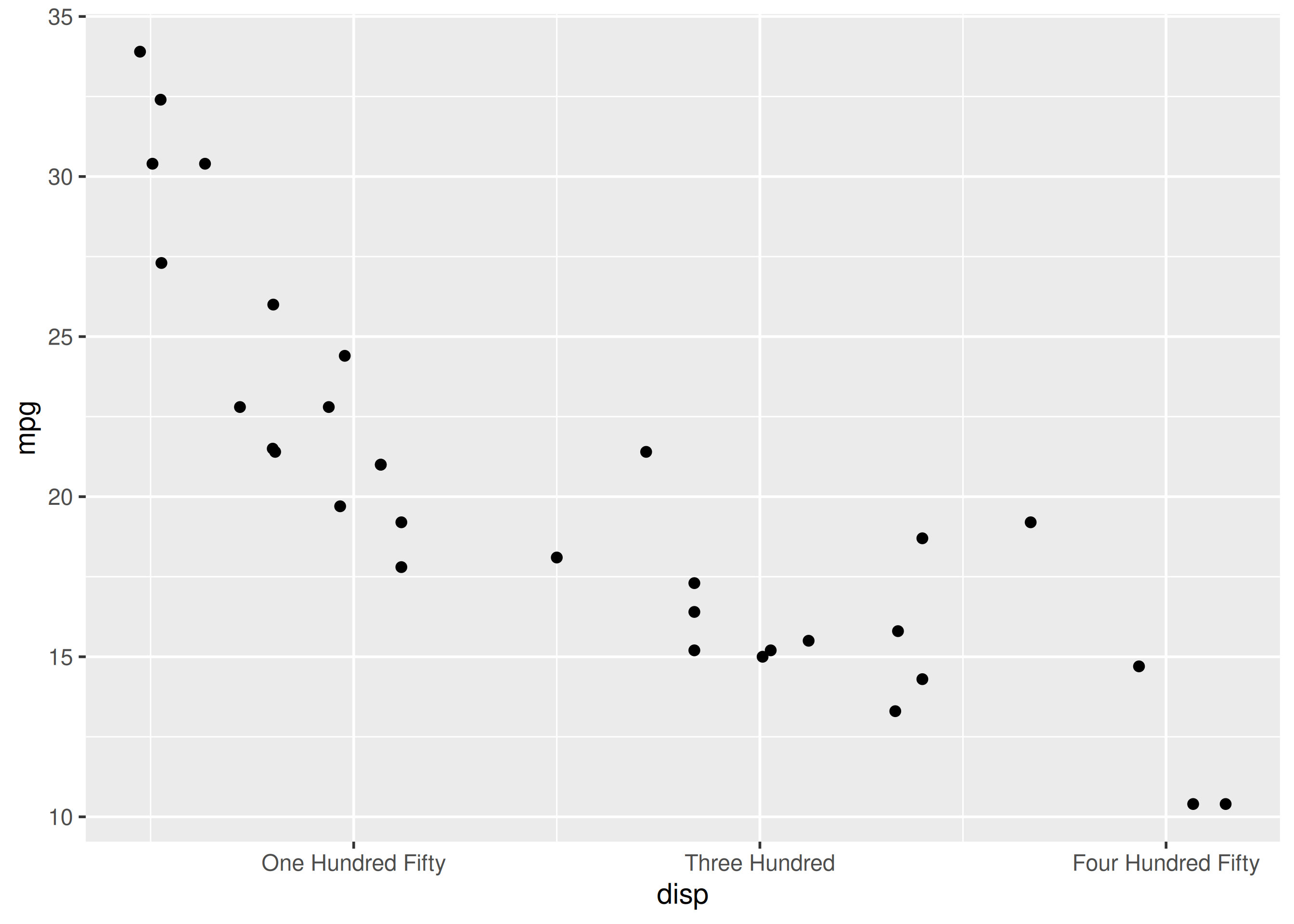
The position of the axes can be changed using the position argument. In the below example, we can move the axes to the top of the plot by supplying the value 'top'.
ggplot(mtcars) +
  geom_point(aes(disp, mpg)) +
  scale_x_continuous(position = 'top')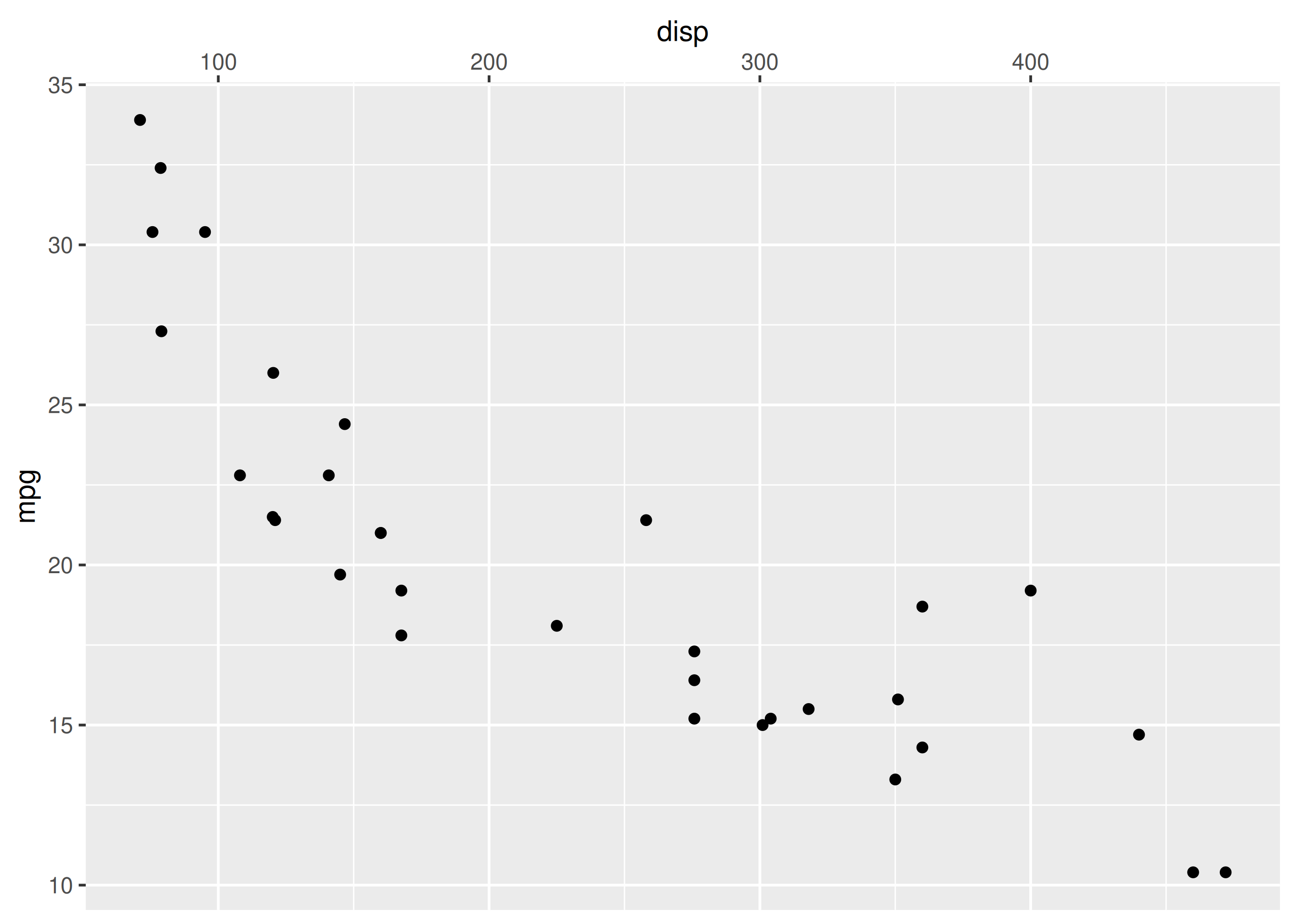
ggplot(mtcars) + geom_point(aes(disp, mpg)) +
  scale_x_continuous(name = "Displacement", limits = c(0, 600),
                     breaks = c(0, 150, 300, 450, 600), position = 'top',
                     labels = c('0', '150', '300', '450', '600'))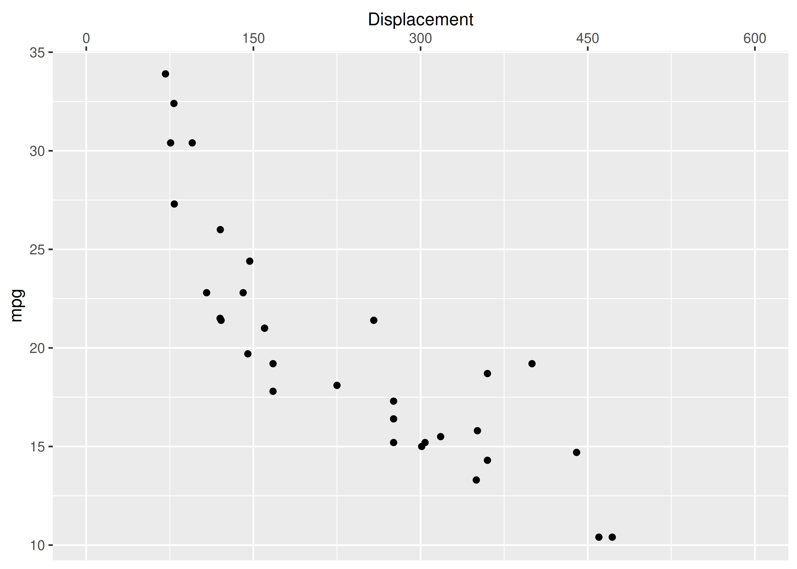
ggplot(mtcars) + geom_point(aes(disp, mpg)) +
  scale_y_continuous(name = "Miles Per Gallon", limits = c(0, 45),
                     breaks = c(0, 15, 30, 45), position = 'right',
                     labels = c('0', '15', '30', '45'))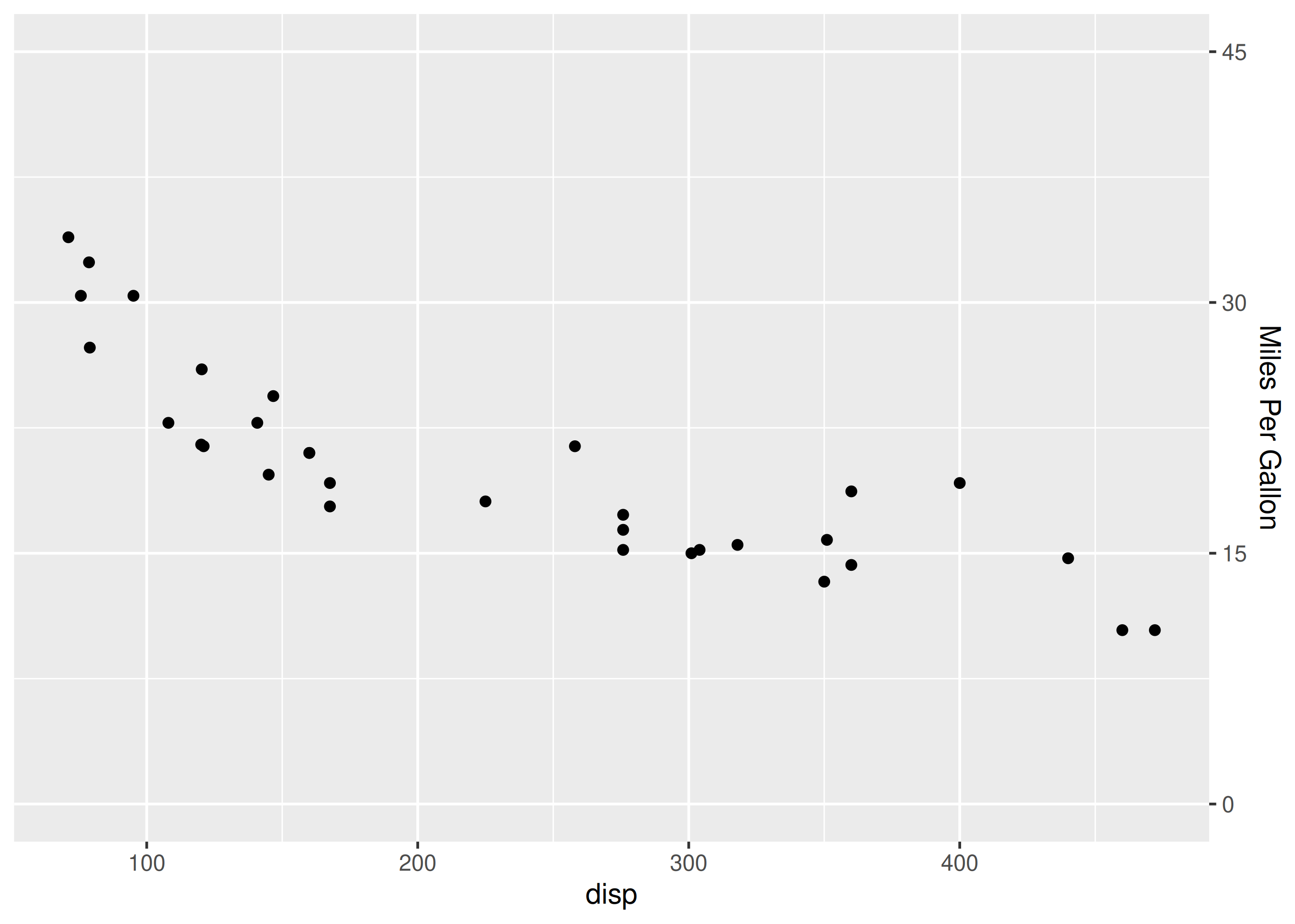
If the X and Y axis represent discrete or categorical data, scale_x_discrete() and scale_y_discrete() can be used to modify them. They take the following arguments:
The above options serve the same purpose as in the case of continuous scales.
ggplot(mtcars) +
  geom_bar(aes(factor(cyl))) +
  scale_x_discrete(name = "Number of Cylinders")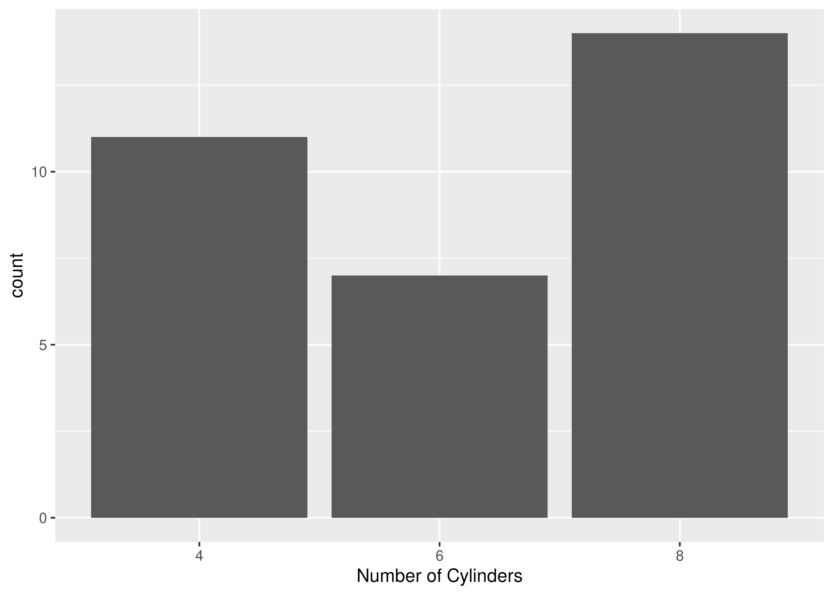
ggplot(mtcars) +
  geom_bar(aes(factor(cyl))) +
  scale_x_discrete(labels = c("4" = "Four", "6" = "Six", "8" = "Eight"))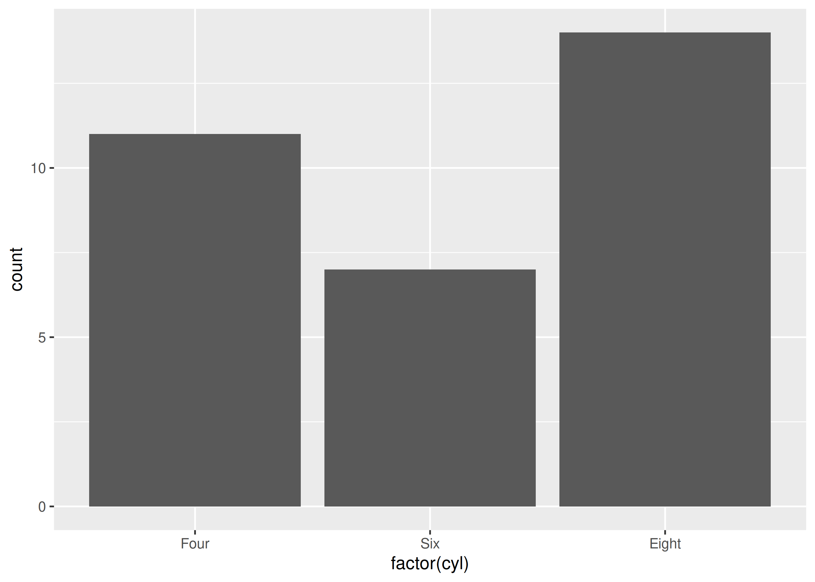
ggplot(mtcars) +
  geom_bar(aes(factor(cyl))) +
  scale_x_discrete(breaks = c("4", "6", "8"))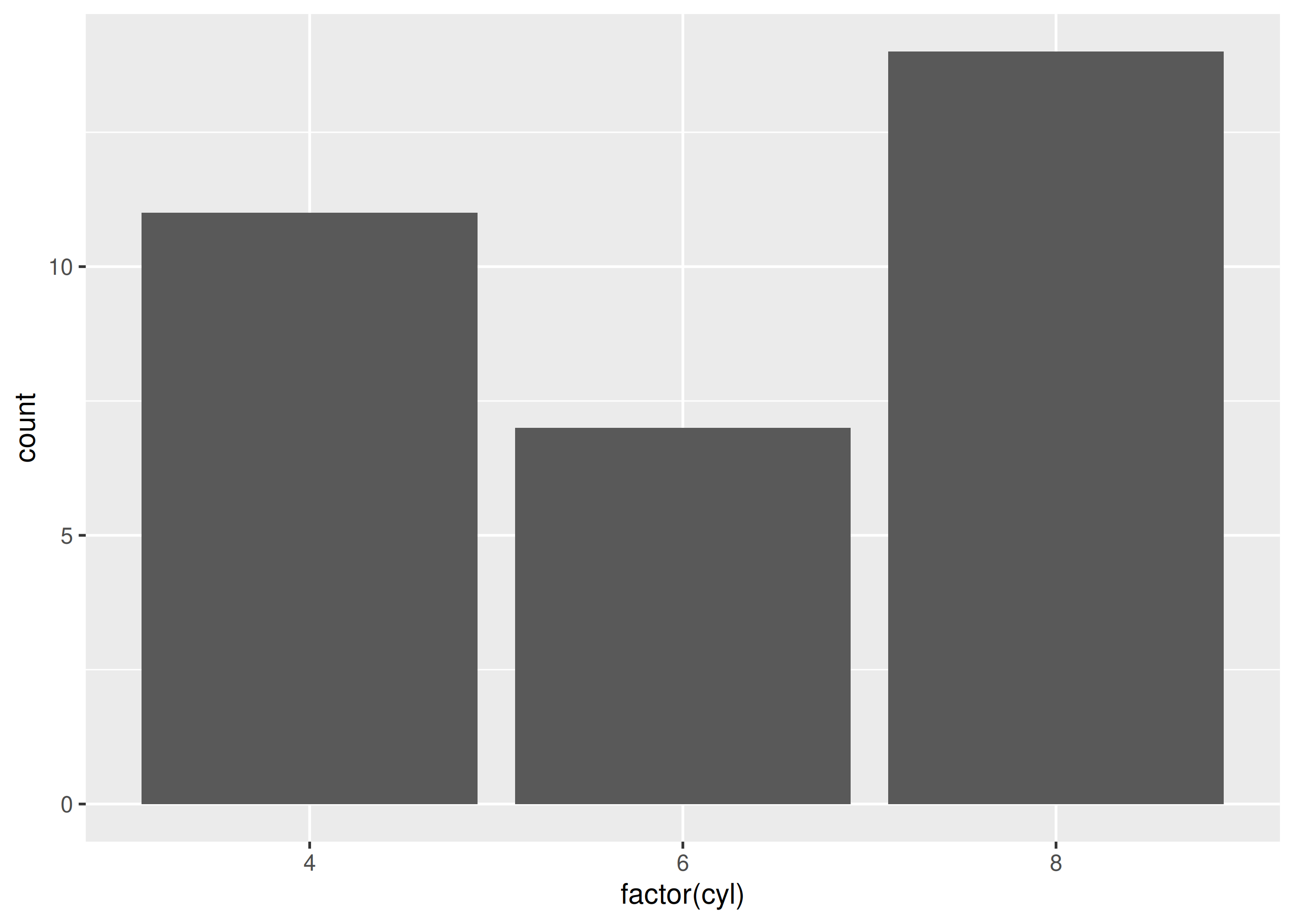
ggplot(mtcars) +
  geom_bar(aes(factor(cyl))) +
  scale_x_discrete(position = 'bottom')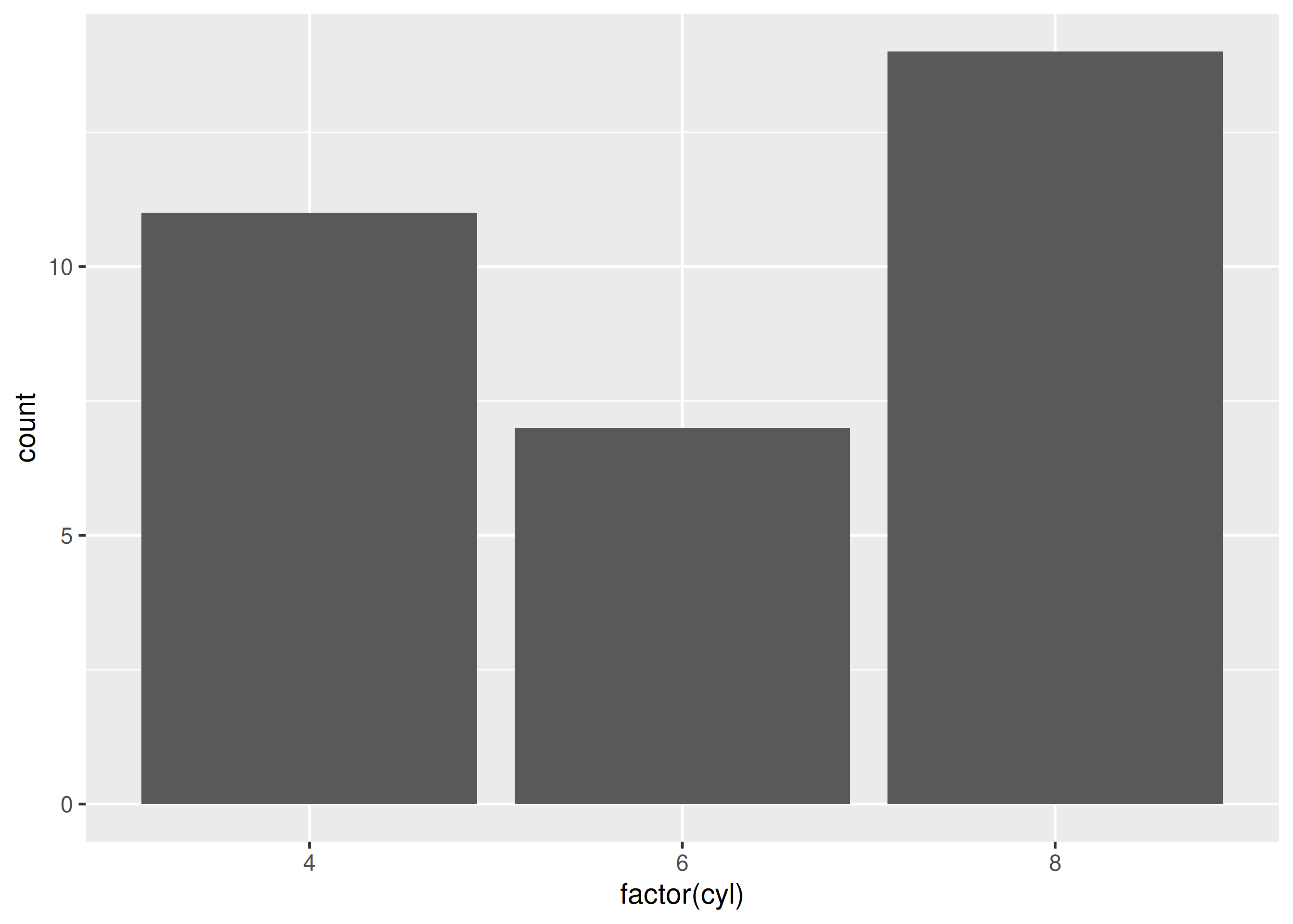
ggplot(mtcars) + geom_bar(aes(factor(cyl))) +
  scale_x_discrete(name = "Number of Cylinders",
    labels = c("4" = "Four", "6" = "Six", "8" = "Eight"),
    breaks = c("4", "6", "8"), position = "bottom")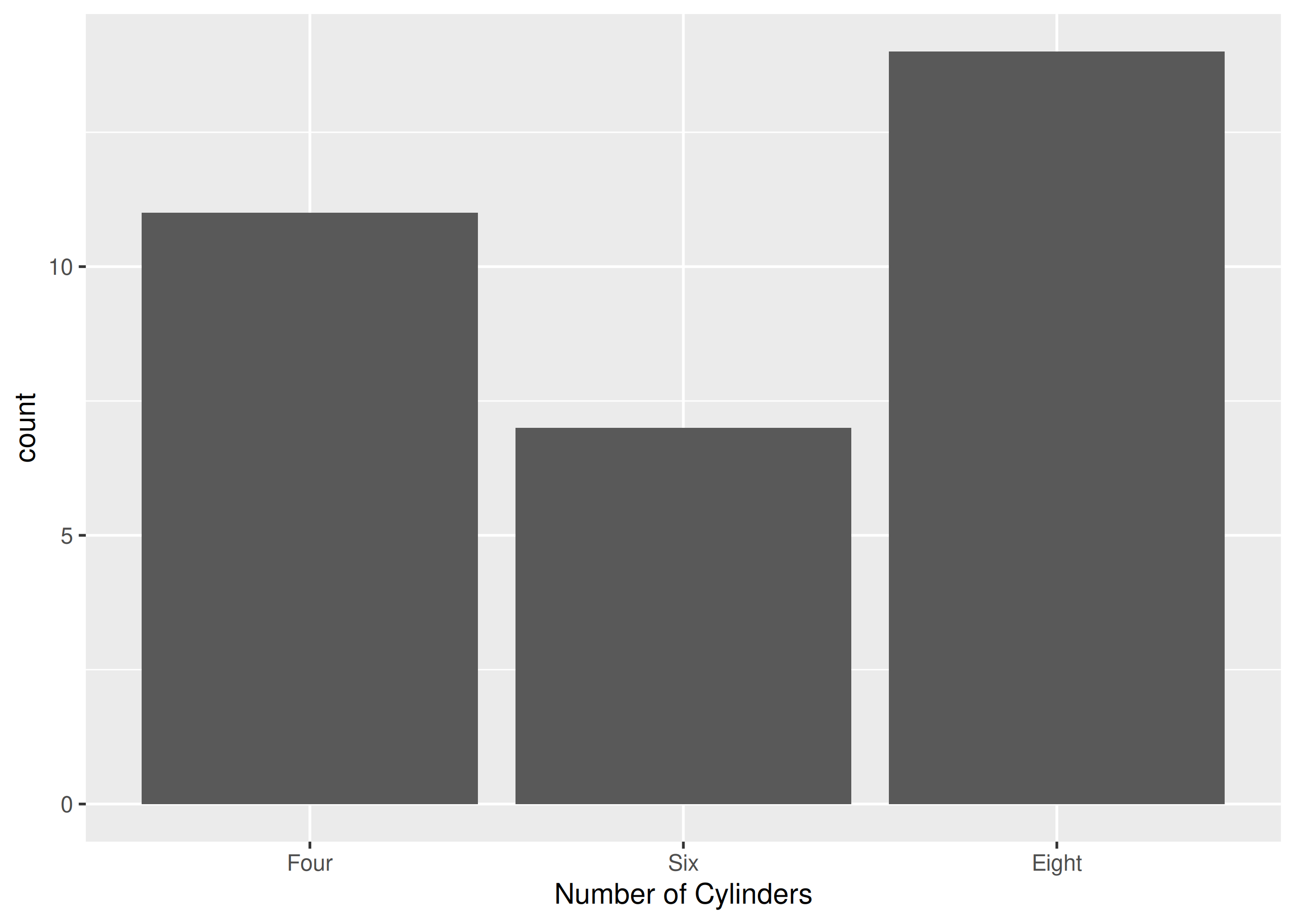
scale_x_continuous().mpg > 20 with coord_cartesian() without dropping data.coord_cartesian() beats limits for zooming.Worked solutions in solutions/axis.md (attempt first).