ggplot(mtcars) +
  geom_point(aes(disp, mpg))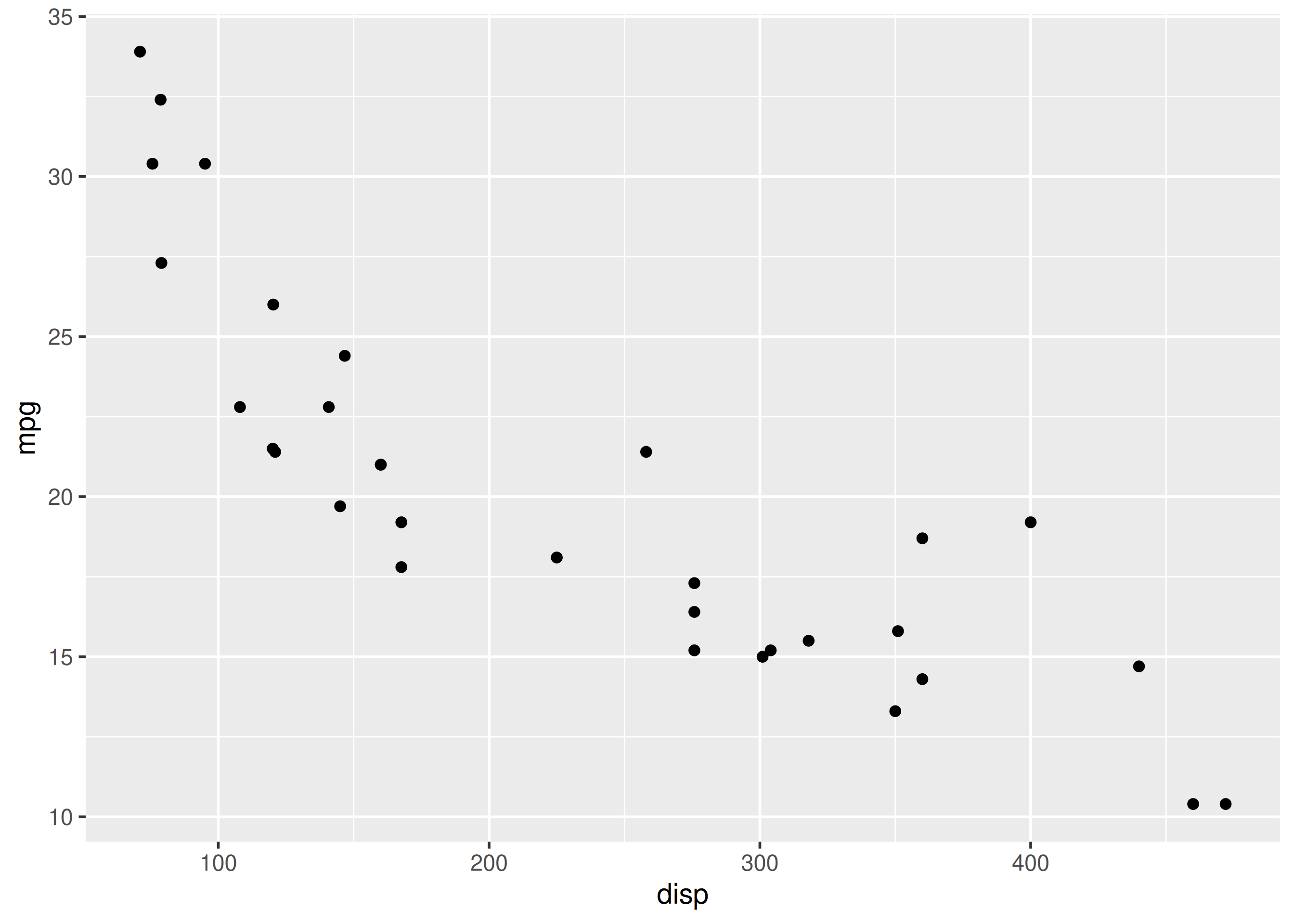
Axis labels and titles turn a plot into a message; they are the cheapest readability win.
Tiny or default labels (e.g. snake_case column names) force readers to guess the message.
In this chapter, we will learn to:
Let us start with a simple scatter plot. We will continue to use the mtcars data set and examine the relationship between displacement and miles per gallon using geom_point().
ggplot(mtcars) +
geom_point(aes(disp, mpg))
There are two ways to add title to a plot:
ggtitle()labs()Let us explore the ggtitle() function first. It takes two arguments:
ggplot(mtcars) +
  geom_point(aes(disp, mpg)) +
  ggtitle(label = 'Displacement vs Mileage', subtitle = 'disp vs mpg')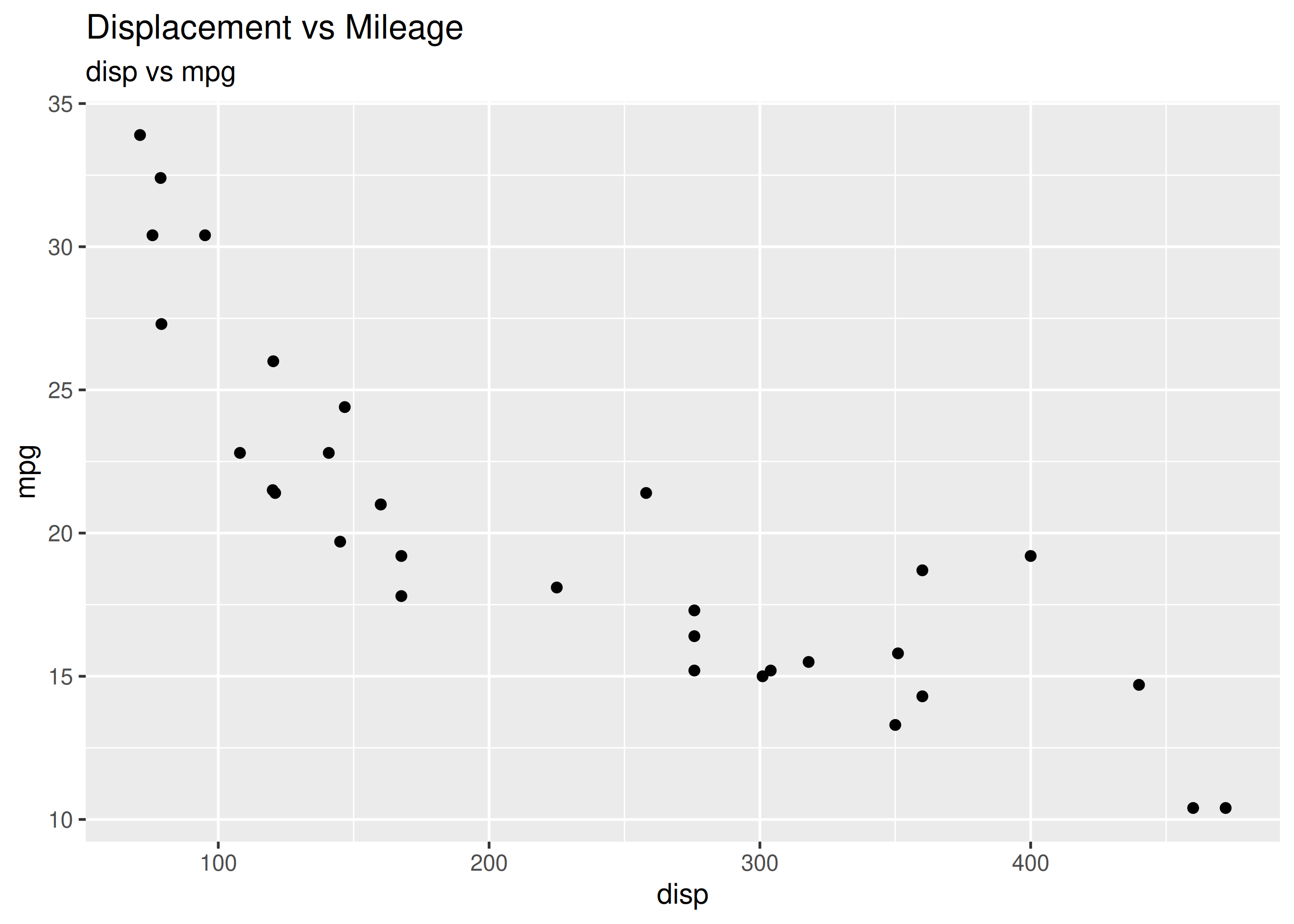
You can add labels to the axis using:
xlab()ylab()labs()ggplot(mtcars) +
geom_point(aes(disp, mpg)) +
xlab('Displacement') + ylab('Miles Per Gallon')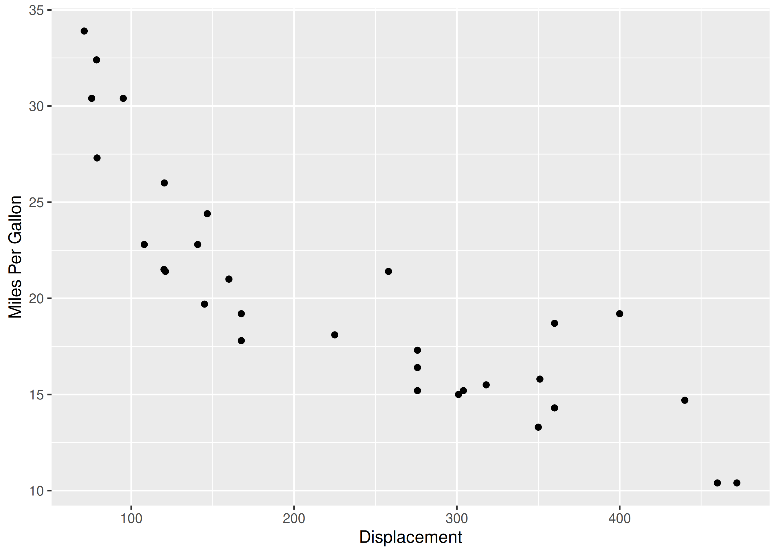
The labs() function can be used to add the following to a plot:
ggplot(mtcars) +
  geom_point(aes(disp, mpg)) +
  labs(title = 'Displacement vs Mileage', subtitle = 'disp vs mpg',
    x = 'Displacement', y = 'Miles Per Gallon')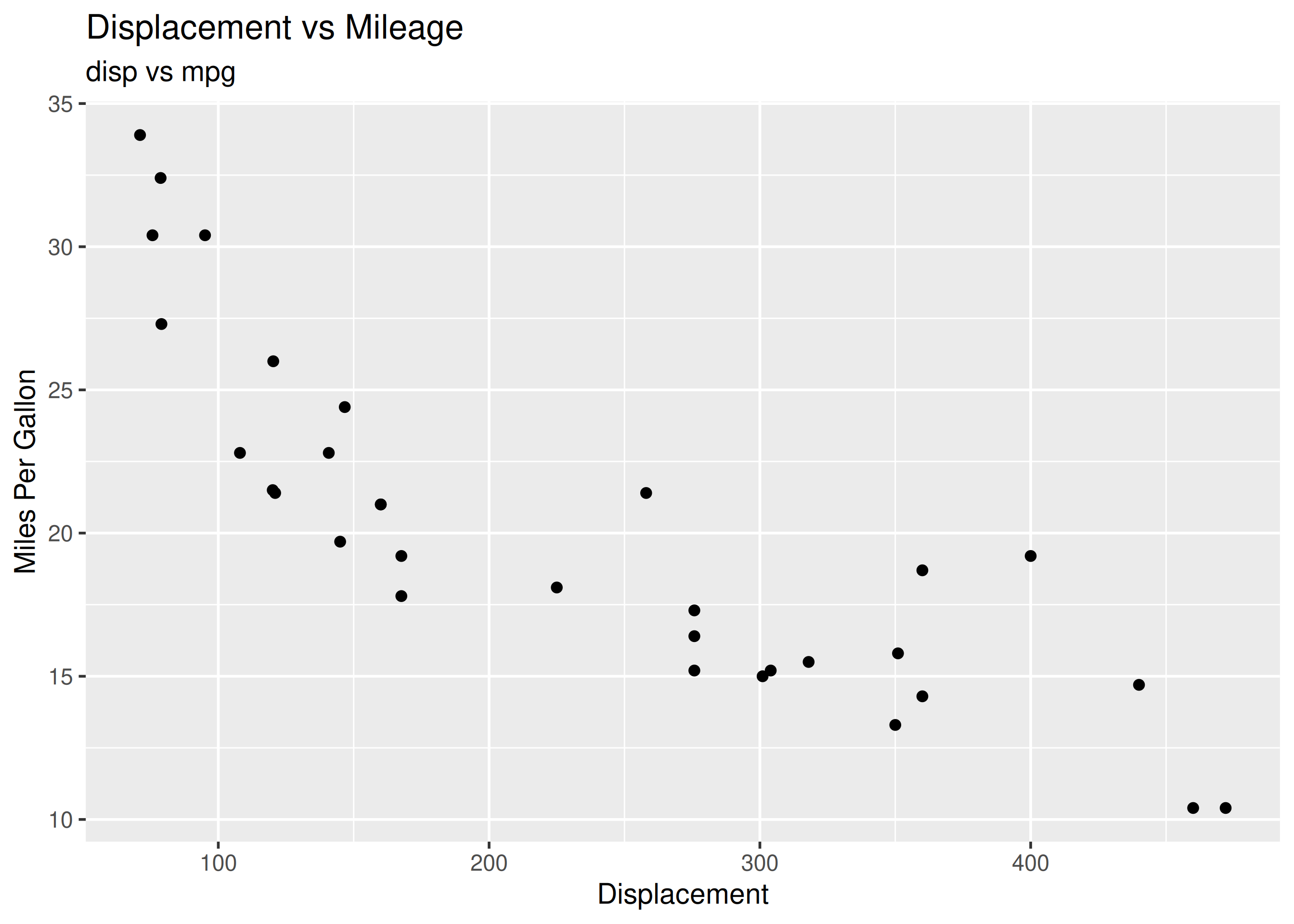
In certain scenarios, you may want to modify the range of the axis. In ggplot2, we can achieve this using:
xlim()
ylim()
expand_limits()
xlim() and ylim() take a numeric vector of length 2 as input
expand_limits() takes two numeric vectors (each of length 2), one for each axis
in all of the above functions, the first element represents the lower limit and the second element represents the upper limit
In the below example, we limit the range of the X axis between 0 and 600 using xlim.
ggplot(mtcars) +
  geom_point(aes(disp, mpg)) +
  xlim(c(0, 600))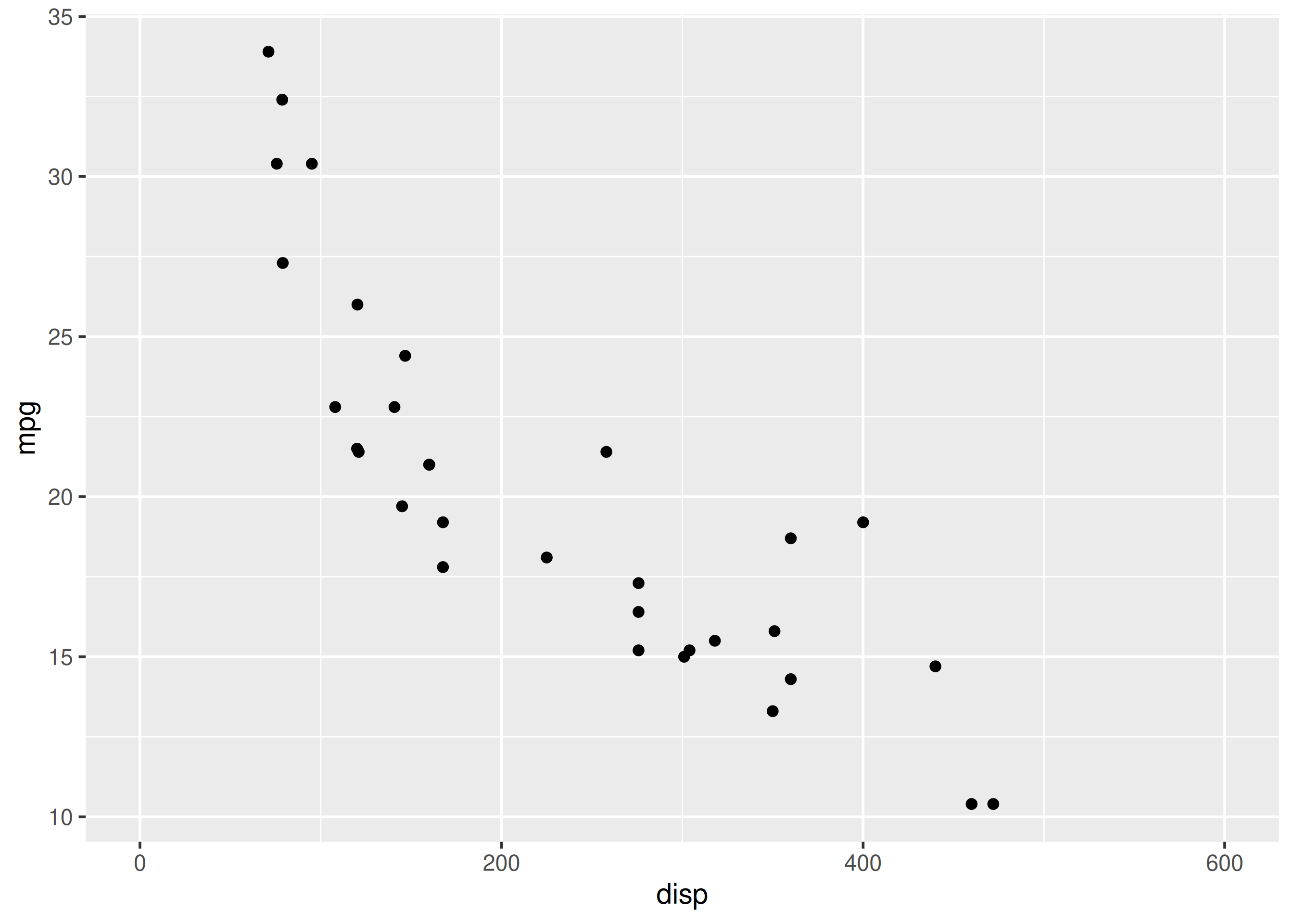
Let us limit the range of the Y axis between 0 and 40.
ggplot(mtcars) +
  geom_point(aes(disp, mpg)) +
  ylim(c(0, 40))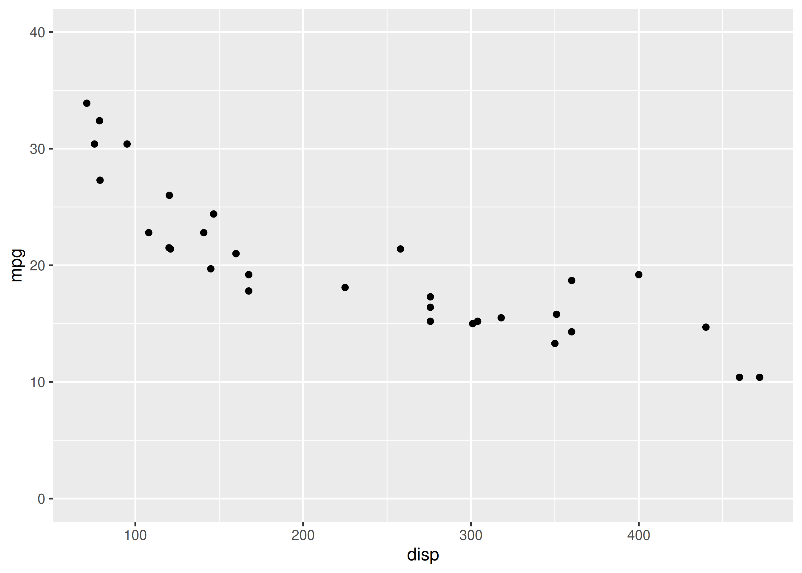
Let us use expand_limits() to limit the range of both the X and Y axis. The first input is the range for the X axis and the second input for the Y axis. In both the cases, we use a numeric vector of length 2 to specify the lower and upper limit.
ggplot(mtcars) +
  geom_point(aes(disp, mpg)) +
  expand_limits(x = c(0, 600), y = c(0, 40))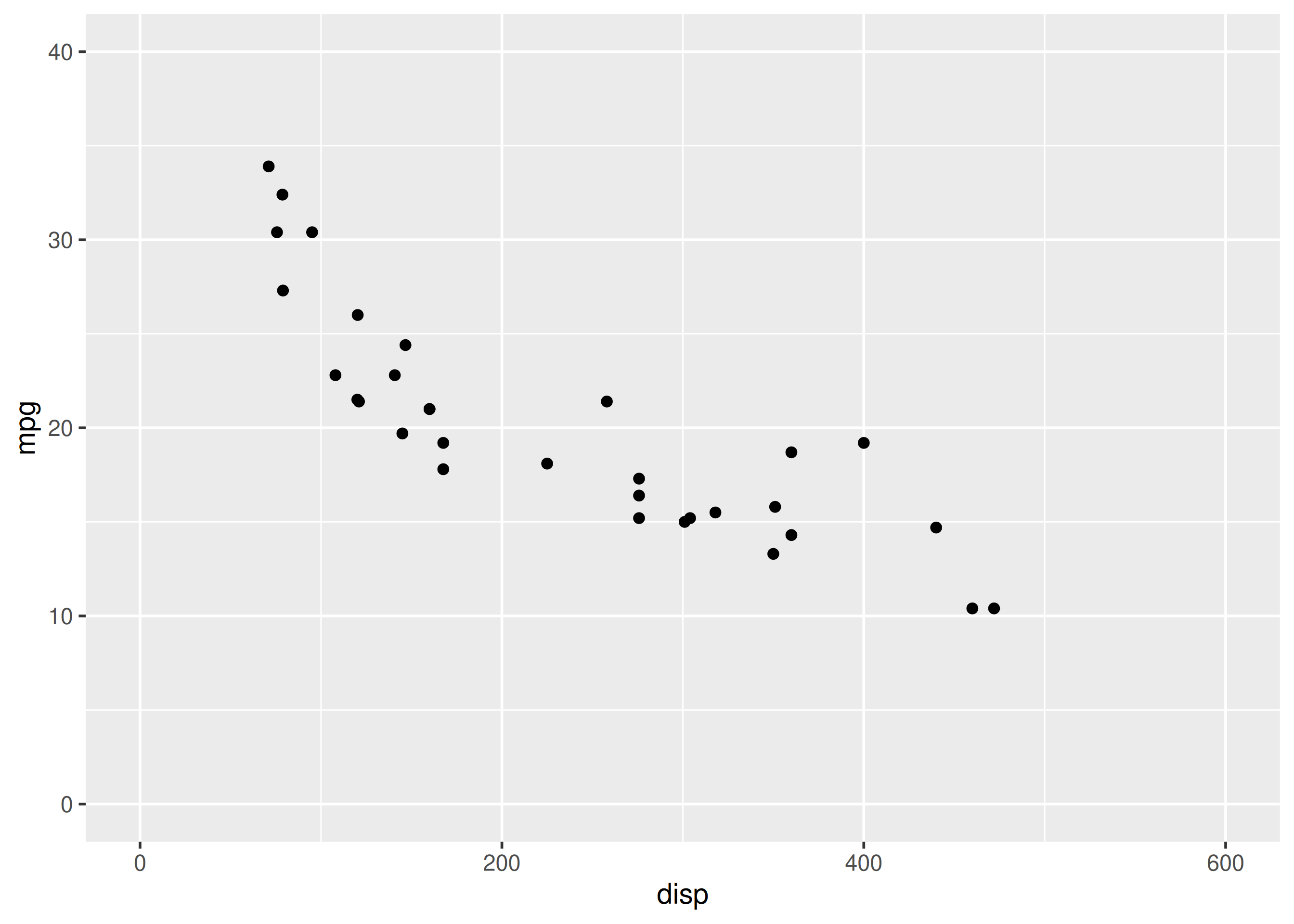
If you want to remove the axis labels all together, use the theme() function. It allows us to modify every aspect of the theme of the plot. Within theme(), set the following to element_blank().
axis.title.xaxis.title.yelement_blank() will remove the title of the X and Y axis.
ggplot(mtcars) +
  geom_point(aes(disp, mpg)) +
  theme(axis.title.x = element_blank(), axis.title.y = element_blank())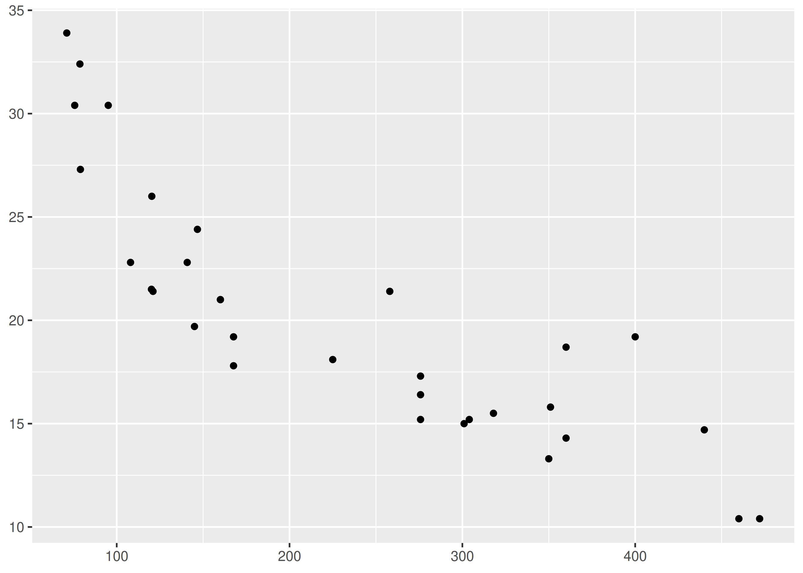
To format the title or the axis labels, we have to modify the theme of the plot using the theme() function. We can modify:
In addition to theme(), we will also use element_text(). It should be used whenever you want to modify the appearance of any text element of your plot.
In the below example, we use the color argument within element_text() to modify the color of the title of the plot to 'blue'.
ggplot(mtcars) +
  geom_point(aes(disp, mpg)) + ggtitle('Diaplacement vs Mileage') +
  theme(plot.title = element_text(color = 'blue'))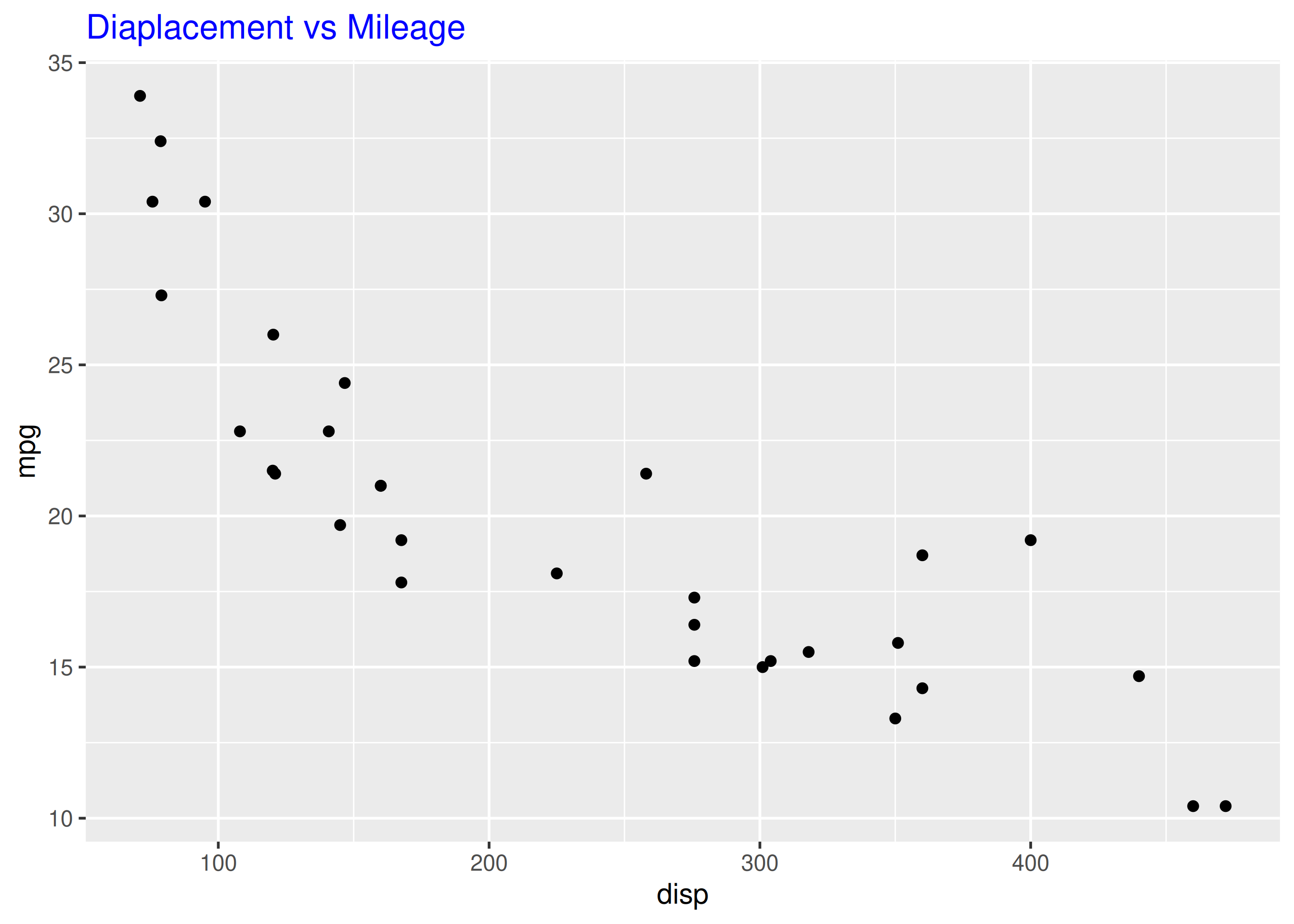
Let us change the font family of the plot title to 'Arial' by using the family argument.
ggplot(mtcars) +
  geom_point(aes(disp, mpg)) + ggtitle('Diaplacement vs Mileage') +
  theme(plot.title = element_text(family = 'Arial'))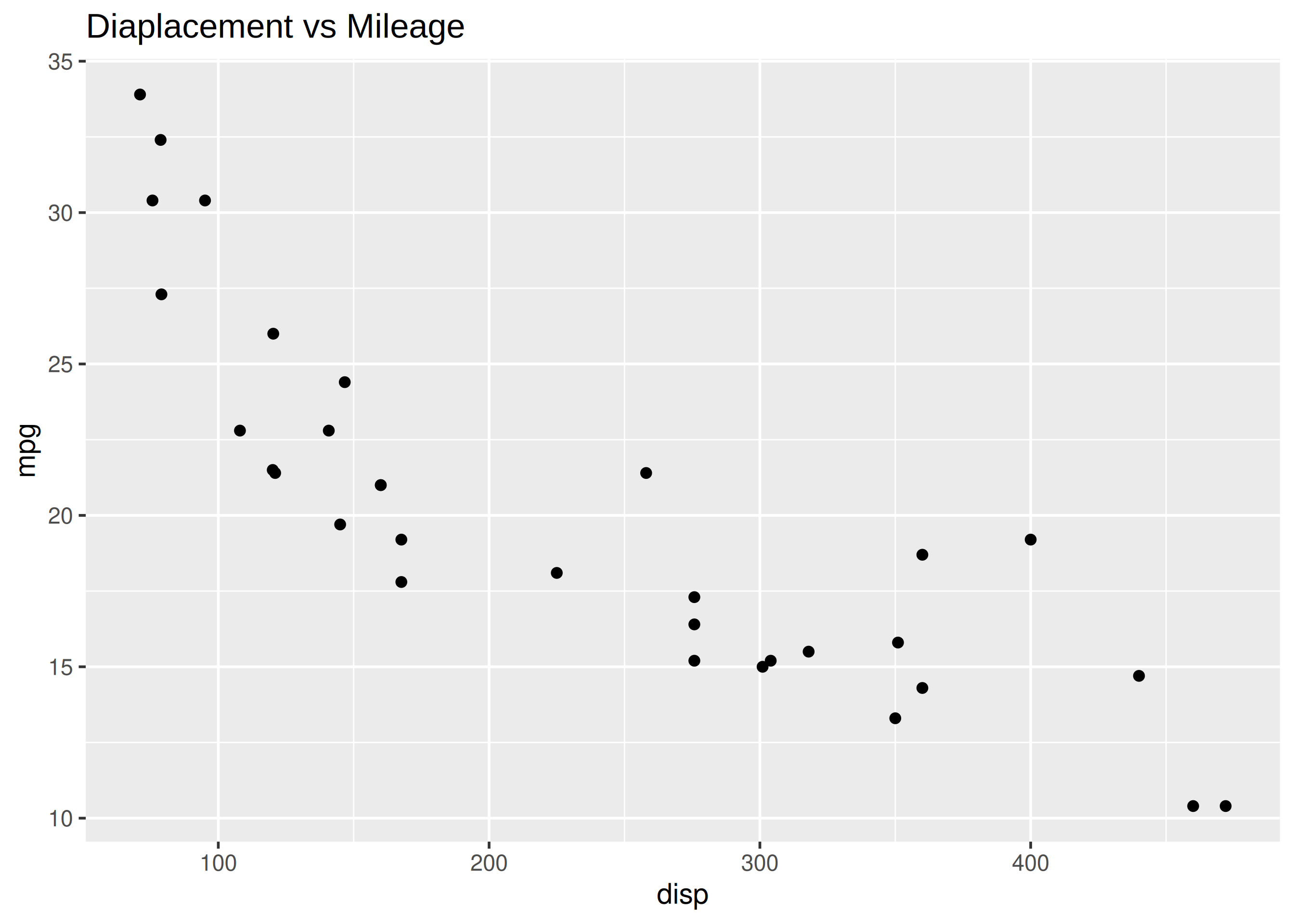
The font face can be any of the following:
plainbolditalicbold.italicThe face argument can be used to modify the font face of the title of the plot.
ggplot(mtcars) +
  geom_point(aes(disp, mpg)) + ggtitle('Diaplacement vs Mileage') +
  theme(plot.title = element_text(face = 'bold'))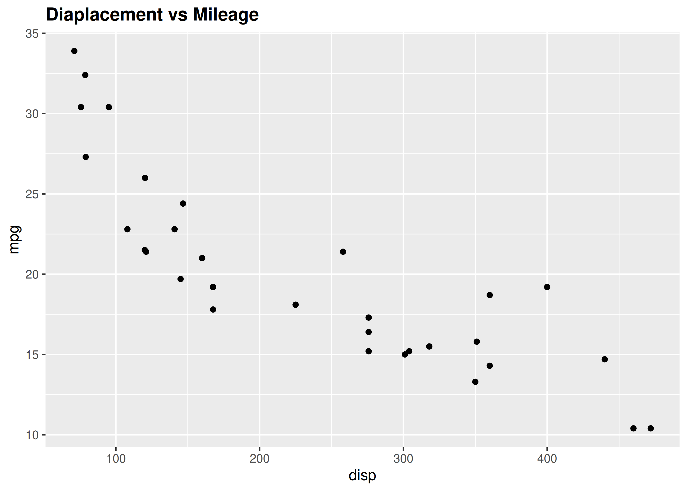
The size of the title of the plot can be modified using the size argument.
ggplot(mtcars) +
  geom_point(aes(disp, mpg)) + ggtitle('Diaplacement vs Mileage') +
  theme(plot.title = element_text(size = 8))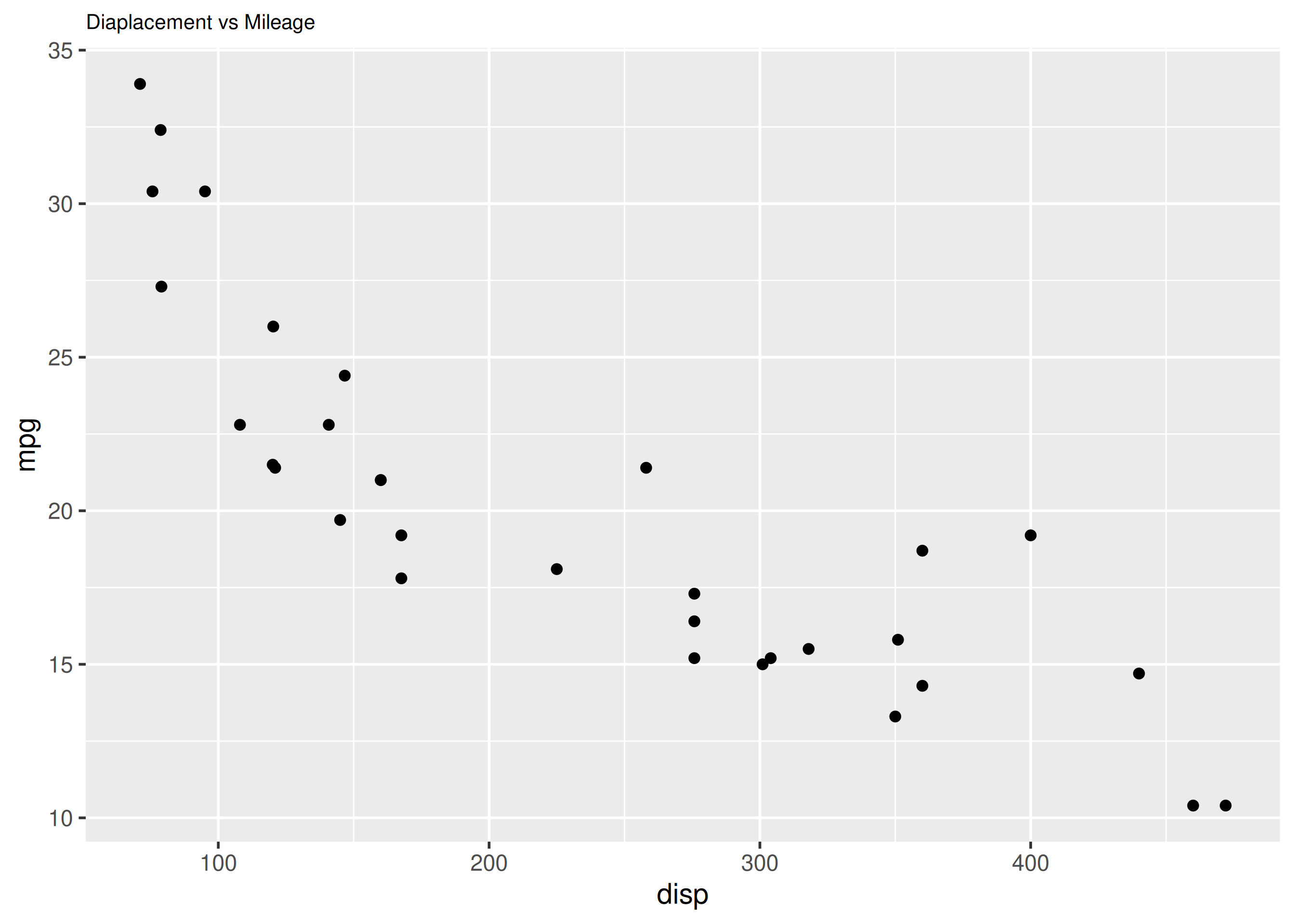
To modify the horizontal alignment of the title, use the hjust argument. It can take values between 0 and 1. If the value is closer to 0, the text will be left-aligned and viceversa.
ggplot(mtcars) +
  geom_point(aes(disp, mpg)) + ggtitle('Diaplacement vs Mileage') +
  theme(plot.title = element_text(hjust = 0.3))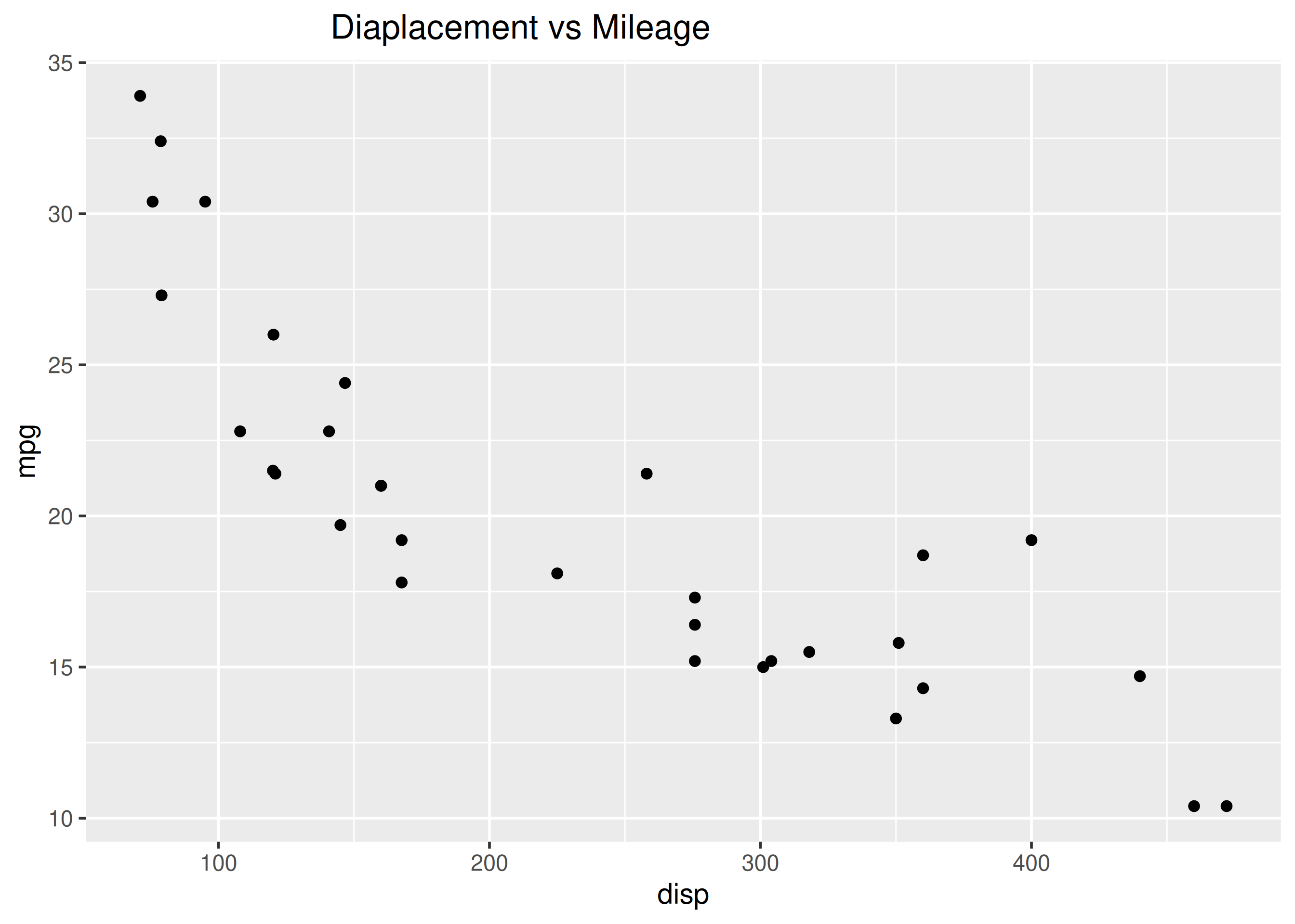
ggplot(mtcars) +
  geom_point(aes(disp, mpg)) + ggtitle('Diaplacement vs Mileage') +
  theme(plot.title = element_text(color = 'blue', family = 'Arial',
    face = 'bold', size = 12, hjust = 0.5))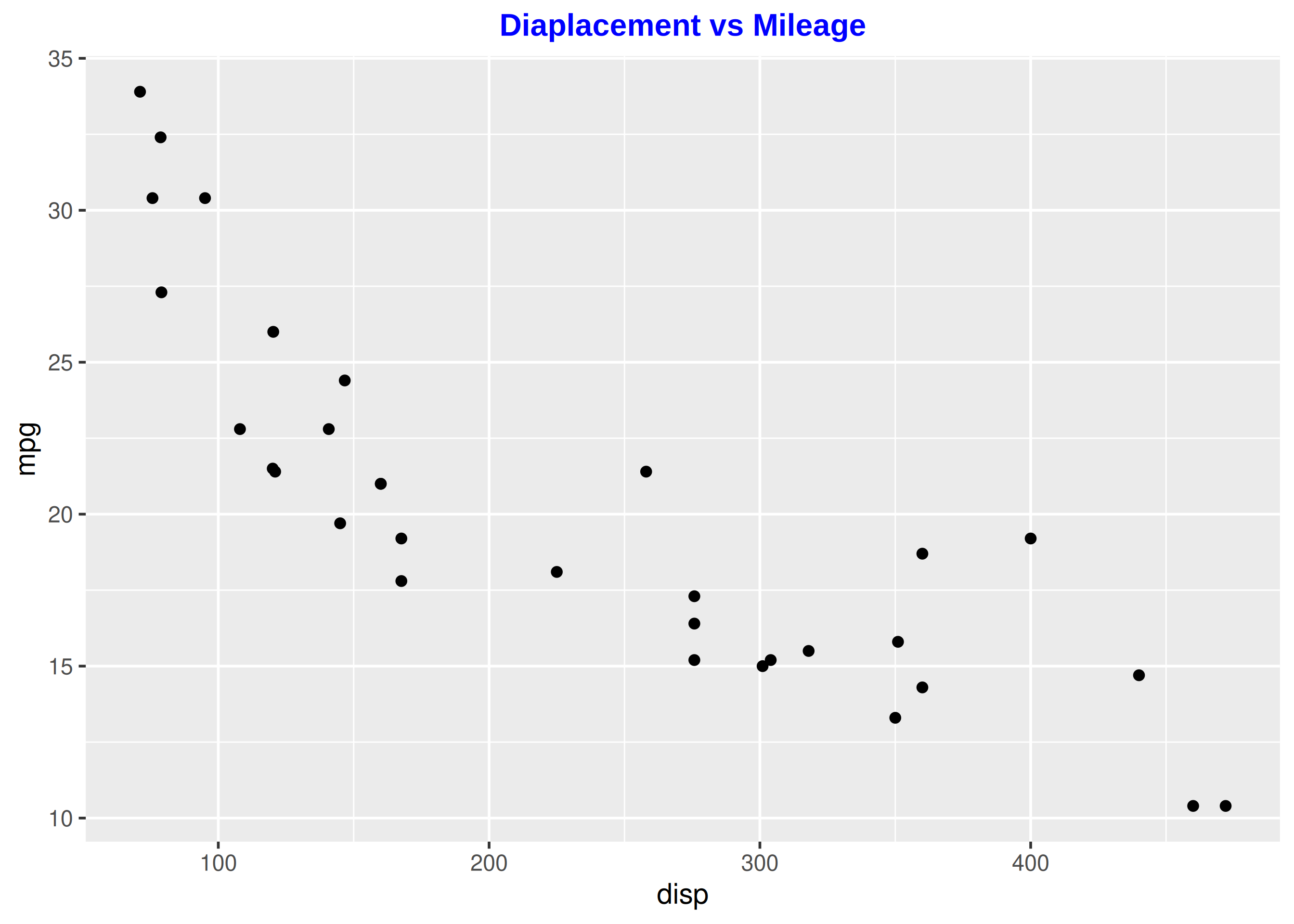
ggplot(mtcars) +
  geom_point(aes(disp, mpg)) + xlab('Diaplacement') +
  theme(axis.title.x = element_text(color = 'blue', family = 'Arial',
    face = 'bold', size = 8, hjust = 0.5, angle = 15))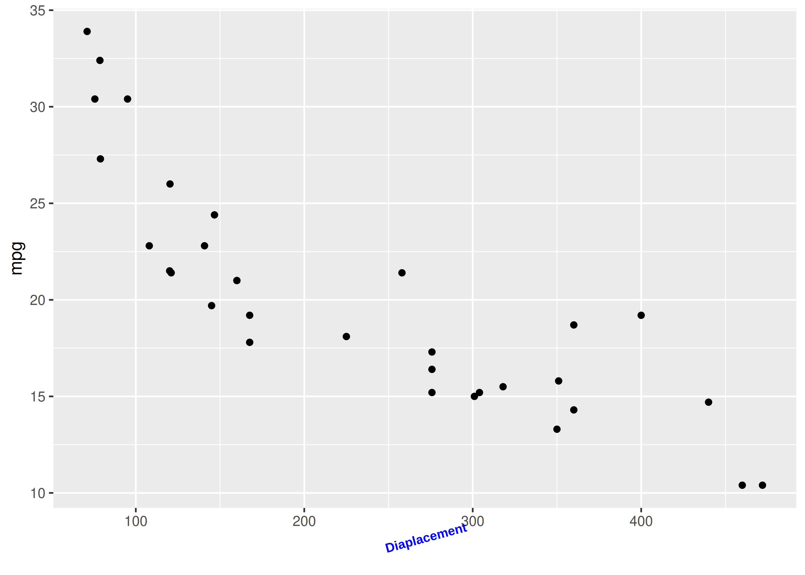
ggplot(mtcars) +
  geom_point(aes(disp, mpg)) + ylab('Miles Per Gallon') +
  theme(axis.title.y = element_text(color = 'blue', family = 'Arial',
    face = 'italic', size = 8, vjust = 0.3, angle = 90))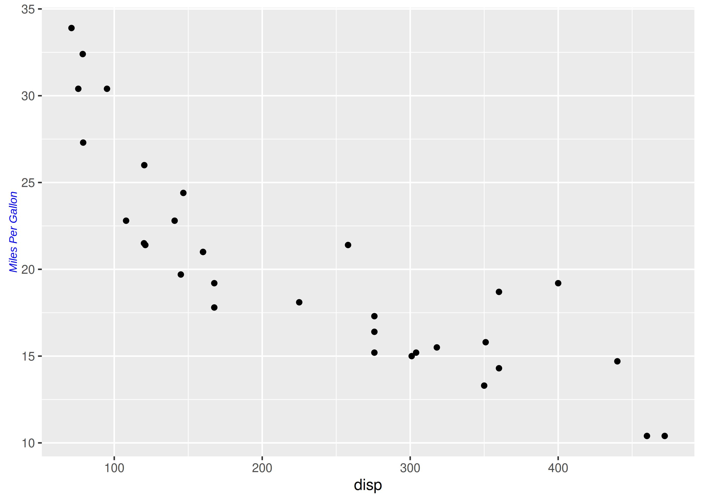
x, y and title labels to a disp vs mpg scatter plot.name argument of a scale function.Worked solutions in solutions/labels.md (attempt first).