ggplot(mtcars) +
  geom_point(aes(disp, mpg, color = factor(cyl)))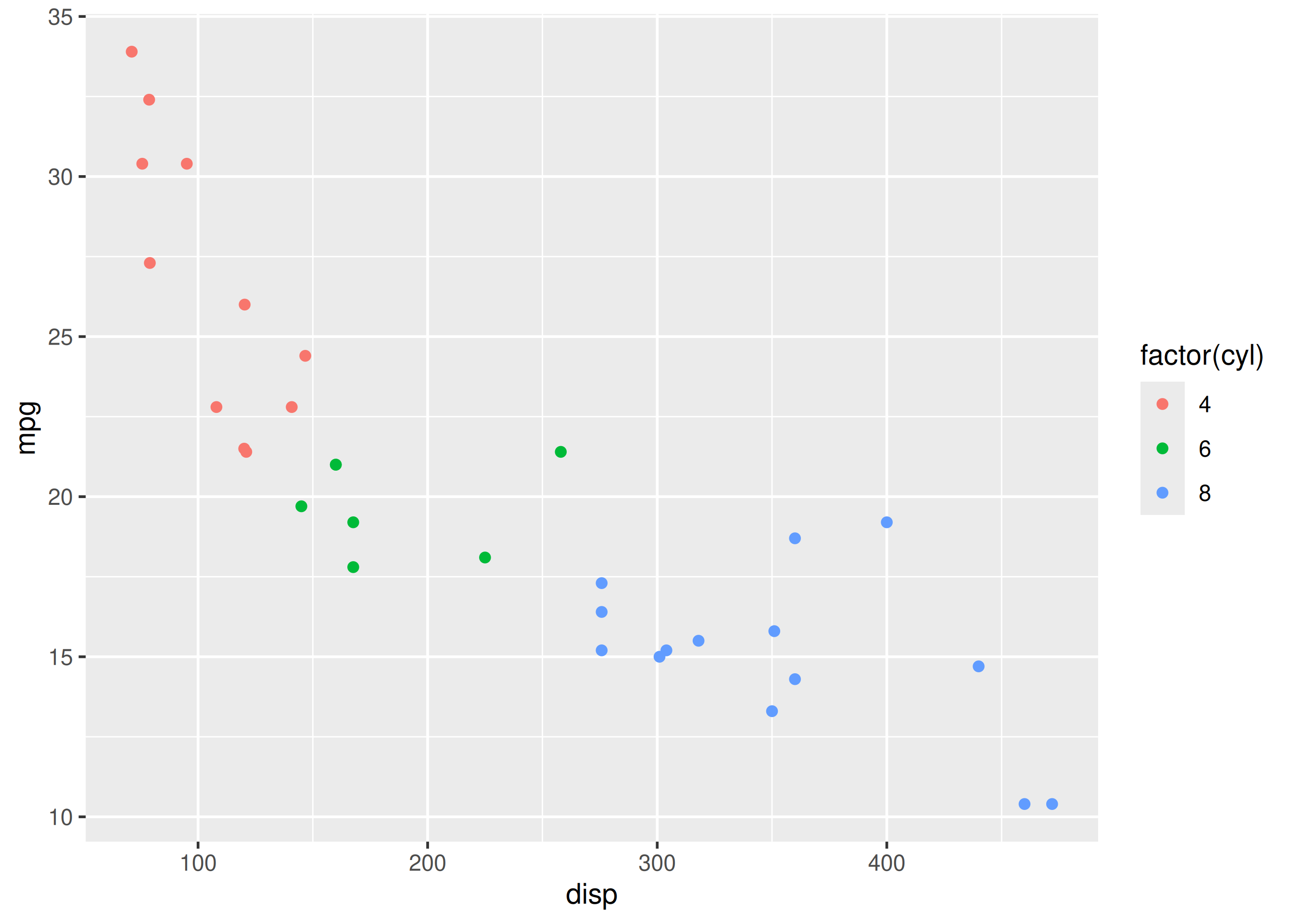
In this chapter, we modify legend title, breaks, limits, labels and values when color or fill is mapped to categorical variables.
Color and fill legends decode groups; keep titles plain words and show only needed breaks.
Using limits silently drops data. Filter with dplyr when you mean to subset.
We will learn to modify the following when color is mapped to categorical variables:
Let us start with a scatter plot examining the relationship between displacement and miles per gallon from the mtcars data set. We will map the color of the points to the cyl variable.
ggplot(mtcars) +
geom_point(aes(disp, mpg, color = factor(cyl)))
As you can see, the legend acts as a guide for the color aesthetic. Now, let us learn to modify the different aspects of the legend.
To change the default colors in the legend, use the values argument and supply a character vector of color names. The number of colors specified must be equal to the number of levels in the categorical variable mapped. In the below example, cyl has 3 levels (4, 6, 8) and hence we have specified 3 colors.
ggplot(mtcars) +
  geom_point(aes(disp, mpg, color = factor(cyl))) +
  scale_color_manual(values = c("red", "blue", "green"))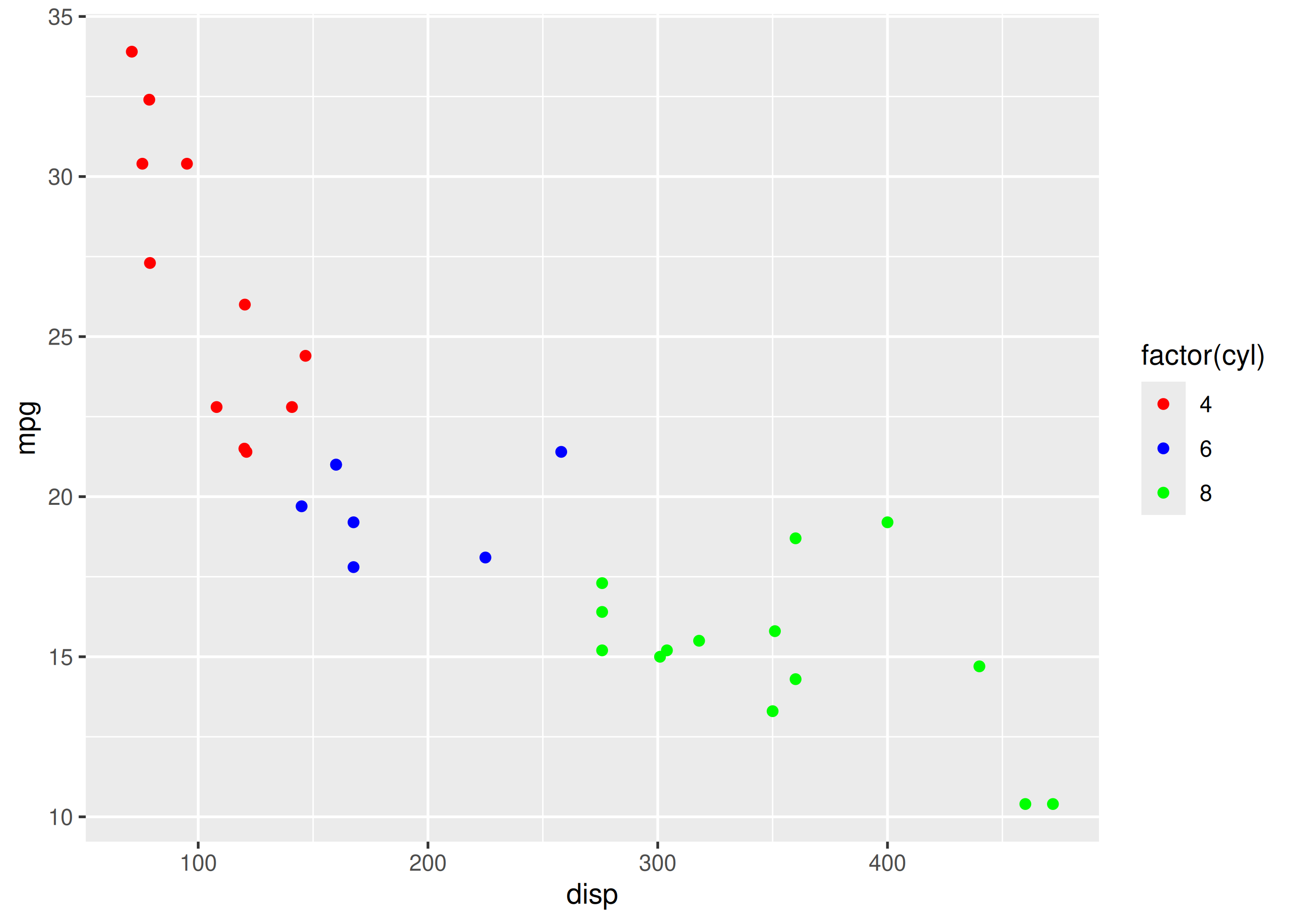
In the previous example, the title of the legend (factor(cyl)) is not very intuitive. If the user does not know the underlying data, they will not be able to make any sense out of it. Let us change it to Cylinders using the name argument.
ggplot(mtcars) +
  geom_point(aes(disp, mpg, color = factor(cyl))) +
  scale_color_manual(name = "Cylinders",
    values = c("red", "blue", "green"))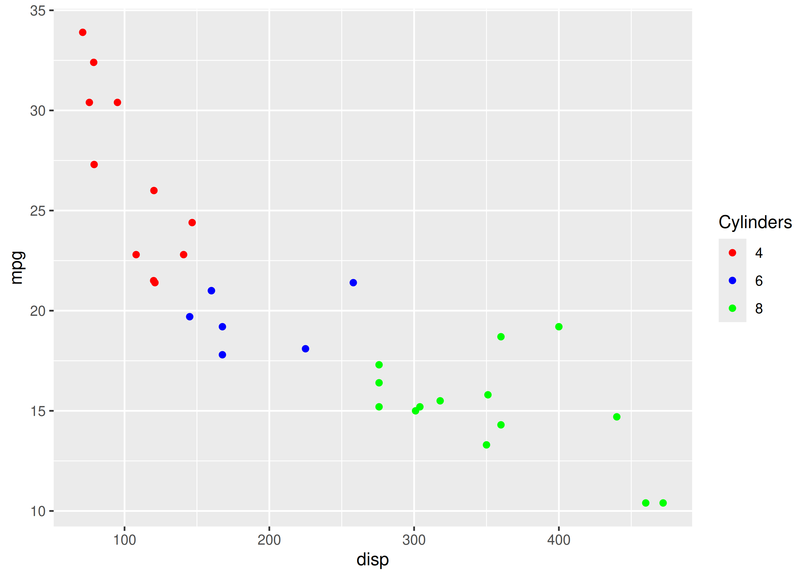
Now, the user will know that the different colors represent number of cylinders in the car.
Let us assume that we want to modify the data to be displayed i.e. instead of examining the relationship between mileage and displacement for all cars, we desire to look at only cars with at least 6 cylinders. One way to approach this would be to filter the data using filter from dplyr and then visualize it. Instead, we will use the limits argument and filter the data for visualization.
ggplot(mtcars) +
  geom_point(aes(disp, mpg, color = factor(cyl))) +
  scale_color_manual(values = c("red", "blue", "green"), limits = c(6, 8))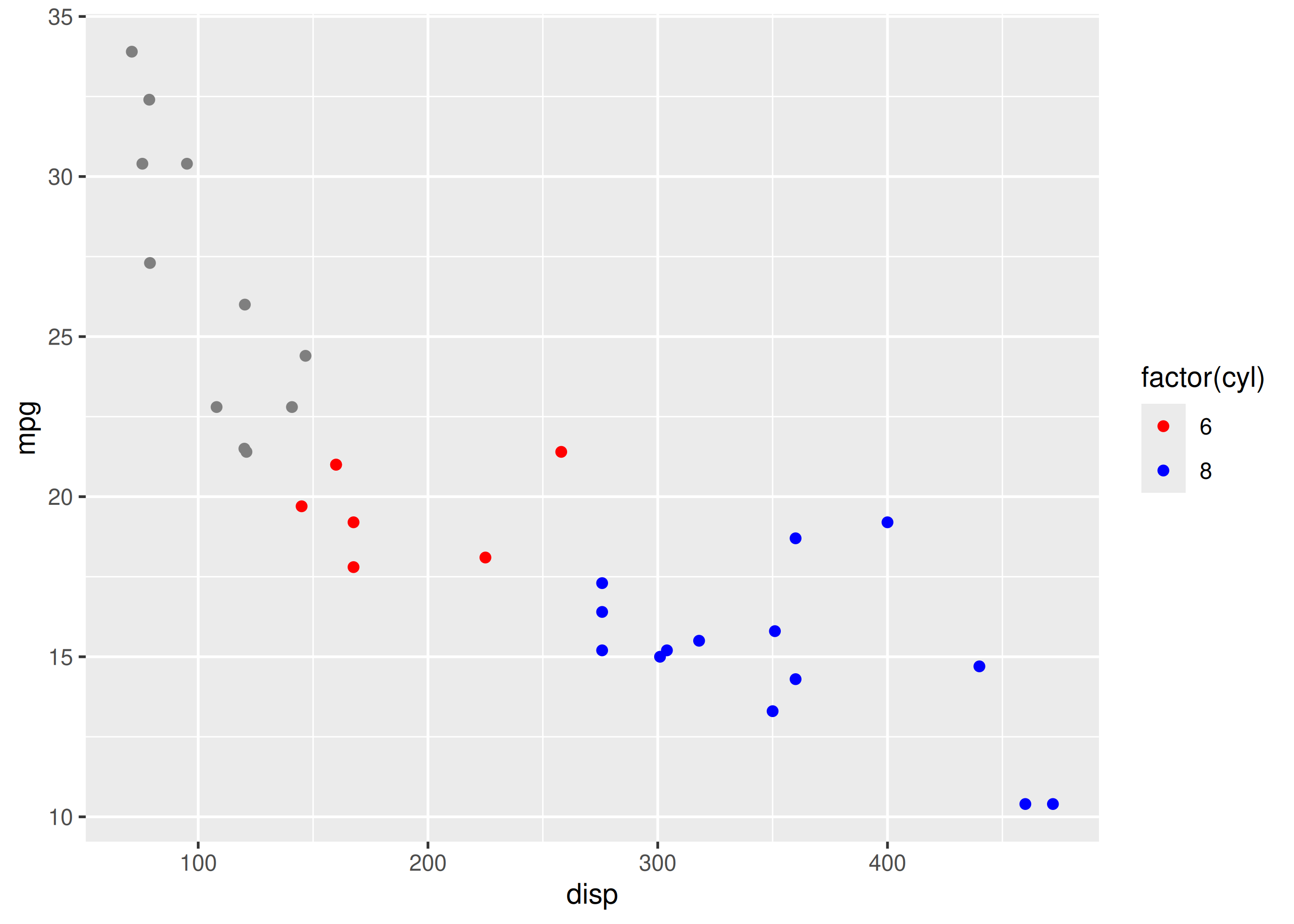
As you can see above, ggplot2 returns a warning message indicating data related to 4 cylinders has been dropped. If you observe the legend, it now represents only 6 and 8 cylinders.
The labels in the legend can be modified using the labels argument. Let us change the labels to Four, Six and Eight in the next example. Ensure that the labels are intuitive and easy to interpret for the end user of the plot.
ggplot(mtcars) +
  geom_point(aes(disp, mpg, color = factor(cyl))) +
  scale_color_manual(values = c("red", "blue", "green"),
    labels = c('Four', 'Six', 'Eight'))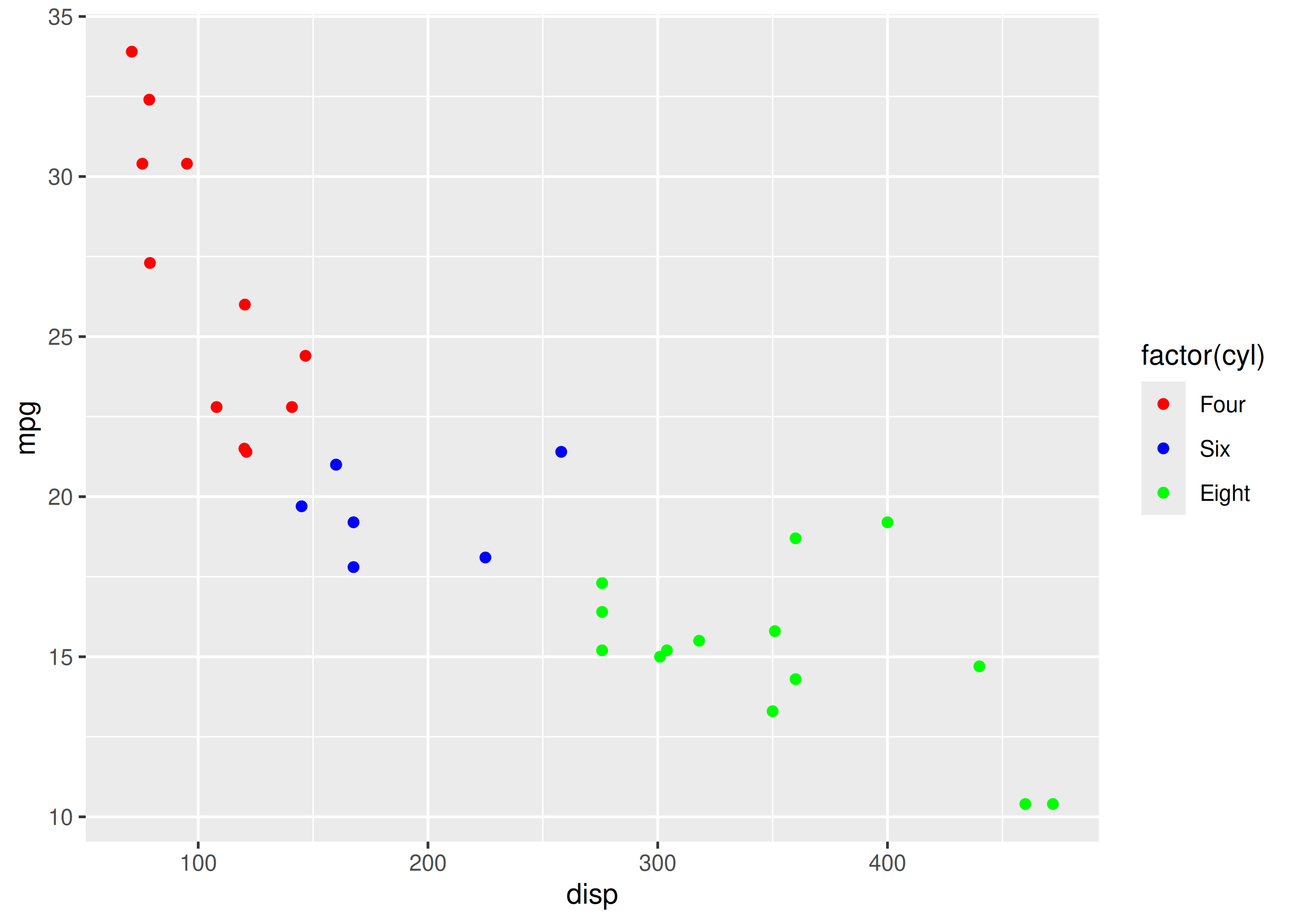
When there are large number of levels in the mapped variable, you may not want the labels in the legend to represent all of them. In such cases, we can use the breaks argument and specify the labels to be used. In the below case, we use the breaks argument to ensure that the labels in legend represent two levels (4, 8) of the mapped variable.
ggplot(mtcars) +
  geom_point(aes(disp, mpg, color = factor(cyl))) +
  scale_color_manual(values = c("red", "blue", "green"),
    breaks = c(4, 8))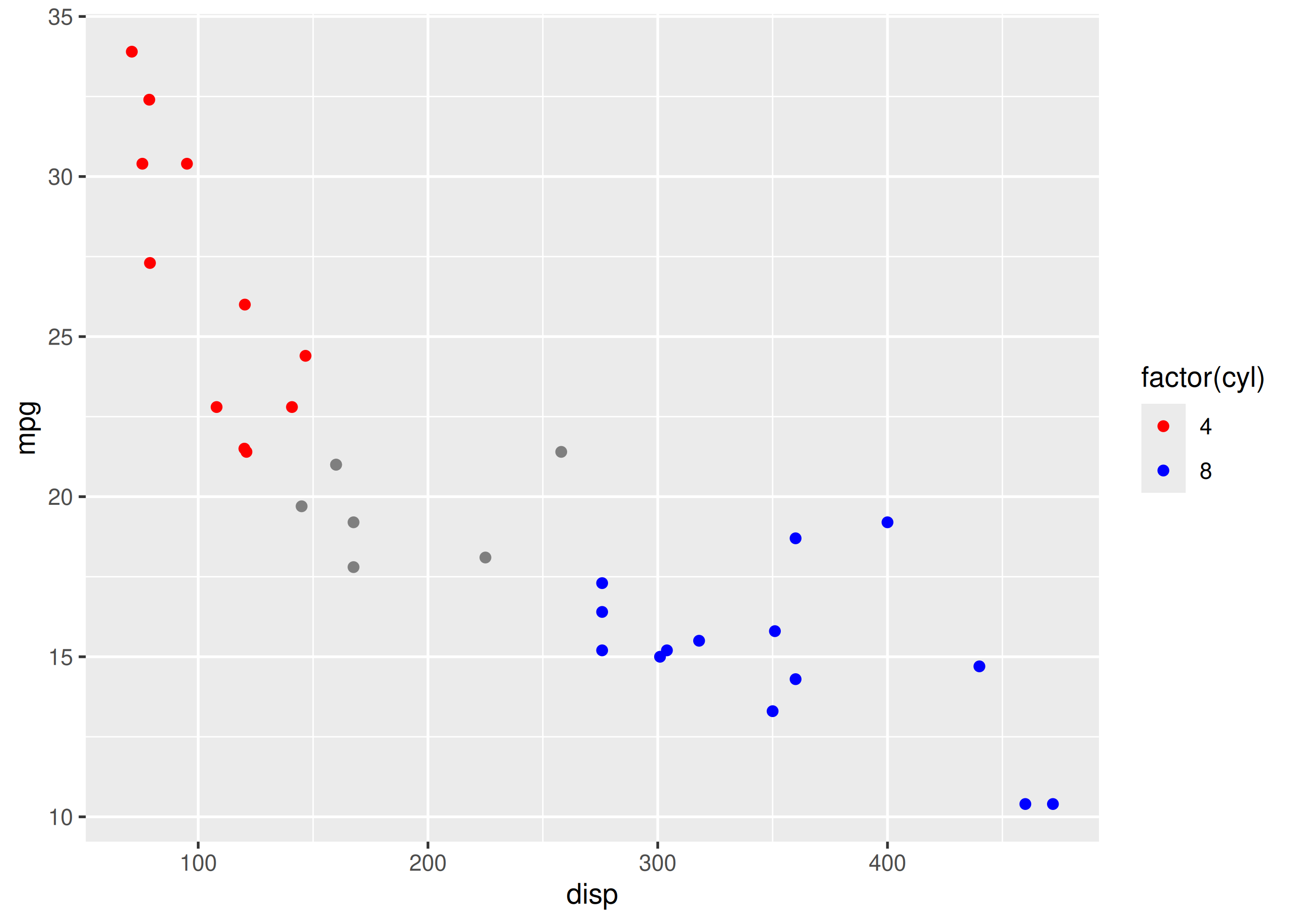
ggplot(mtcars) +
  geom_point(aes(disp, mpg, color = factor(cyl))) +
  scale_color_manual(name = "Cylinders", values = c("red", "blue", "green"),
    labels = c('Four', 'Six', 'Eight'), limits = c(4, 6, 8), breaks = c(4, 6, 8))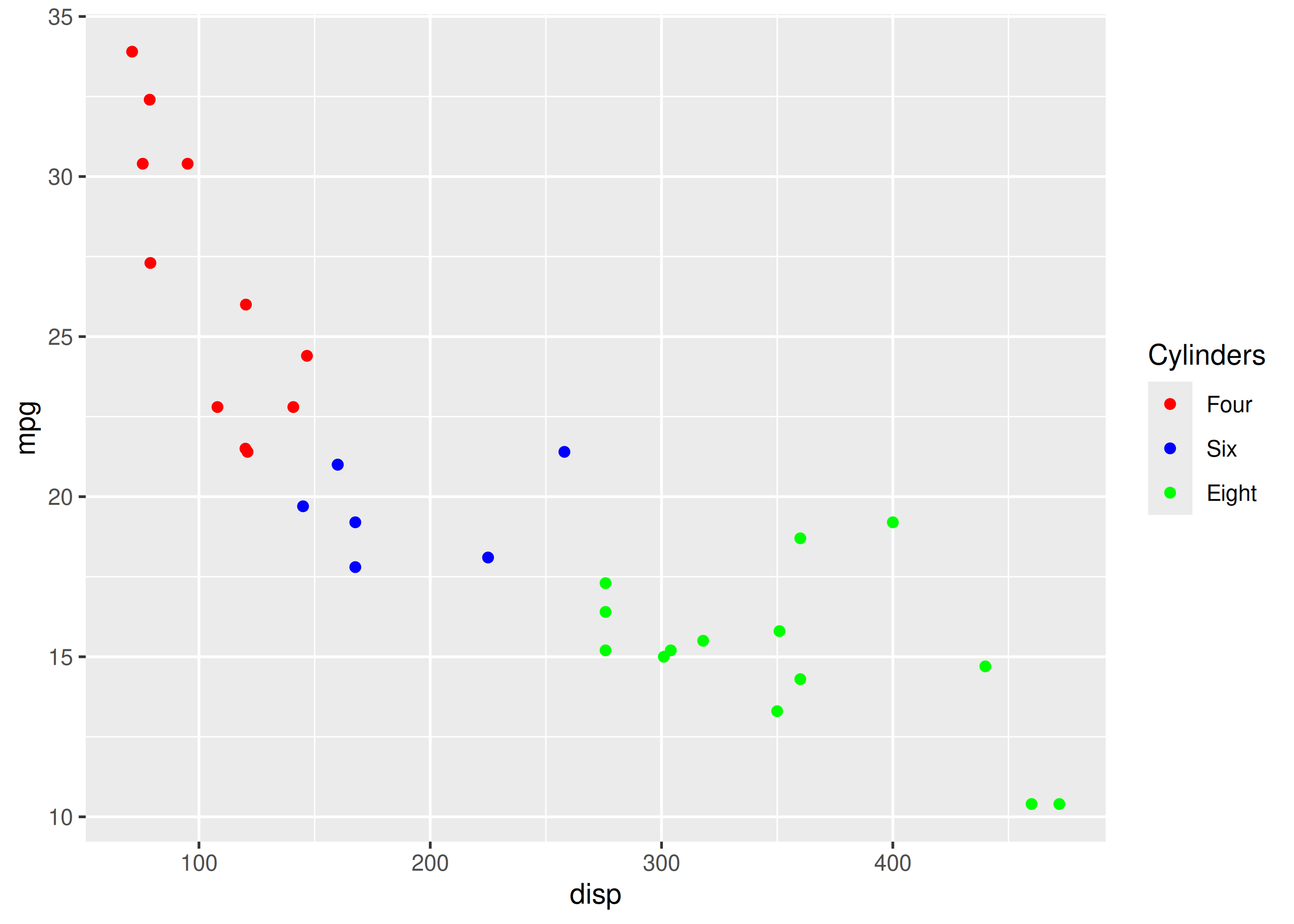
we will learn to modify the following using scale_fill_manual() when fill is mapped to categorical variables:
Let us start with a scatter plot examining the relationship between displacement and miles per gallon from the mtcars data set. We will map fill to the cyl variable.
ggplot(mtcars) +
  geom_point(aes(disp, mpg, fill = factor(cyl)), shape = 22)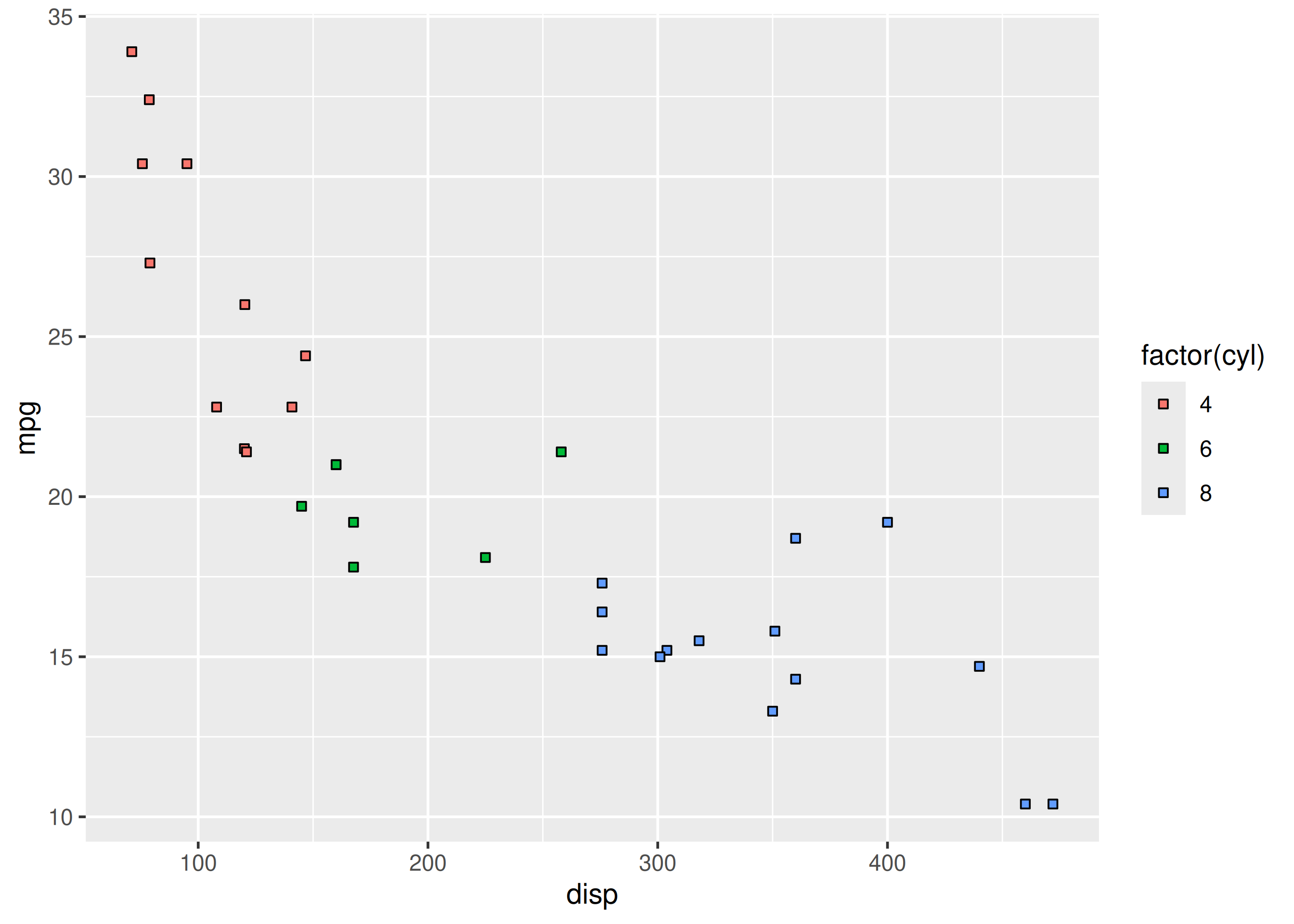
As you can see, the legend acts as a guide for the color aesthetic. Now, let us learn to modify the different aspects of the legend.
The title of the legend (factor(cyl)) is not very intuitive. If the user does not know the underlying data, they will not be able to make any sense out of it. Let us change it to Cylinders using the name argument.
ggplot(mtcars) +
  geom_point(aes(disp, mpg, fill = factor(cyl)), shape = 22) +
  scale_fill_manual(name = "Cylinders",
    values = c("red", "blue", "green"))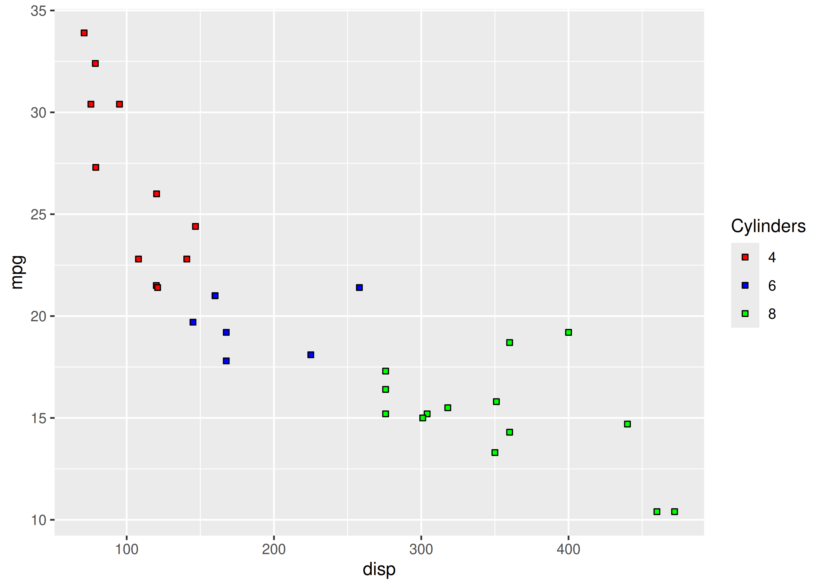
To change the default colors in the legend, use the values argument and supply a character vector of color names. The number of colors specified must be equal to the number of levels in the categorical variable mapped. In the below example, cyl has 3 levels (4, 6, 8) and hence we have specified 3 colors.
ggplot(mtcars) +
  geom_point(aes(disp, mpg, fill = factor(cyl)), shape = 22) +
  scale_fill_manual(values = c("red", "blue", "green"))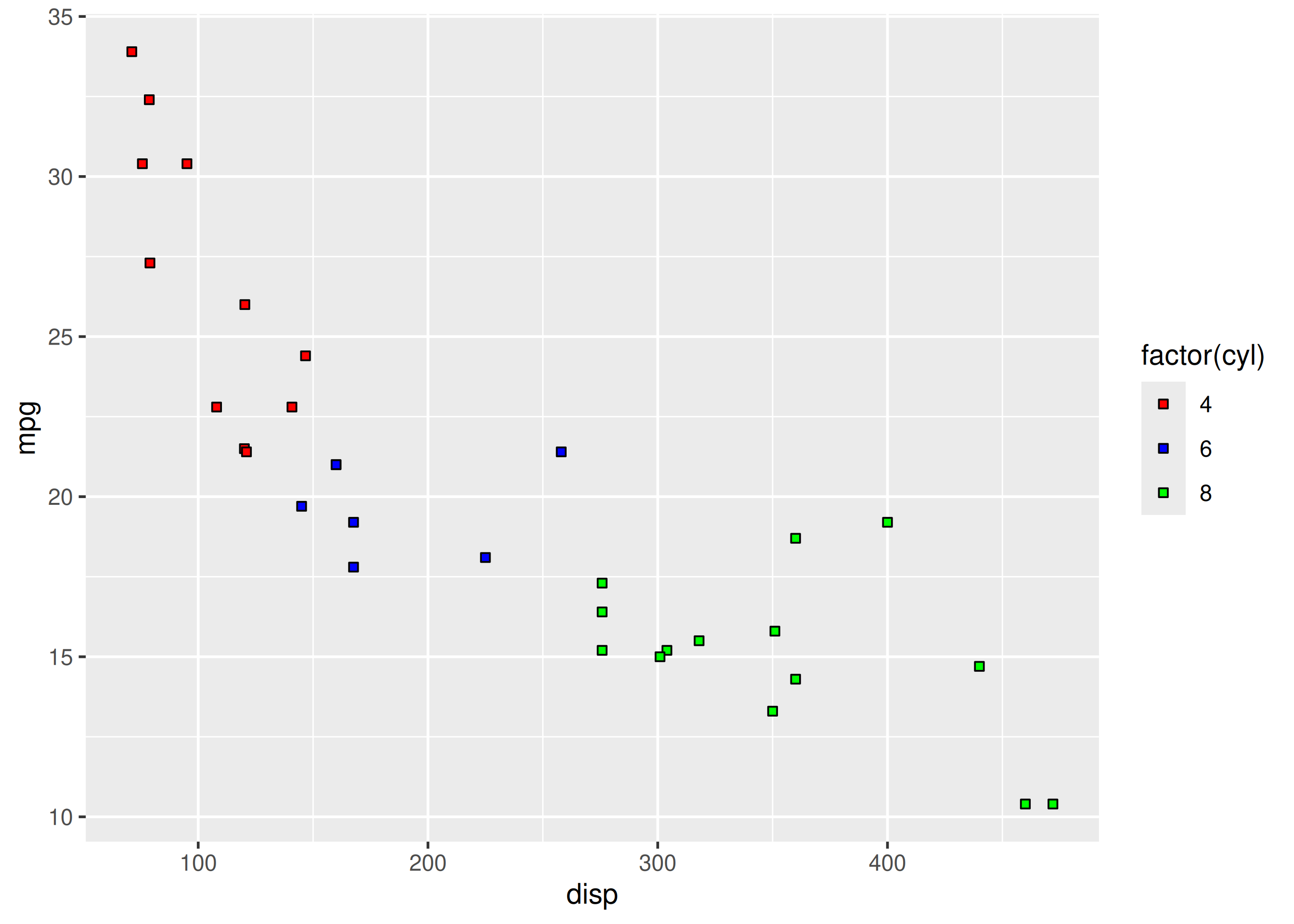
The labels in the legend can be modified using the labels argument. Let us change the labels to Four, Six and Eight in the next example. Ensure that the labels are intuitive and easy to interpret for the end user of the plot.
ggplot(mtcars) +
  geom_point(aes(disp, mpg, fill = factor(cyl)), shape = 22) +
  scale_fill_manual(values = c("red", "blue", "green"),
    labels = c('Four', 'Six', 'Eight'))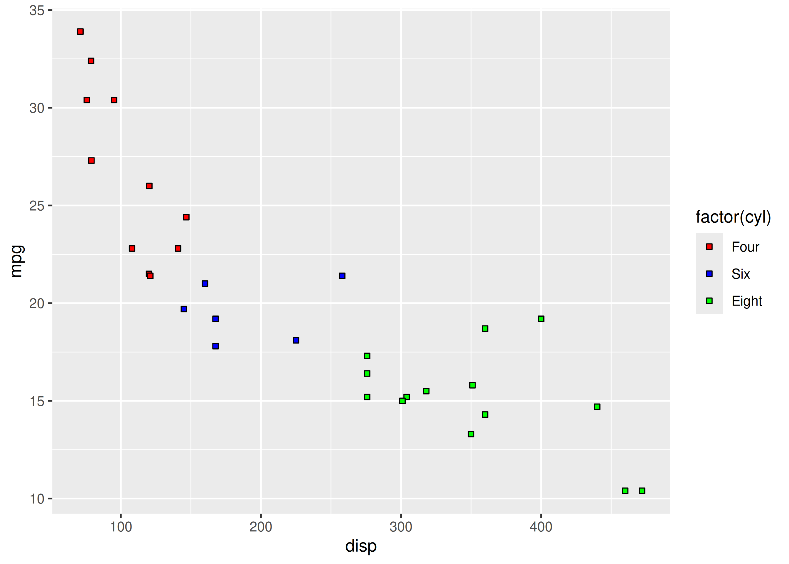
Let us assume that we want to modify the data to be displayed i.e. instead of examining the relationship between mileage and displacement for all cars, we desire to look at only cars with at least 6 cylinders. One way to approach this would be to filter the data using filter from dplyr and then visualize it. Instead, we will use the limits argument and filter the data for visualization.
ggplot(mtcars) +
  geom_point(aes(disp, mpg, fill = factor(cyl)), shape = 22) +
  scale_fill_manual(values = c("red", "blue", "green"),
    limits = c(6, 8))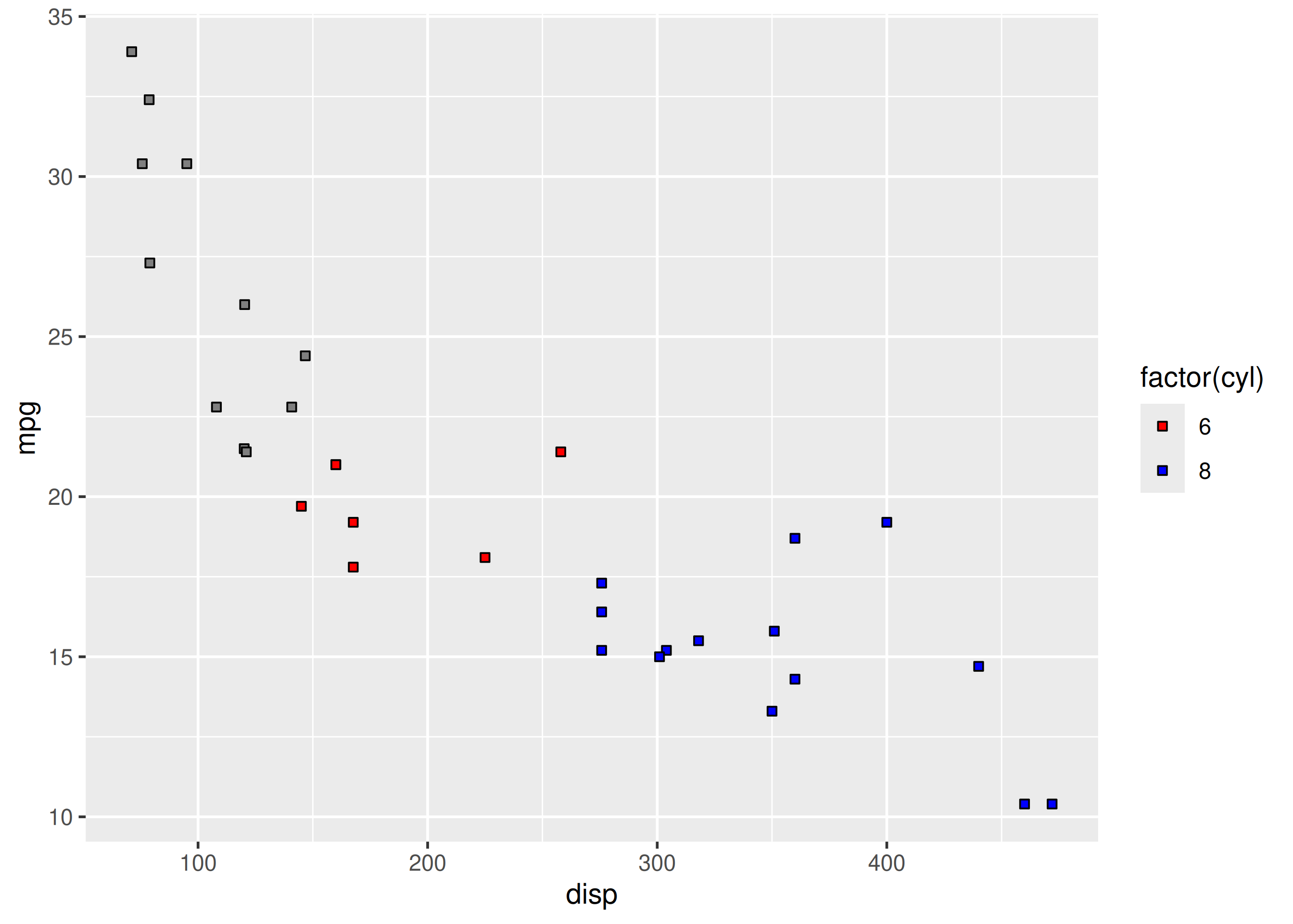
As you can see above, ggplot2 returns a warning message indicating data related to 4 cylinders has been dropped. If you observe the legend, it now represents only 6 and 8 cylinders.
When there are large number of levels in the mapped variable, you may not want the labels in the legend to represent all of them. In such cases, we can use the breaks argument and specify the labels to be used. In the below case, we use the breaks argument to ensure that the labels in legend represent two levels (4, 8) of the mapped variable.
ggplot(mtcars) +
  geom_point(aes(disp, mpg, fill = factor(cyl)), shape = 22) +
  scale_fill_manual(values = c("red", "blue", "green"),
    breaks = c(4, 8))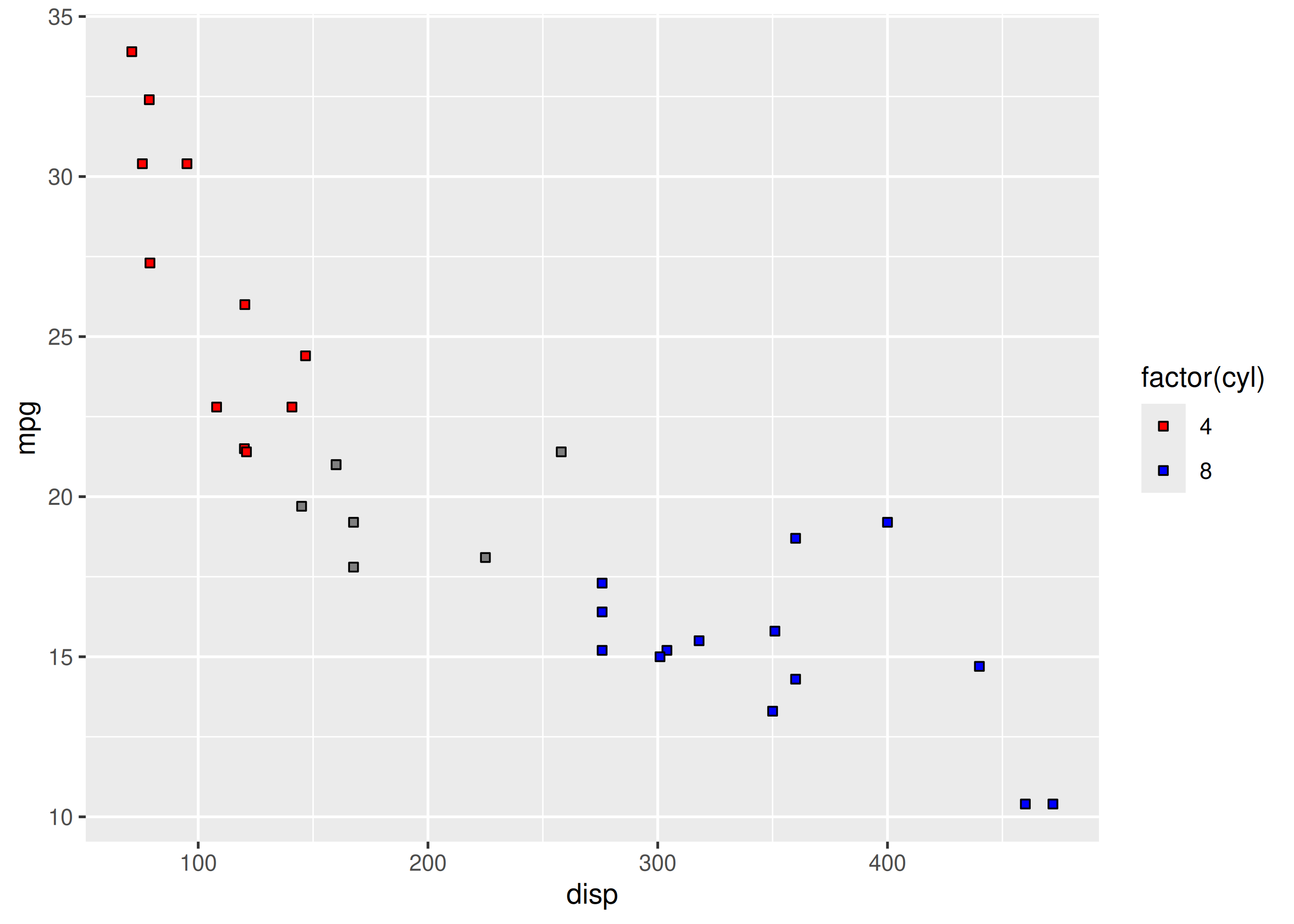
ggplot(mtcars) +
  geom_point(aes(disp, mpg, fill = factor(cyl)), shape = 22) +
  scale_fill_manual(name = "Cylinders", values = c("red", "blue", "green"),
    labels = c('Four', 'Six', 'Eight'), limits = c(4, 6, 8), breaks = c(4, 6, 8))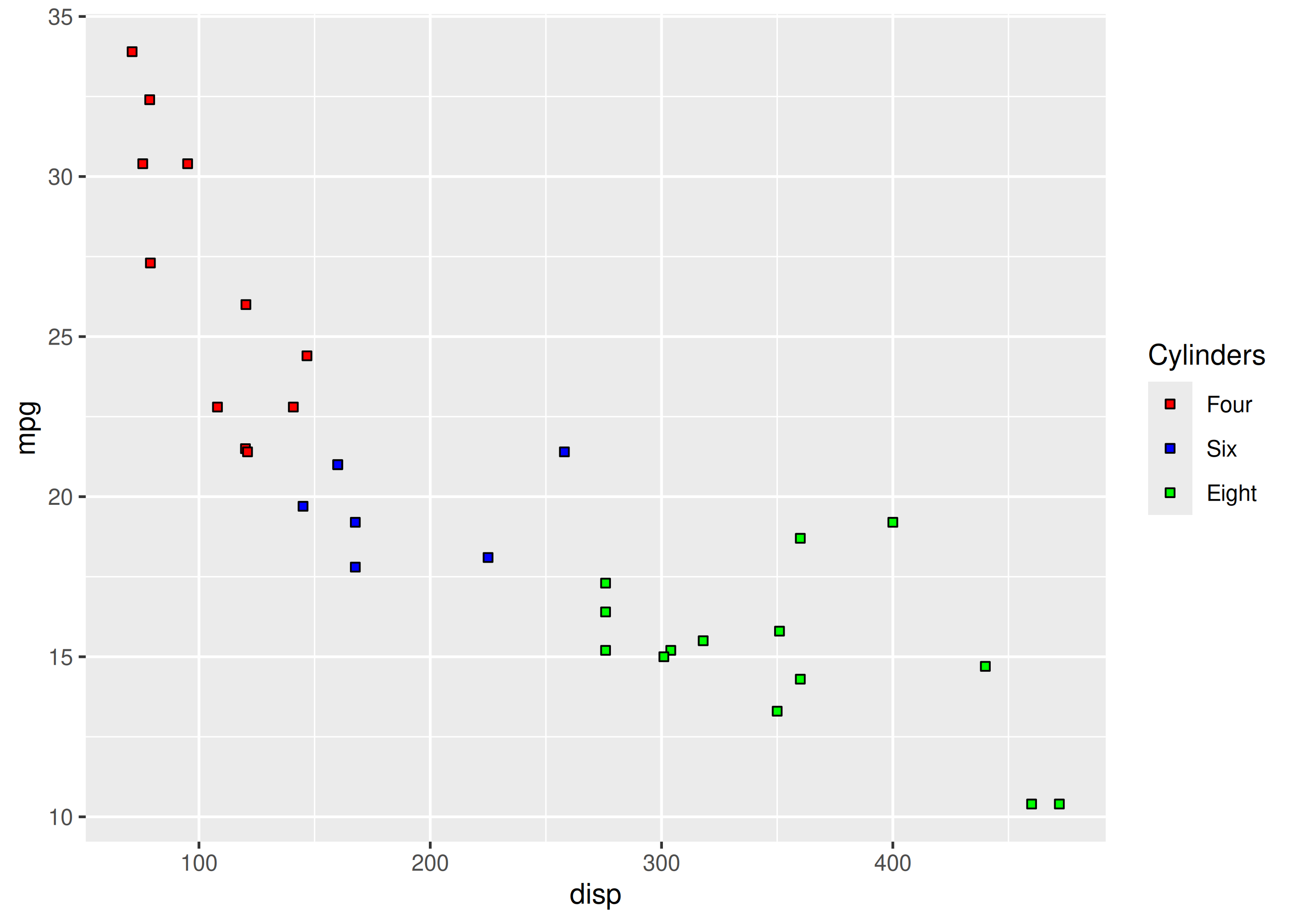
scale_color_manual(values = ...).labels argument.breaks and justify vs limits.Worked solutions in solutions/legend-color-fill.md (attempt first).