# A tibble: 5,000 × 4
   device  bouncers purchase referrer
   <fct>   <lgl>    <lgl>    <fct>
 1 Desktop FALSE    FALSE    Affiliates
 2 Mobile  FALSE    FALSE    Affiliates
 3 Desktop TRUE     FALSE    Organic
 4 Desktop FALSE    FALSE    Organic
 5 Mobile  TRUE     FALSE    Direct
 6 Desktop TRUE     FALSE    Direct
 7 Desktop FALSE    FALSE    Referral
 8 Tablet  TRUE     FALSE    Organic
 9 Mobile  TRUE     FALSE    Social
10 Desktop TRUE     FALSE    Organic
# ℹ 4,990 more rows
8.2.1 Data Dictionary
device: device used to visit the website
bouncers: whether visit was a bouncer (exit website from landing page)
purchase: whether visitor purchased
referrer: referrer website/search engine
8.3 Basic Plot
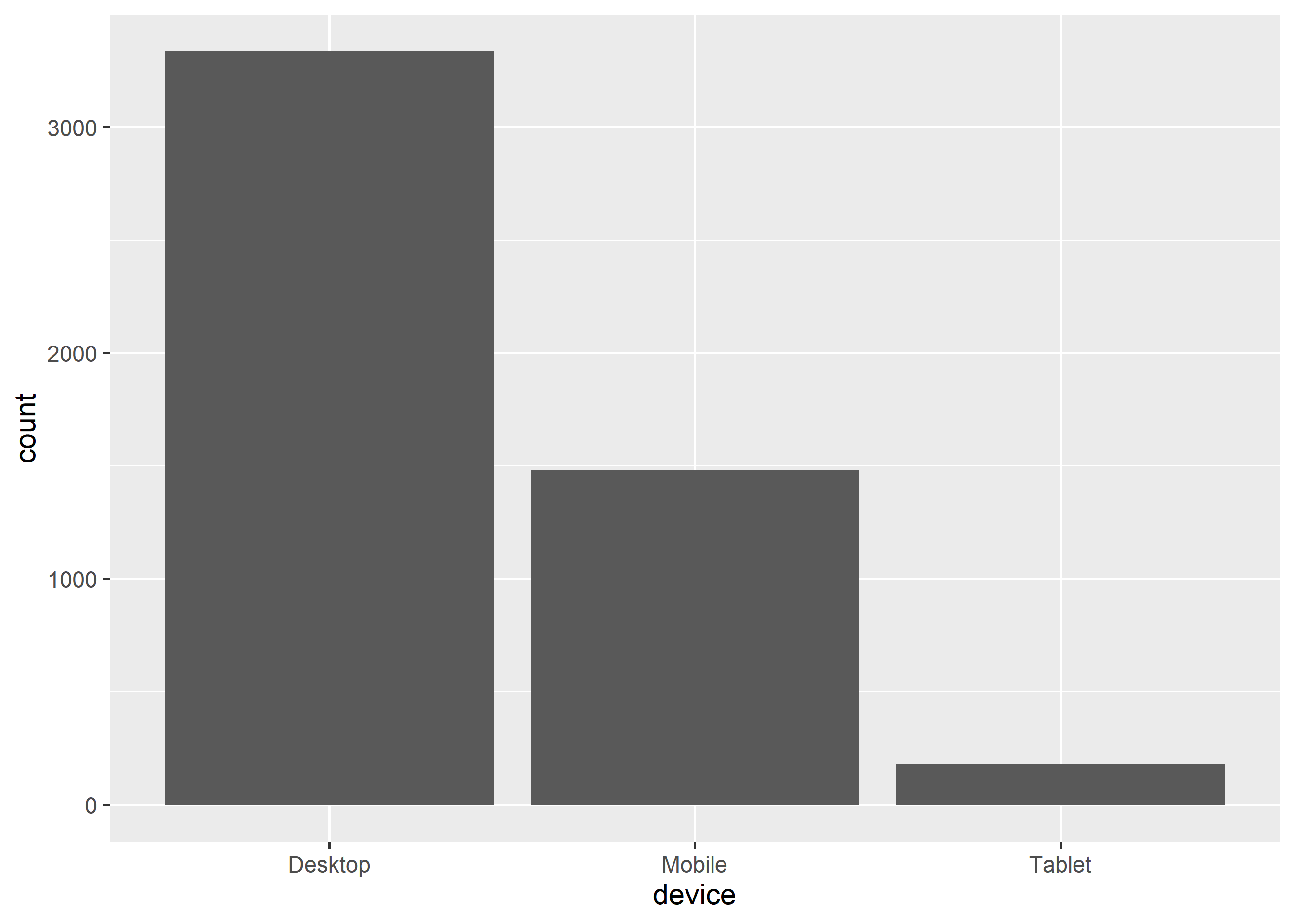
We can create a bar plot using geom_bar(). It takes a single input, a categorical variable. In the below example, we plot the number of visits for each device type.
ggplot(ecom) +geom_bar(aes(device))
8.4 Bar Color
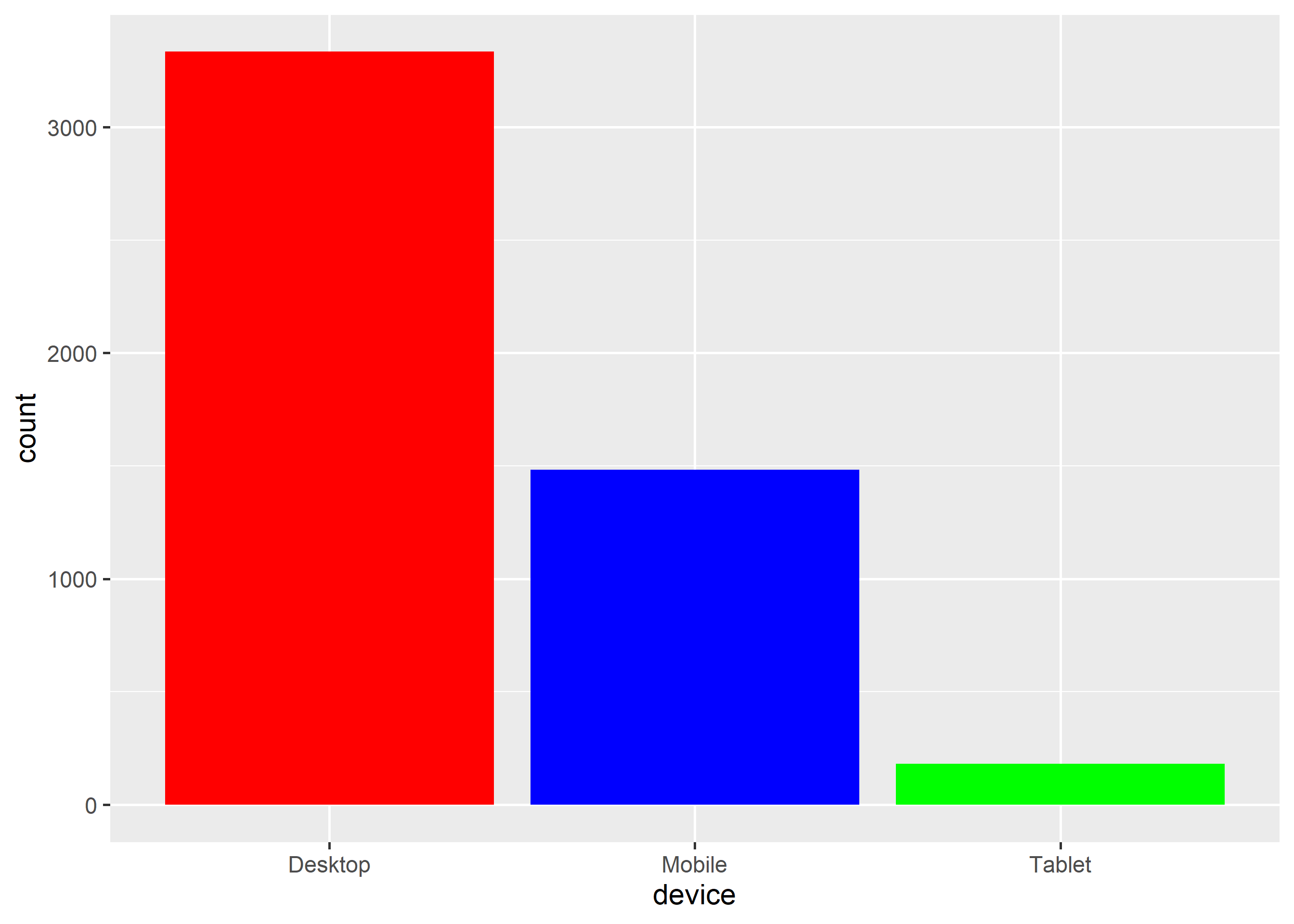
The color of the bars can be modified using the fill argument. In the below example, we assign different colors to the 3 bars in the plot. If you use the color argument, it will modify the color of the bar line and not the background color of the bars. We will look at that later in the chapter.
ggplot(ecom) +geom_bar(aes(device), fill =c('red', 'blue', 'green'))
8.5 Stacked Bar Plot
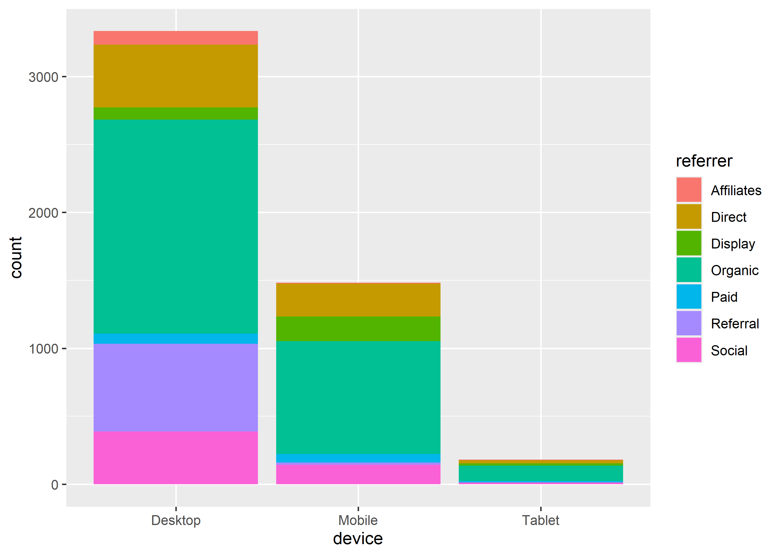
If you want to look at distribution of one categorical variable across the levels of another categorical variable, you can create a stacked bar plot. In ggplot2, a stacked bar plot is created by mapping the fill argument to the second categorical variable. In the below example, we have mapped fill to referrer variable.
ggplot(ecom) +geom_bar(aes(device, fill = referrer))
8.6 Grouped Bar Plot
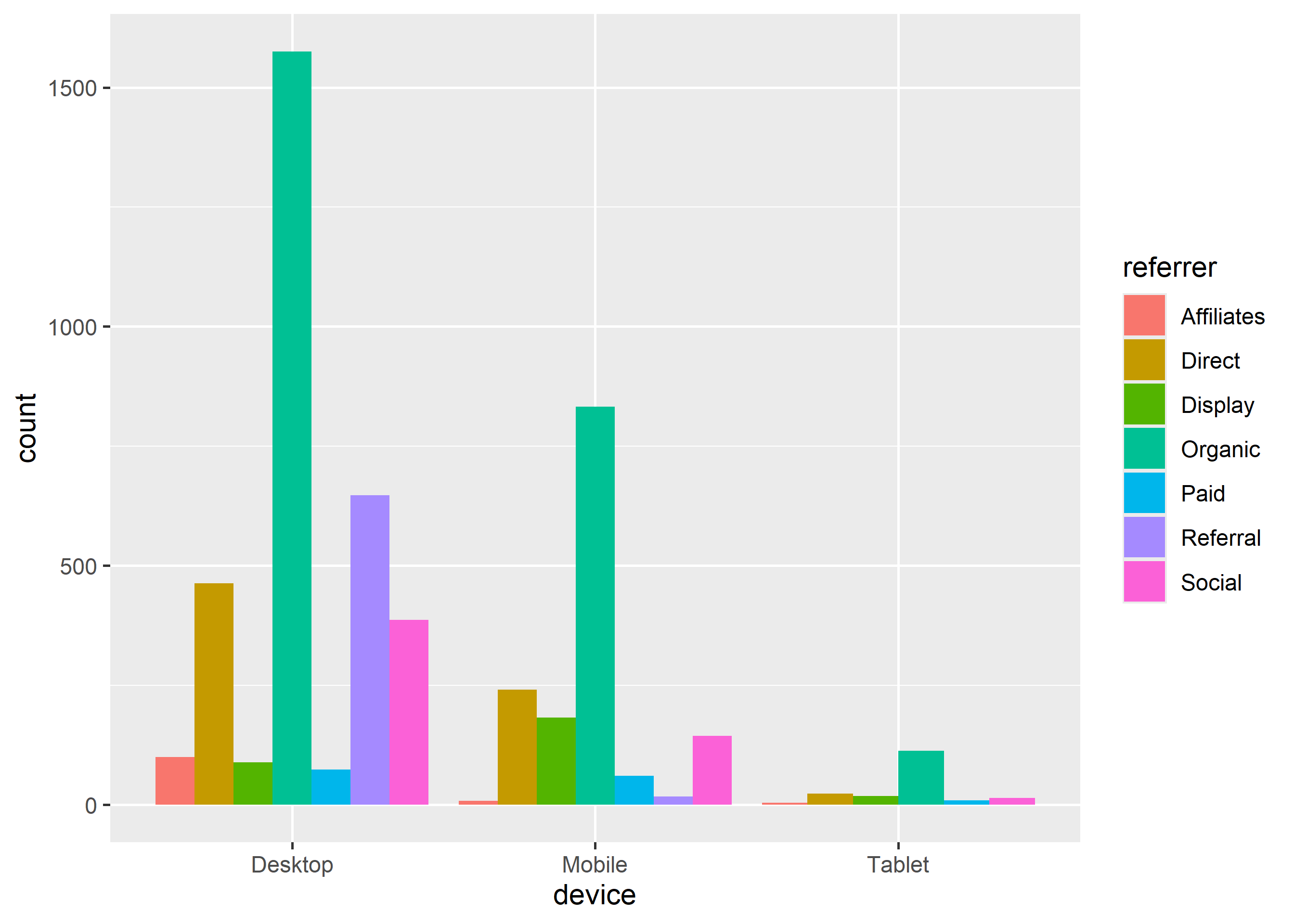
Grouped bar plots are a variation of stacked bar plots. Instead of being stacked on top of one another, the bars are placed next to one another and grouped by levels. In the below example, we create a grouped bar plot and you can observe that the bars are placed next to one another instead of being stacked as was shown in the previous example. To create a grouped bar plot, use the position argument and set it to 'dodge'.
ggplot(ecom) +geom_bar(aes(device, fill = referrer), position ='dodge')
8.7 Proportional Bar Plot
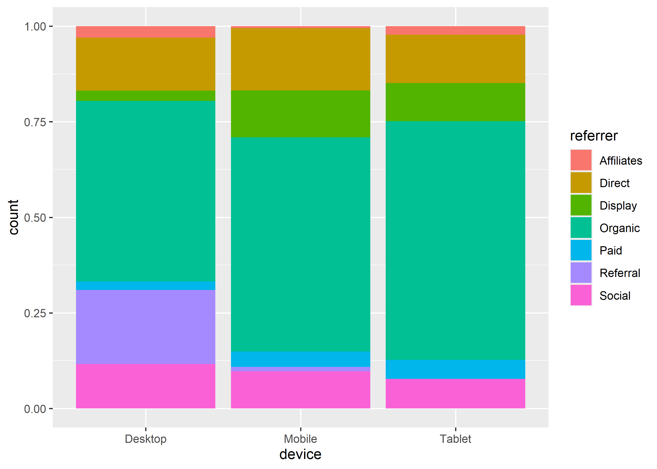
In a proportional bar plot, the height of all the bars is proportional or same. To create a proportional bar plot, use the position argument and set it to 'fill'.
ggplot(ecom) +geom_bar(aes(device, fill = referrer), position ='fill')
8.8 Horizontal Bar Plot
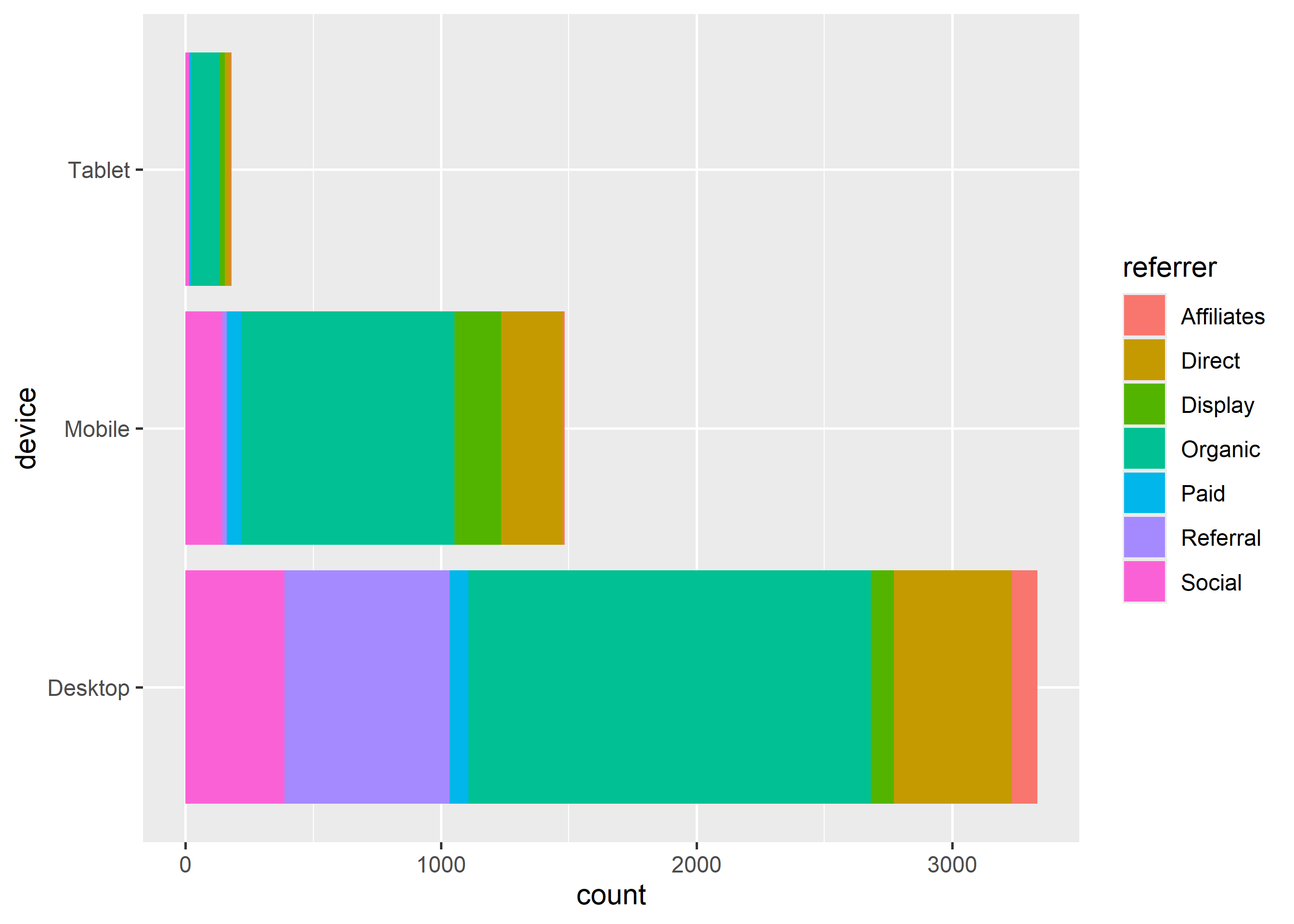
A horizontal bar plot can be created by flipping the coordinate axes of a regular plot. To flip the axes, use coord_flip() as shown below.
ggplot(ecom) +geom_bar(aes(device, fill = referrer)) +coord_flip()
8.9 Bar Line
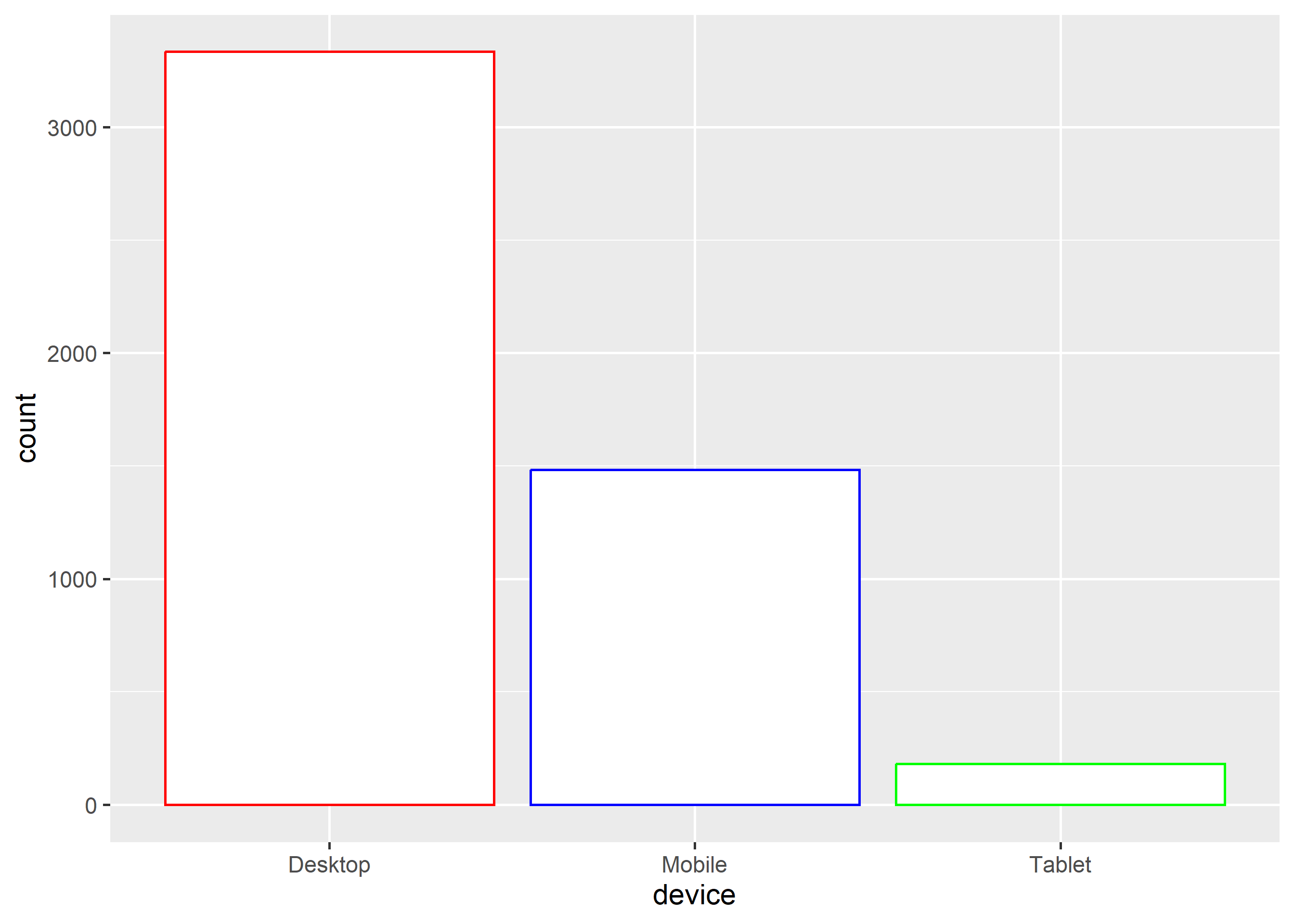
The color of the bar line can be modified using the color argument. The color can be specified either using its name or hex code.
ggplot(ecom) +geom_bar(aes(device), fill ='white', color =c('red', 'blue', 'green'))
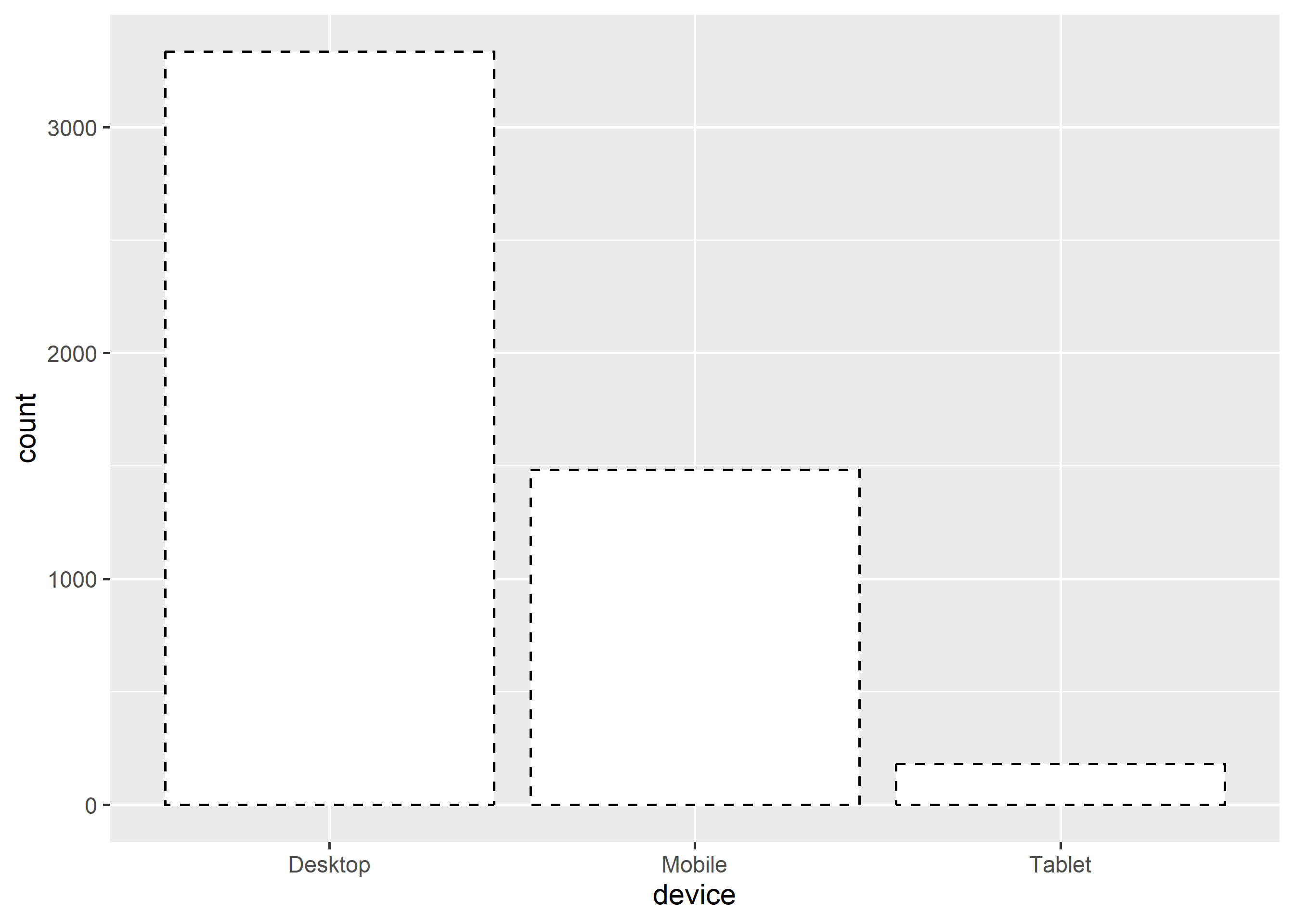
To modify the line type of the bar line, use the linetype argument. It can take values between 0 and 6.
ggplot(ecom) +geom_bar(aes(device), fill ='white', color ='black', linetype =2)
The width of the bar line can be modified using the linewidth argument. It can take any value greater than 0.
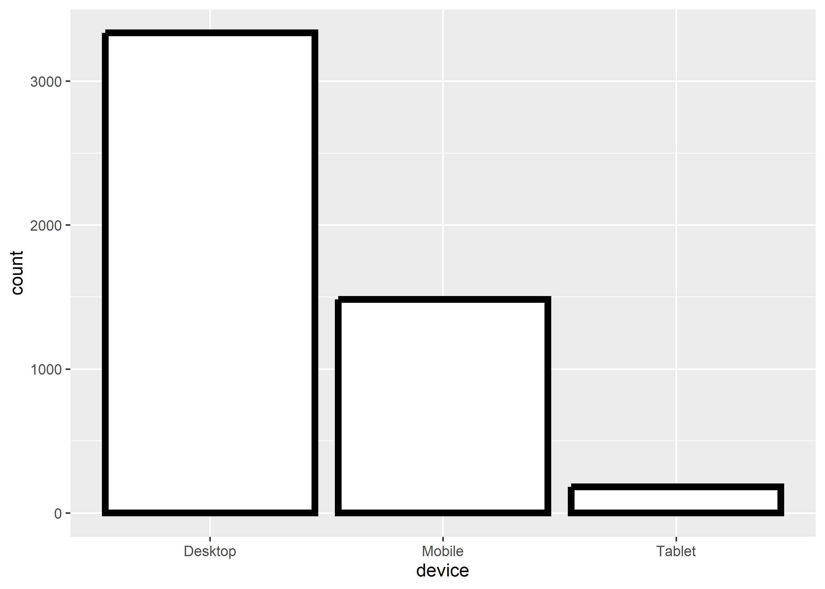
ggplot(ecom) +geom_bar(aes(device), fill ='white', color ='black', linewidth =2)
8.10 Exercises
Draw counts of cars per cylinder class from mtcars.
Group by gears with dodged bars, gap tuned via position_dodge(width = 0.8).
Rewrite the plot with a message-first title; keep bars starting at zero.
Worked solutions in solutions/bar.md (attempt first).
Where to go next
ggplot2 book (ggplot2-book.org) for theory behind this layer
Claus Wilke, Fundamentals of Data Visualization, for perception guidance