wide <- data.frame(
  quarter = c("Q1", "Q2", "Q3", "Q4"),
  north = c(120, 150, 135, 180),
  south = c(100, 130, 160, 175)
)
wide
quarter north south
1 Q1 120 100
2 Q2 150 130
3 Q3 135 160
4 Q4 180 175In this chapter, we will learn the one idea that unlocks faceting, grouped aesthetics and multi-series line graphs: long versus wide data.
ggplot2 maps one column to one aesthetic. Wide tables (one column per series) must be reshaped to long tables (one key column plus one value column) before color, fill or facets can separate the series.
gather() appears in older answers but is retired. Always use tidyr::pivot_longer() in new code.
Wide data keeps each series in its own column. Here quarterly revenue for two regions sits in north and south:
wide <- data.frame(
quarter = c("Q1", "Q2", "Q3", "Q4"),
north = c(120, 150, 135, 180),
south = c(100, 130, 160, 175)
)
wide quarter north south
1 Q1 120 100
2 Q2 150 130
3 Q3 135 160
4 Q4 180 175Plotting this directly forces one layer per series — repetitive and unscalable.
pivot_longer() collapses the series columns into a region key column and a revenue value column:
long <- tidyr::pivot_longer(wide, cols = c(north, south),
  names_to = "region", values_to = "revenue")
long
# A tibble: 8 × 3
quarter region revenue
<chr> <chr> <dbl>
1 Q1 north 120
2 Q1 south 100
3 Q2 north 150
4 Q2 south 130
5 Q3 north 135
6 Q3 south 160
7 Q4 north 180
8 Q4 south 175One mapping now draws both series, distinguished by color:
ggplot(long) +
  geom_line(aes(quarter, revenue, color = region, group = region), linewidth = 1) +
  geom_point(aes(quarter, revenue, color = region), size = 2)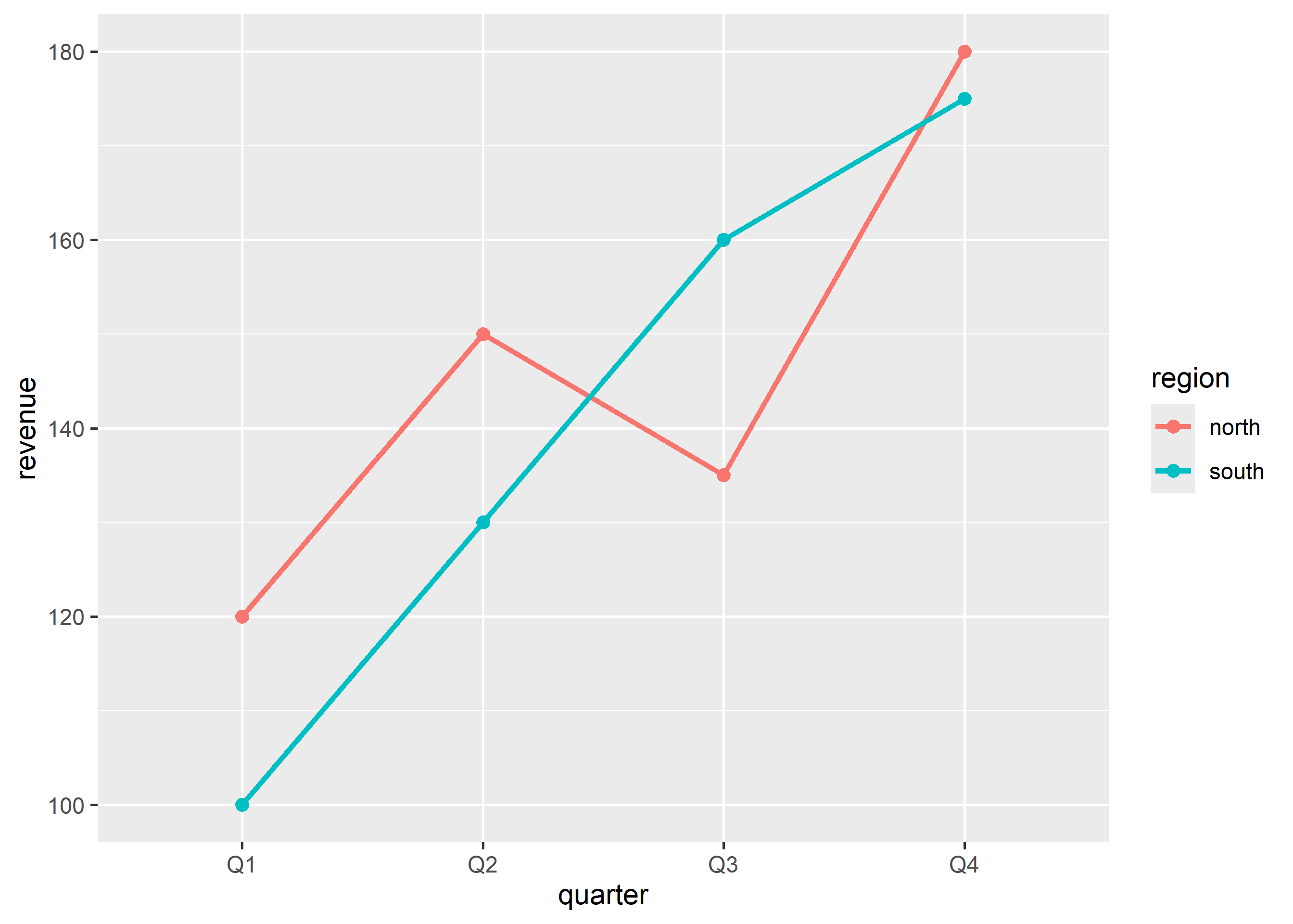
The same long shape powers facets and dodged bars with no extra reshaping.
Chain reshaping into plotting with the native pipe |>:
wide |>
  tidyr::pivot_longer(cols = c(north, south), names_to = "region", values_to = "revenue") |>
  ggplot() +
  geom_bar(aes(region, revenue, fill = quarter), stat = "identity",
    position = position_dodge(width = 0.8))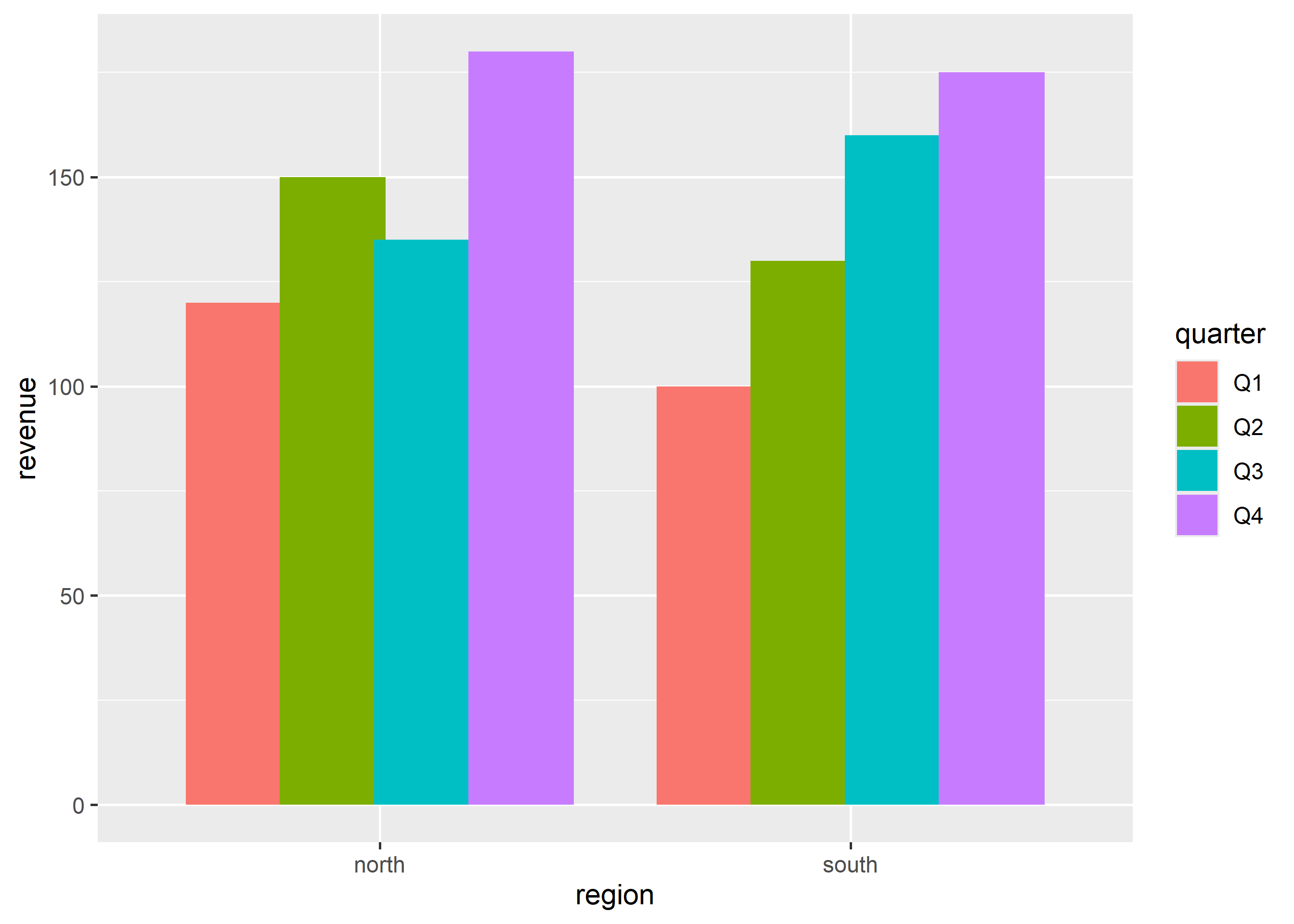
pivot_longer() reference for multi-column specs