p <- ggplot(mtcars) +
  geom_point(aes(disp, mpg, color = factor(cyl))) +
  labs(title = "Displacement vs mileage",
    x = "Displacement (cu. in.)", y = "Miles per gallon",
    color = "Cylinders")

ggplot2::ggsave("displacement-vs-mileage.png", plot = p,
width = 8, height = 6, dpi = 300)22 Export & Communicate
In this chapter, we will save figures at print resolution with ggsave() and run a storytelling checklist before sharing.
NoteWhy this matters
A great on-screen plot that exports blurry or unlabeled fails at the finish line. Export settings and a final message check are what your audience actually sees.
WarningCommon pitfall
Screenshots of the RStudio plot pane are low resolution and carry UI chrome. Always export with ggsave() for anything you share.
22.1 Saving with ggsave
ggsave() writes the last plot. Set width, height and dpi explicitly for print-crisp output:
Match dimensions to the destination: 8x6 inches suits slides, while narrower widths (e.g. 6x4) fit single-column manuscripts.
22.2 Vector Formats
For manuscripts and posters, export PDF or SVG so lines stay sharp at any zoom:
ggplot2::ggsave("displacement-vs-mileage.pdf", plot = p, width = 8, height = 6)
ggplot2::ggsave("displacement-vs-mileage.svg", plot = p, width = 8, height = 6)
22.3 Storytelling Checklist
Before sharing any figure, run this Knaflic-inspired check:
- Context: does the title state the conclusion, not just the topic?
- Clutter: are gridlines, borders and decimals reduced to the minimum?
- Focus: is the key series emphasized with color while the rest recede?
- Labels: are axes, units and sources stated so the figure stands alone?
- Honesty: does the axis start at zero for bars, and are missing data disclosed?
22.4 Before and After
Apply the checklist to a default scatter plot: add a message-first title, direct axis units and a restrained palette.
ggplot(mtcars) +
  geom_point(aes(disp, mpg, color = factor(cyl)), size = 2.5) +
  labs(title = "Heavier engines get fewer miles per gallon",
    x = "Displacement (cu. in.)", y = "Miles per gallon", color = "Cylinders") +
  theme_minimal()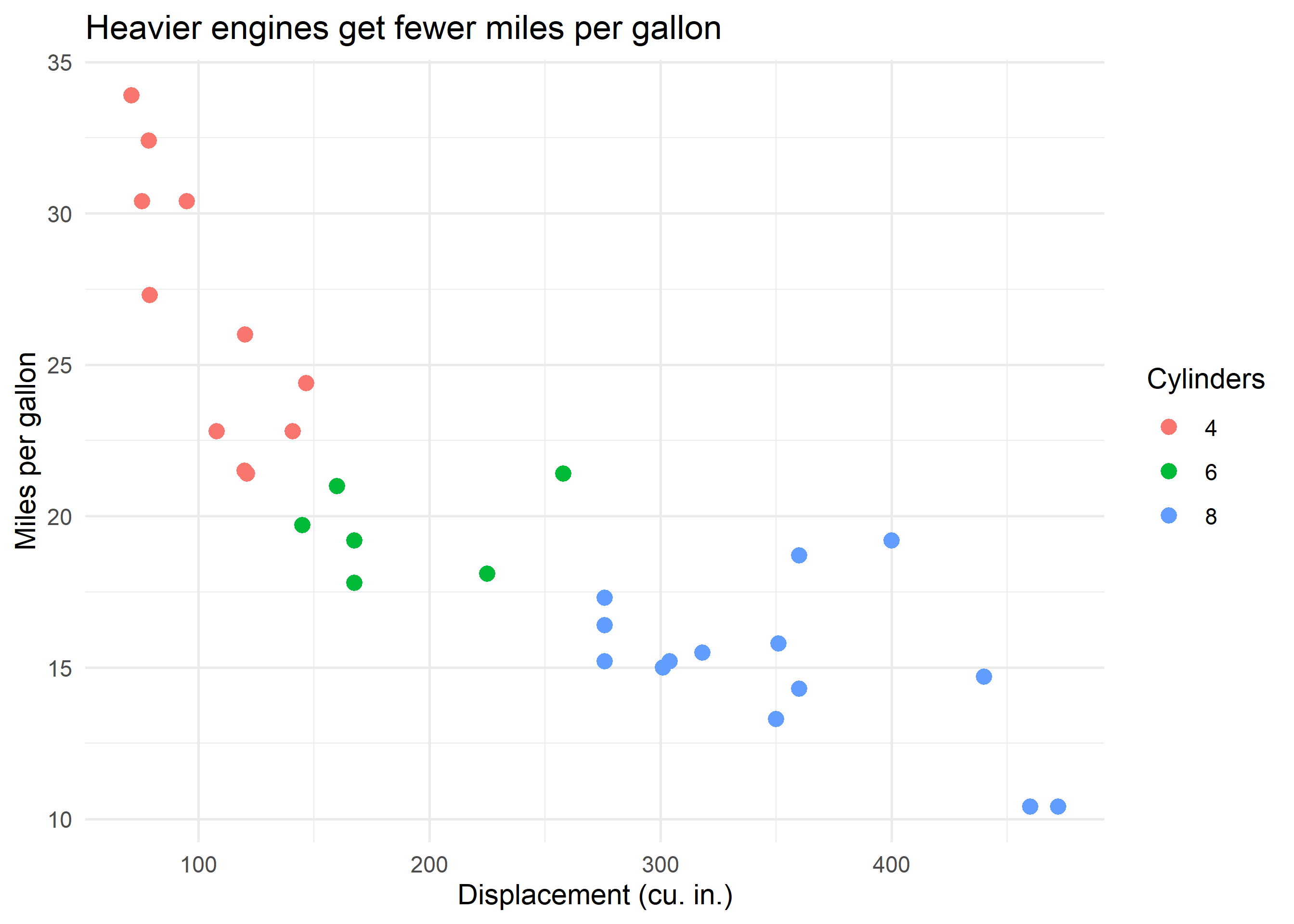
Where to go next
- Storytelling with Data (Knaflic) for the full narrative framework
- Claus Wilke, Fundamentals of Data Visualization, for design principles