ggplot(mtcars, aes(disp, mpg)) +
  geom_point()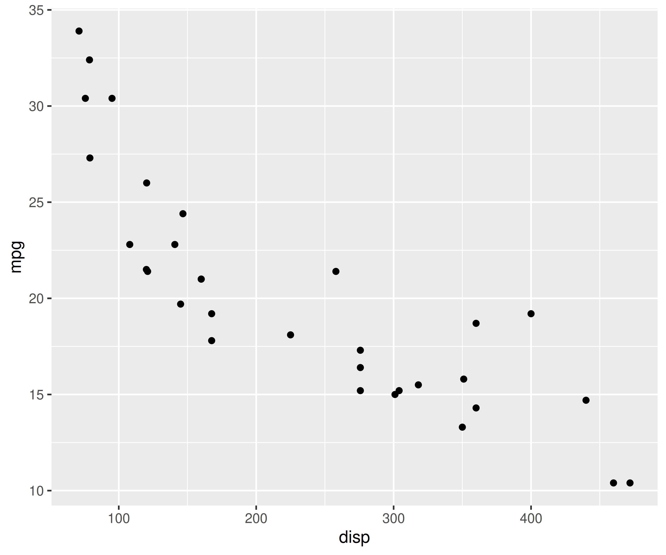
A 5-minute on-ramp: one ggplot() plus one geom_*() draws your first chart.
Skipping labs() early produces cryptic default titles; label axes from the start.
In this chapter, we will quickly build a set of plots that are routinely used to explore data using ggplot() combined with a geom_*() layer. Every plot follows the same recipe: map variables to aesthetics in aes() and add the geometry that draws them.
qplot() was deprecated in ggplot2 3.4.0. It still appears in older tutorials, but all examples in this book use ggplot() + geom_*(), which is the supported syntax going forward.
We will use the following libraries in this chapter:
All the data sets used in this chapter can be found here and code can be downloaded from here.
Scatter plots are used to examine the relationship between two continuous variables. The relationship can be examined across the levels of a categorical variable as well. Let us begin by creating scatter plots. Map the X and Y variables inside aes() and add geom_point().
ggplot(mtcars, aes(disp, mpg)) +
geom_point()
If you want the relationship between the two variables to be represented by both points and a line, add both layers.
ggplot(mtcars, aes(disp, mpg)) +
  geom_point() +
  geom_line()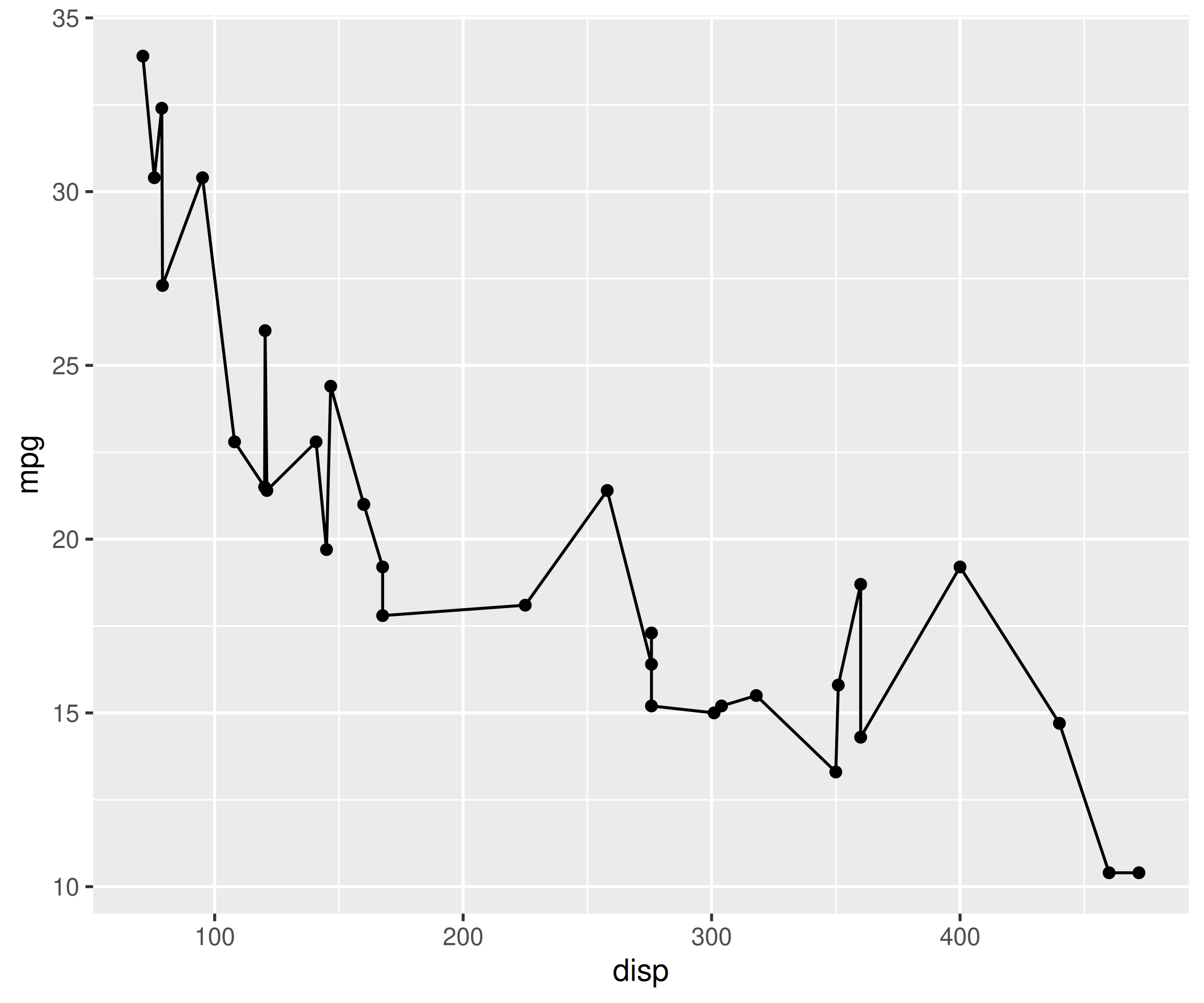
The color of the points can be mapped to a categorical variable, in our case cyl, using the color aesthetic. Ensure that the variable is categorical using factor().
ggplot(mtcars, aes(disp, mpg, color = factor(cyl))) +
  geom_point()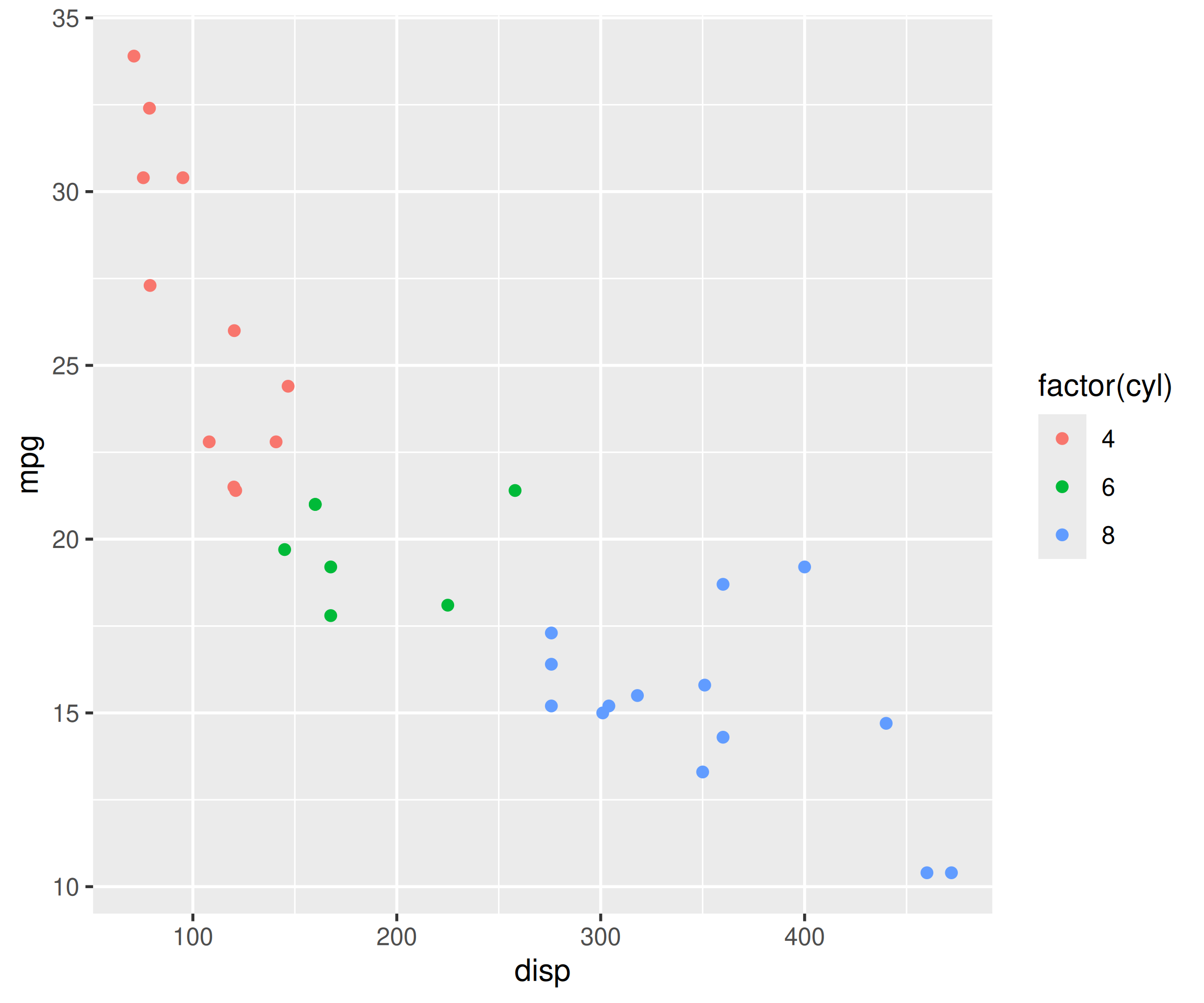
The shape and size of the points can also be mapped to variables using the shape and size aesthetics as shown in the below examples.
ggplot(mtcars, aes(disp, mpg, shape = factor(cyl))) +
  geom_point()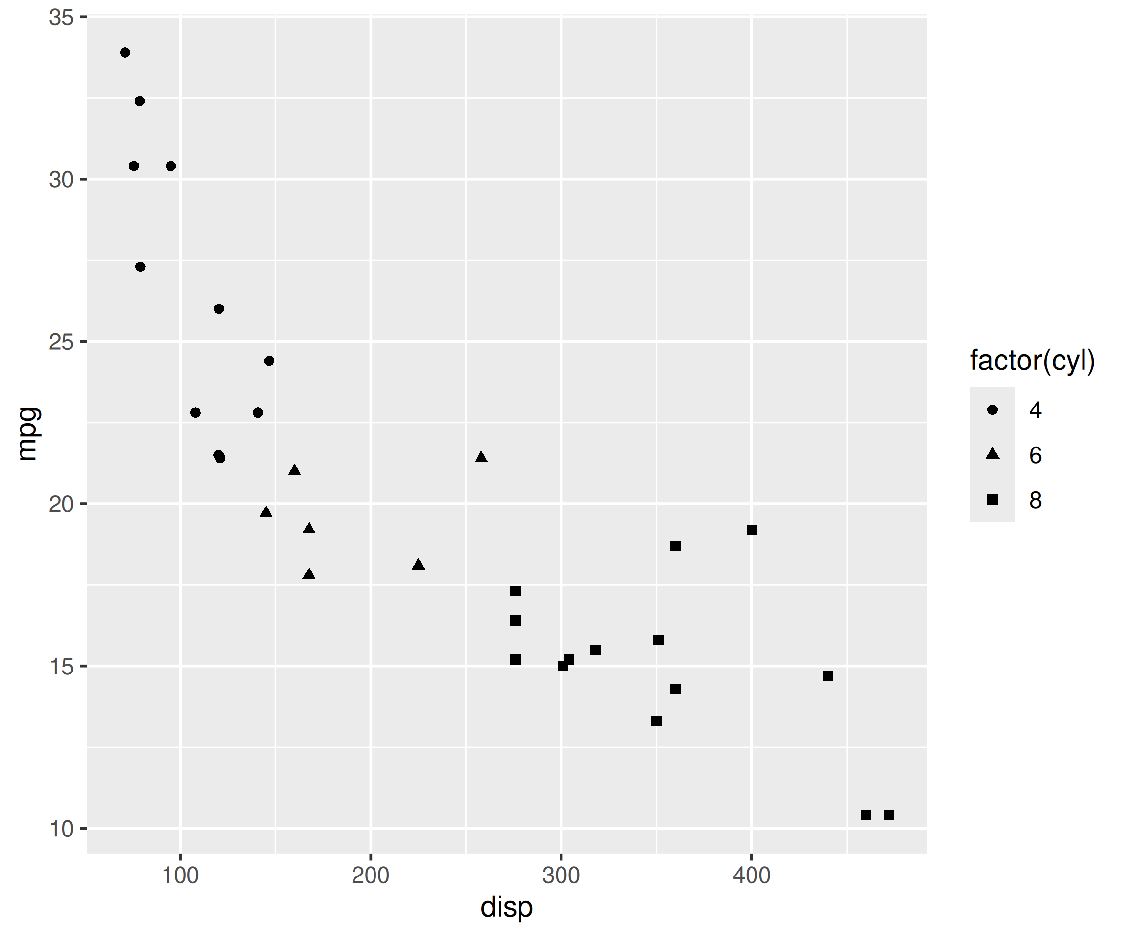
Ensure that size is mapped to a continuous variable.
ggplot(mtcars, aes(disp, mpg, size = qsec)) +
  geom_point()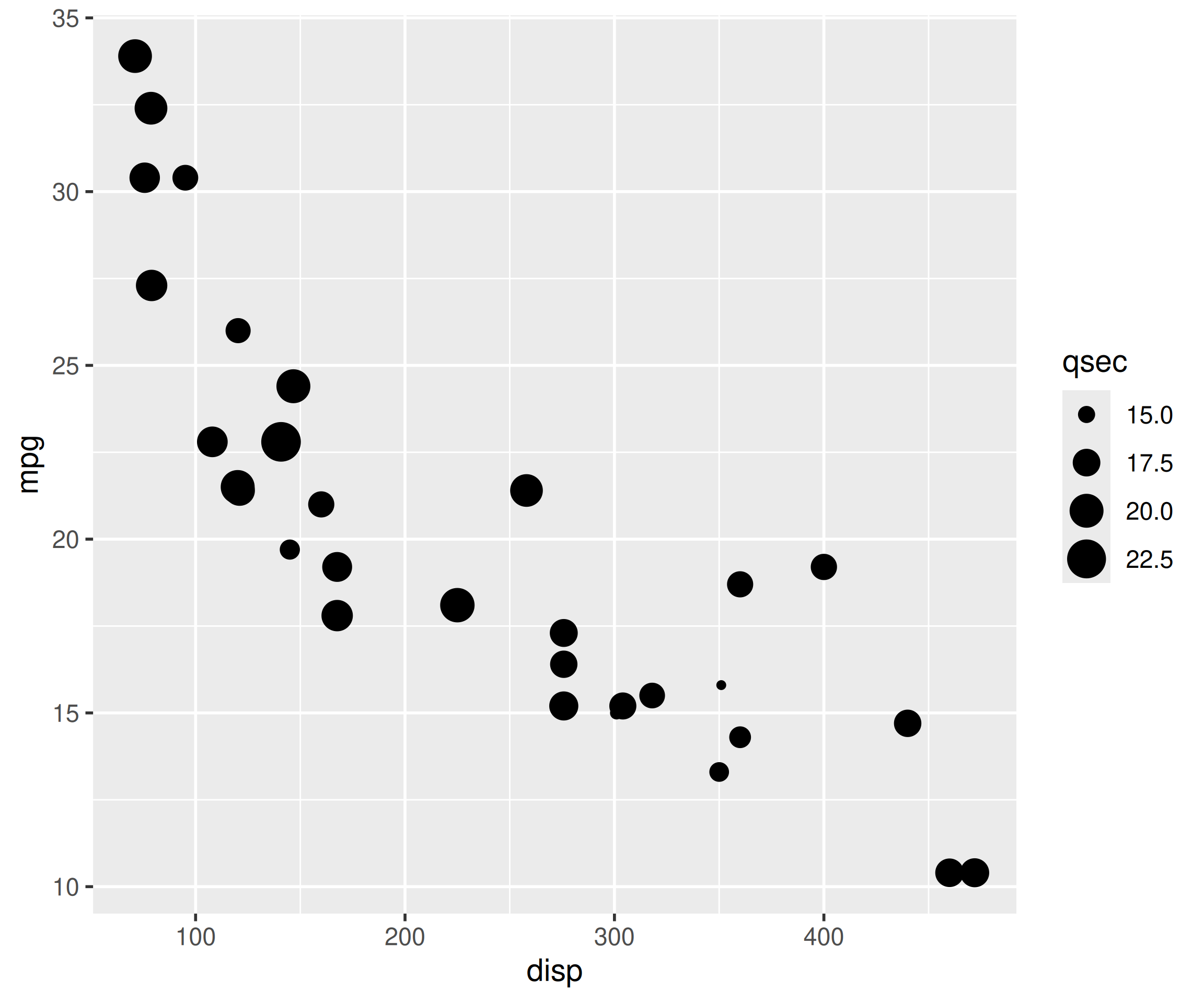
A bar plot represents data in rectangular bars. The length of the bars are proportional to the values they represent. Bar plots can be either horizontal or vertical. The X axis of the plot represents the levels or the categories and the Y axis represents the frequency/count of the variable.
To create a bar plot, map a categorical variable to x. You can convert a variable to type factor (R equivalent of categorical) using the factor() function, and add geom_bar().
ggplot(mtcars, aes(factor(cyl))) +
  geom_bar()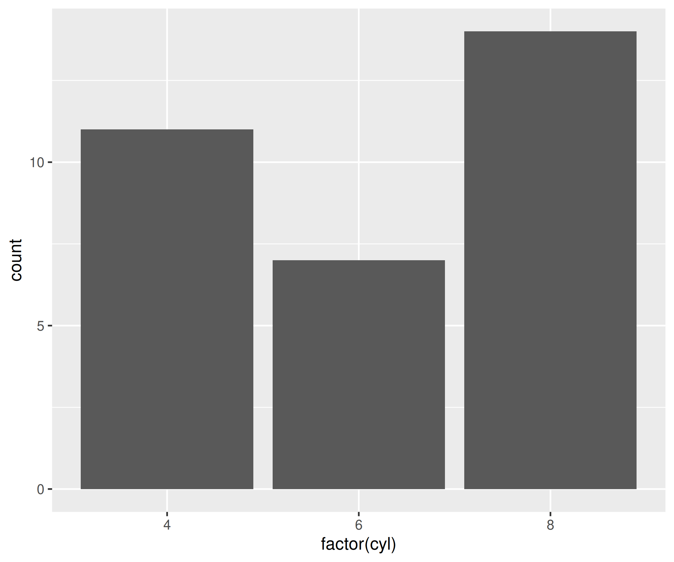
You can create a stacked bar plot by mapping another categorical variable to fill.
ggplot(mtcars, aes(factor(cyl), fill = factor(am))) +
  geom_bar()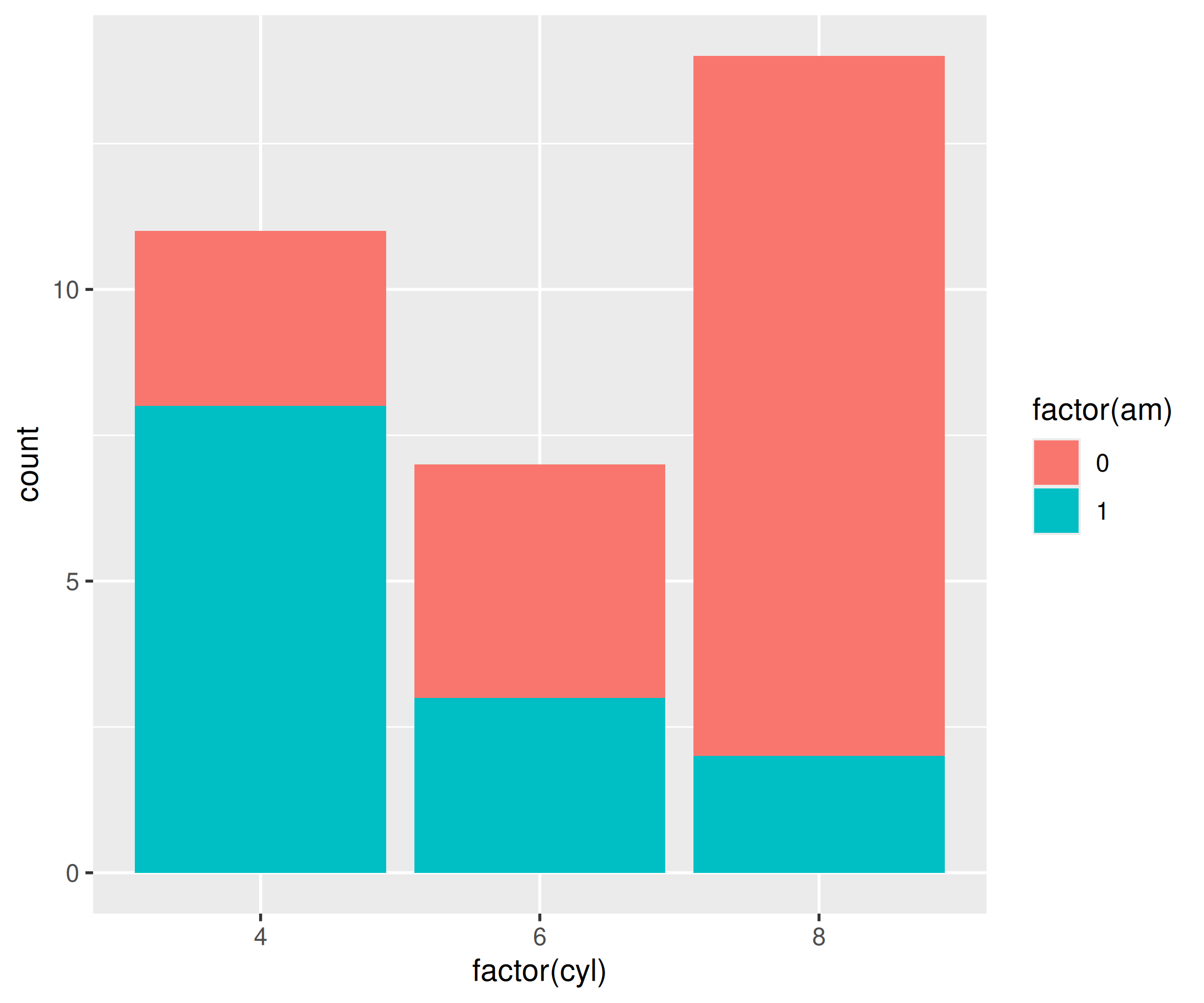
The box plot is a standardized way of displaying the distribution of data based on the five number summary: minimum, first quartile, median, third quartile, and maximum. Box plots are useful for detecting outliers and for comparing distributions. It shows the shape, central tendancy and variability of the data.
Box plots are created with geom_boxplot(). Map a categorical variable to x and a continuous variable to y.
ggplot(mtcars, aes(factor(cyl), mpg)) +
  geom_boxplot()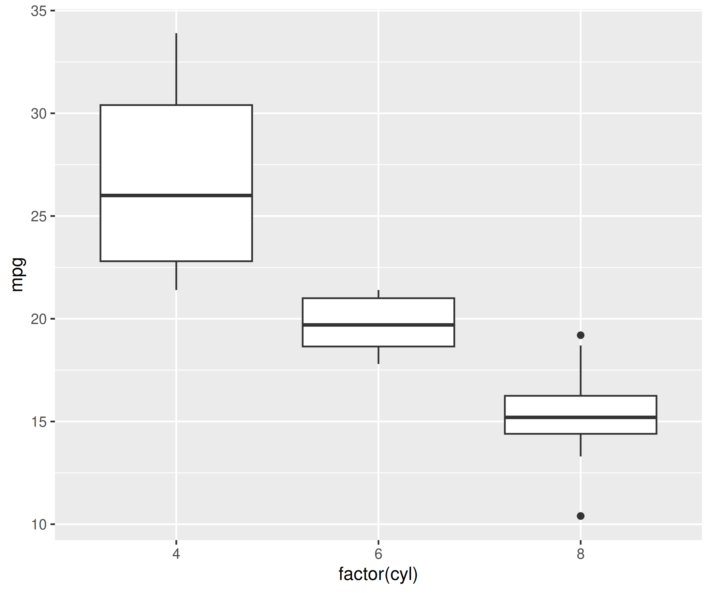
To plot the distribution of a single continuous variable without any grouping, map only y. Modern ggplot2 accepts a single-variable boxplot natively.
ggplot(mtcars, aes(y = mpg)) +
  geom_boxplot()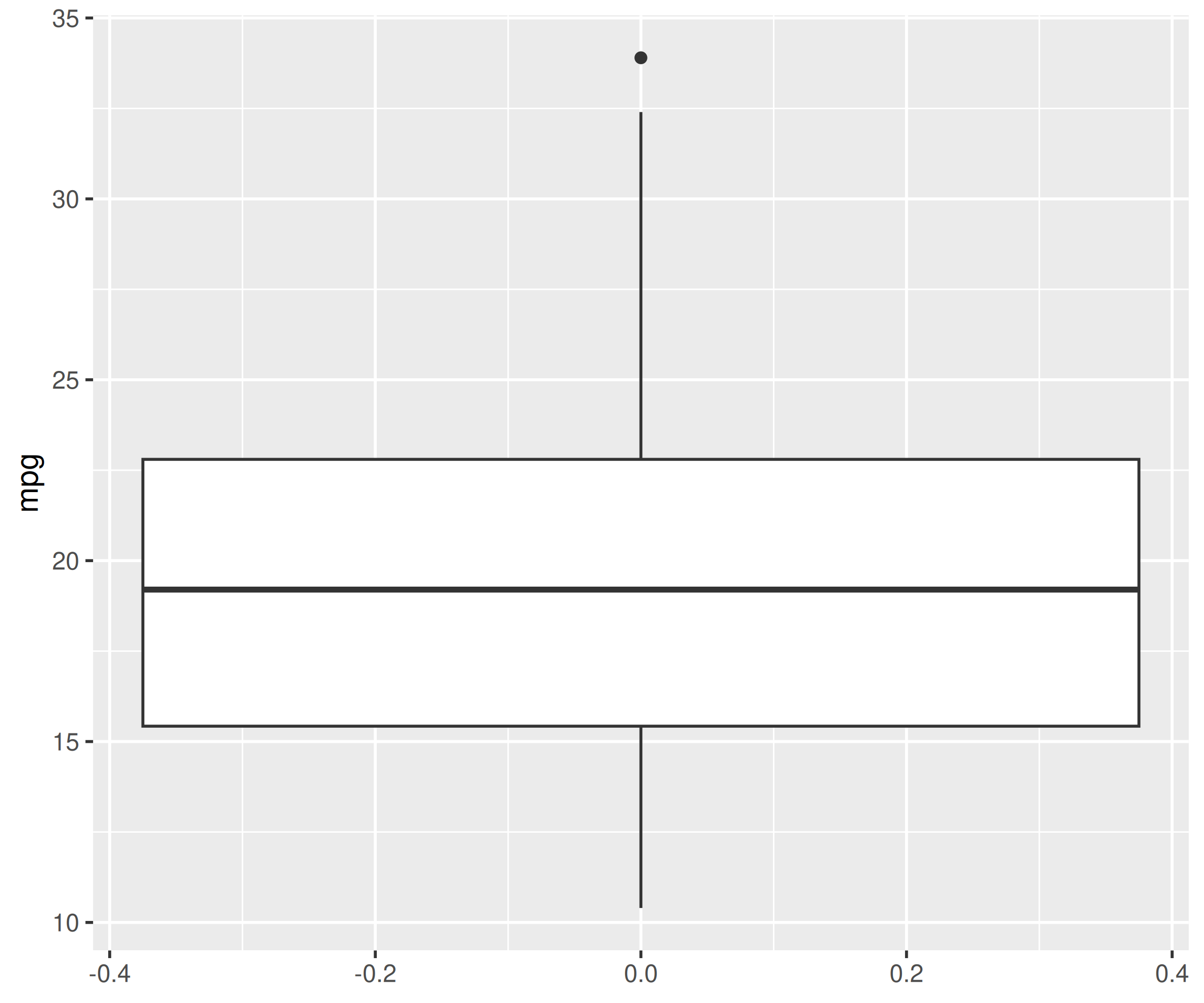
Older code (including earlier editions of this book) used aes(x = factor(1)) as a dummy grouping variable for single boxplots. That workaround is no longer needed but still renders, so you may encounter it in the wild.
Line charts are used to examing trends across time. Map the time variable to x, the measurement to y, and add geom_line().
ggplot(economics, aes(date, unemploy)) +
  geom_line()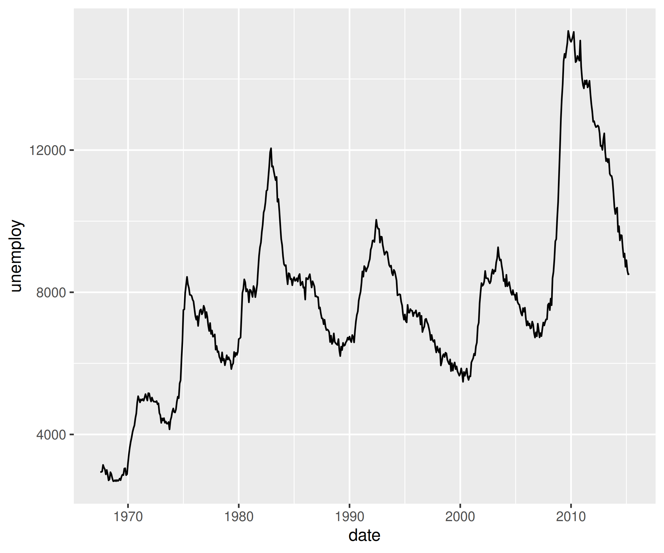
The appearance of the line can be modified by setting the color outside aes() as shown below.
ggplot(economics, aes(date, unemploy)) +
  geom_line(color = 'red')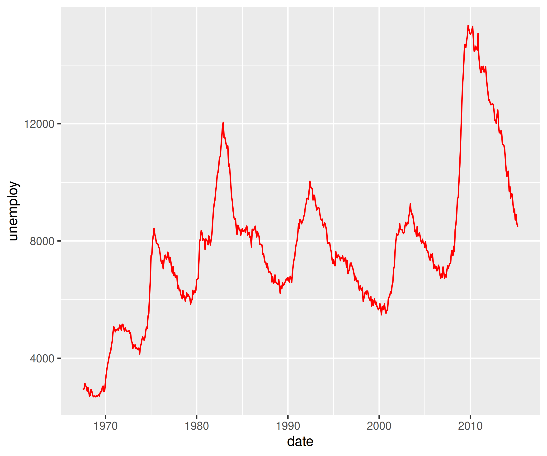
A histogram is a plot that can be used to examine the shape and spread of continuous data. It looks very similar to a bar graph and can be used to detect outliers and skewness in data. Map the continuous variable to x and add geom_histogram(), controlling detail with bins.
ggplot(mtcars, aes(mpg)) +
  geom_histogram(bins = 5)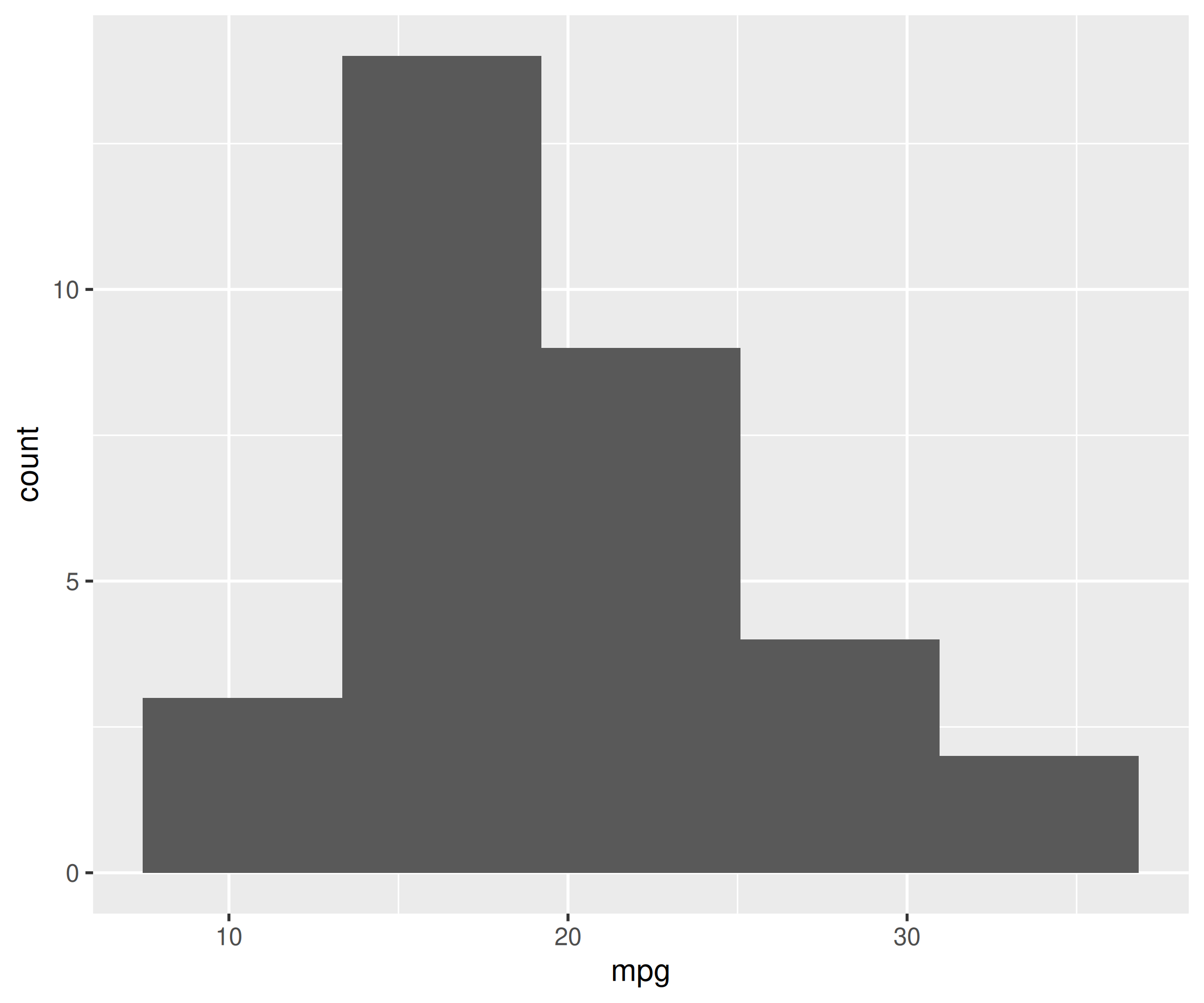
ggplot(mtcars) scatter of disp vs mpg with geom_point().labs() title.qplot() is legacy code.Worked solutions in solutions/quicktour.md (attempt first).