Chapter 7 Line Graphs
7.1 Introduction
In this chapter, we will learn to:
- build
- simple line chart
- grouped line chart
- map aesthetics to variables
- modify line
- color
- type
- size
7.2 Case Study
We will use a data set related to GDP growth rate. You can download it from here. It contains GDP (Gross Domestic Product) growth data for the BRICS (Brazil, Russia, India, China, South Africa) for the years 2000 to 2005.
7.2.1 Data
gdp <- readr::read_csv('https://raw.githubusercontent.com/rsquaredacademy/datasets/master/gdp.csv')## Warning: Missing column names filled in: 'X1' [1]gdp## # A tibble: 6 x 6
## X1 X year growth india china
## <dbl> <dbl> <date> <dbl> <dbl> <dbl>
## 1 1 1 2000-01-01 6 5 8
## 2 2 2 2001-01-01 9 9 5
## 3 3 3 2002-01-01 8 8 6
## 4 4 4 2003-01-01 9 8 8
## 5 5 5 2004-01-01 9 5 9
## 6 6 6 2005-01-01 8 7 87.3 Line Chart
To create a line chart, use geom_line(). In the below example, we examine the
GDP growth rate trend of India for the years 2000 to 2005.
ggplot(gdp, aes(year, india)) +
  geom_line()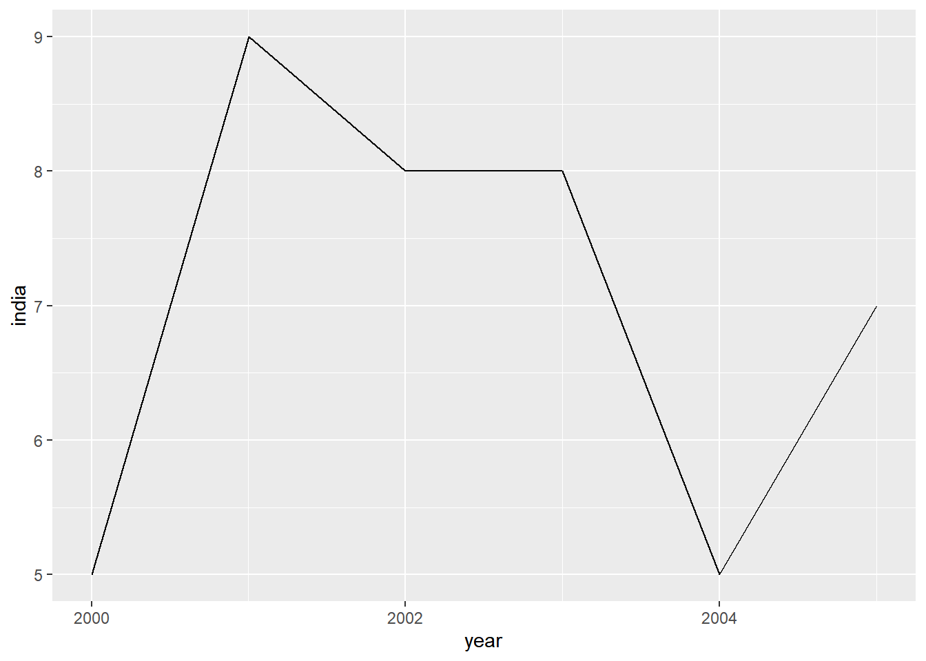
7.3.1 Line Color
To modify the color of the line, use the color argument and supply it a valid
color name. In the below example, we modify the color of the line to 'blue'.
Remember that the color argument should be outside aes().
ggplot(gdp, aes(year, india)) +
  geom_line(color = 'blue')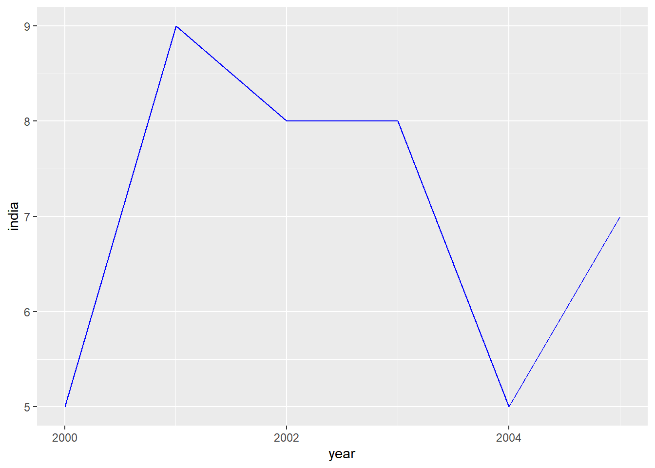
7.3.2 Line Type
The line type can be modified using the linetype argument. It can take 7 different
values. You can specify the line type either using numbers or words as shown below:
- 0 : blank
- 1 : solid
- 2 : dashed
- 3 : dotted
- 4 : dotdash
- 5 : longdash
- 6 : twodash
Let us modify the line type to dashed style by supplying the value 2 to the
linetype argument.
ggplot(gdp, aes(year, india)) +
  geom_line(linetype = 2)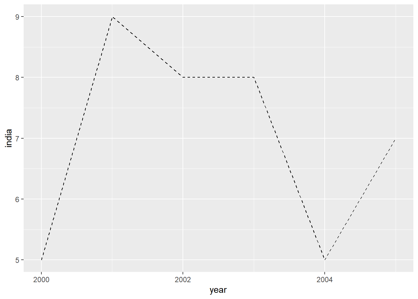
The above example can be recreated by supplying the value 'dashed' instead
of 2.
ggplot(gdp, aes(year, india)) +
  geom_line(linetype = 'dashed')
7.3.3 Line Size
The width of the line can be modified using the size argument. It can take
any value above 0 as input.
ggplot(gdp, aes(year, india)) +
  geom_line(size = 2)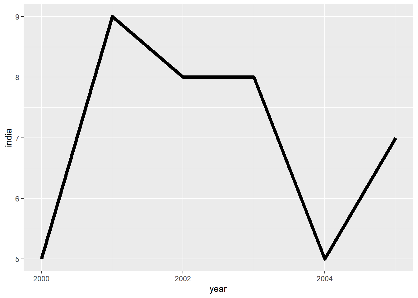
7.4 Multiple Lines
7.4.1 Modify Data
Now let us map the aesthetics to the variables. The data used in the above
example cannot be used as we need a variable with country names. We will use
gather() function from the tidyr package to reshape the data.
gdp2 <- gdp %>%
  select(year, growth, india, china) %>%
  gather(key = country, value = gdp, -year)

gdp2
## # A tibble: 18 x 3
## year country gdp
## <date> <chr> <dbl>
## 1 2000-01-01 growth 6
## 2 2001-01-01 growth 9
## 3 2002-01-01 growth 8
## 4 2003-01-01 growth 9
## 5 2004-01-01 growth 9
## 6 2005-01-01 growth 8
## 7 2000-01-01 india 5
## 8 2001-01-01 india 9
## 9 2002-01-01 india 8
## 10 2003-01-01 india 8
## 11 2004-01-01 india 5
## 12 2005-01-01 india 7
## 13 2000-01-01 china 8
## 14 2001-01-01 china 5
## 15 2002-01-01 china 6
## 16 2003-01-01 china 8
## 17 2004-01-01 china 9
## 18 2005-01-01 china 8In the original data, to plot GDP trend of multiple countries we will have to
use geom_line() multiple times. But in the reshaped data, we have the
country names as one of the variables and this can be used along with the
group argument to plot data of multiple countries with a single line of code
as shown below. By mapping country to the group argument, we have plotted
data of all countries.
ggplot(gdp2, aes(year, gdp, group = country)) +
  geom_line()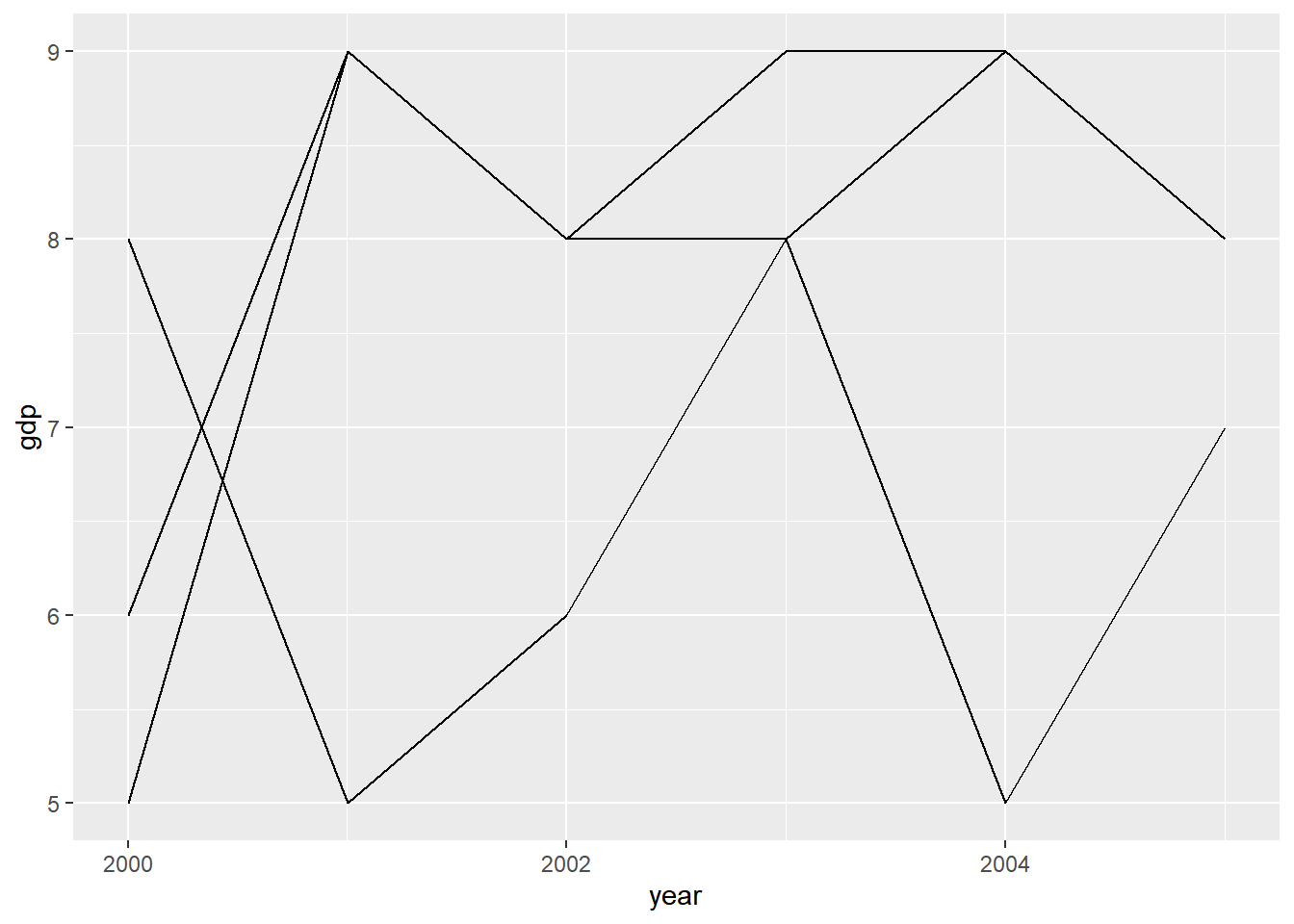
In the above plot, we cannot distinguish between the lines and there is no way
to identify which line represents which country. To make it easier to identify
the trend of different countries, let us map the color argument to the
variable country as shown below. Now, each country will be represented by line
of different color.
ggplot(gdp2, aes(year, gdp, group = country)) +
  geom_line(aes(color = country))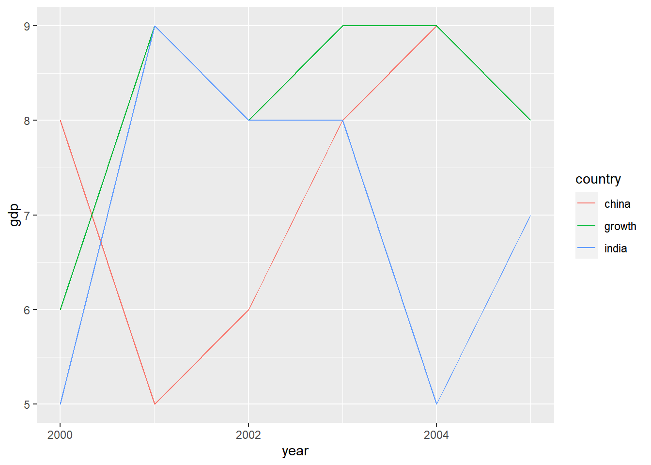
We can map linetype argument to country as well. In this case, each country
will be represented by a different line type.
ggplot(gdp2, aes(year, gdp, group = country)) +
  geom_line(aes(linetype = country))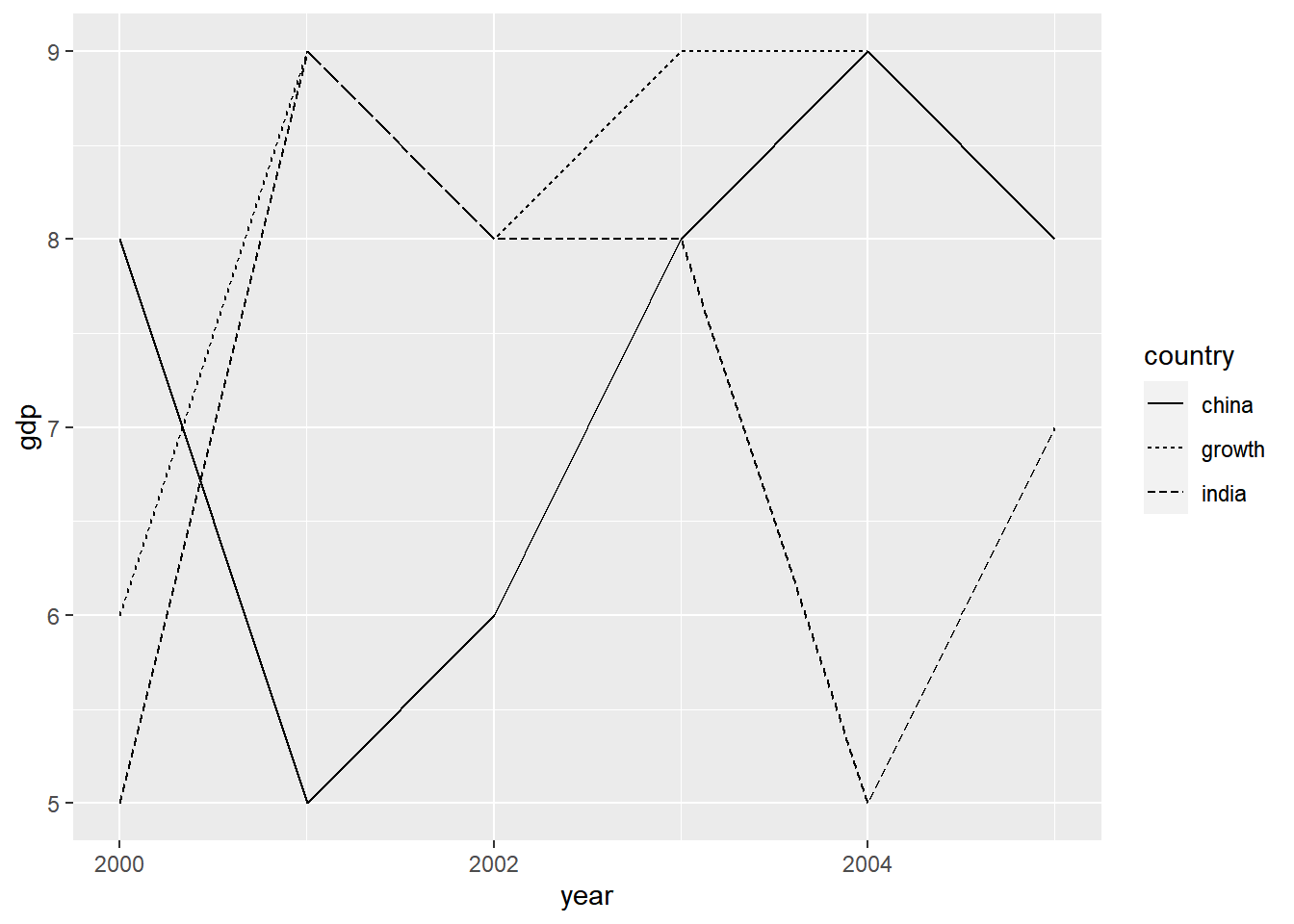
We can map the width of the line to the variable country as well. But in this case, the plot does not look either elegant or intuitive.
ggplot(gdp2, aes(year, gdp, group = country)) +
  geom_line(aes(size = country))
## Warning: Using size for a discrete variable is not advised.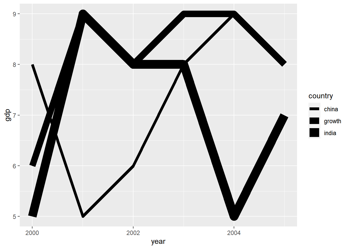
Remember that in all the above cases, we mapped the arguments to a variable
inside aes().