Histograms show the shape of one continuous variable: center, spread, skew and gaps.
WarningCommon pitfall
Bin width drives the story; try several widths before concluding a distribution is bimodal.
In this chapter, we will learn to
build histogram
specify bins
modify
color
fill
alpha
bin width
line type
line size
map aesthetics to variables
A histogram is a plot that can be used to examine the shape and spread of continuous data. It looks very similar to a bar graph and can be used to detect outliers and skewness in data. The histogram graphically shows the following:
center (location) of the data
spread (dispersion) of the data
skewness
outliers
presence of multiple modes
To construct a histogram, the data is split into intervals called bins. The intervals may or may not be equal sized. For each bin, the number of data points that fall into it are counted (frequency). The Y axis of the histogram represents the frequency and the X axis represents the variable.
# A tibble: 1,000 × 11
      id referrer device bouncers n_visit n_pages duration country      purchase
   <dbl> <chr>    <chr>  <lgl>      <dbl>   <dbl>    <dbl> <chr>        <lgl>
 1     1 google   laptop TRUE          10       1      693 Czech Repub… FALSE
 2     2 yahoo    tablet TRUE           9       1      459 Yemen        FALSE
 3     3 direct   laptop TRUE           0       1      996 Brazil       FALSE
 4     4 bing     tablet FALSE          3      18      468 China        TRUE
 5     5 yahoo    mobile TRUE           9       1      955 Poland       FALSE
 6     6 yahoo    laptop FALSE          5       5      135 South Africa FALSE
 7     7 yahoo    mobile TRUE          10       1       75 Bangladesh   FALSE
 8     8 direct   mobile TRUE          10       1      908 Indonesia    FALSE
 9     9 bing     mobile FALSE          3      19      209 Netherlands  FALSE
10    10 google   mobile TRUE           6       1      208 Czech Repub… FALSE
# ℹ 990 more rows
# ℹ 2 more variables: order_items <dbl>, order_value <dbl>
10.2.1 Data Dictionary
id: row id
referrer: referrer website/search engine
device: device used to visit the website
bouncers: whether the visit bounced (single page viewed)
n_visit: number of visits
n_pages: number of pages visited
duration: time spent on the website (in seconds)
country: country of origin
purchase: whether visitor purchased
order_items: number of items ordered
order_value: order value of visitor (in dollars)
10.3 Plot
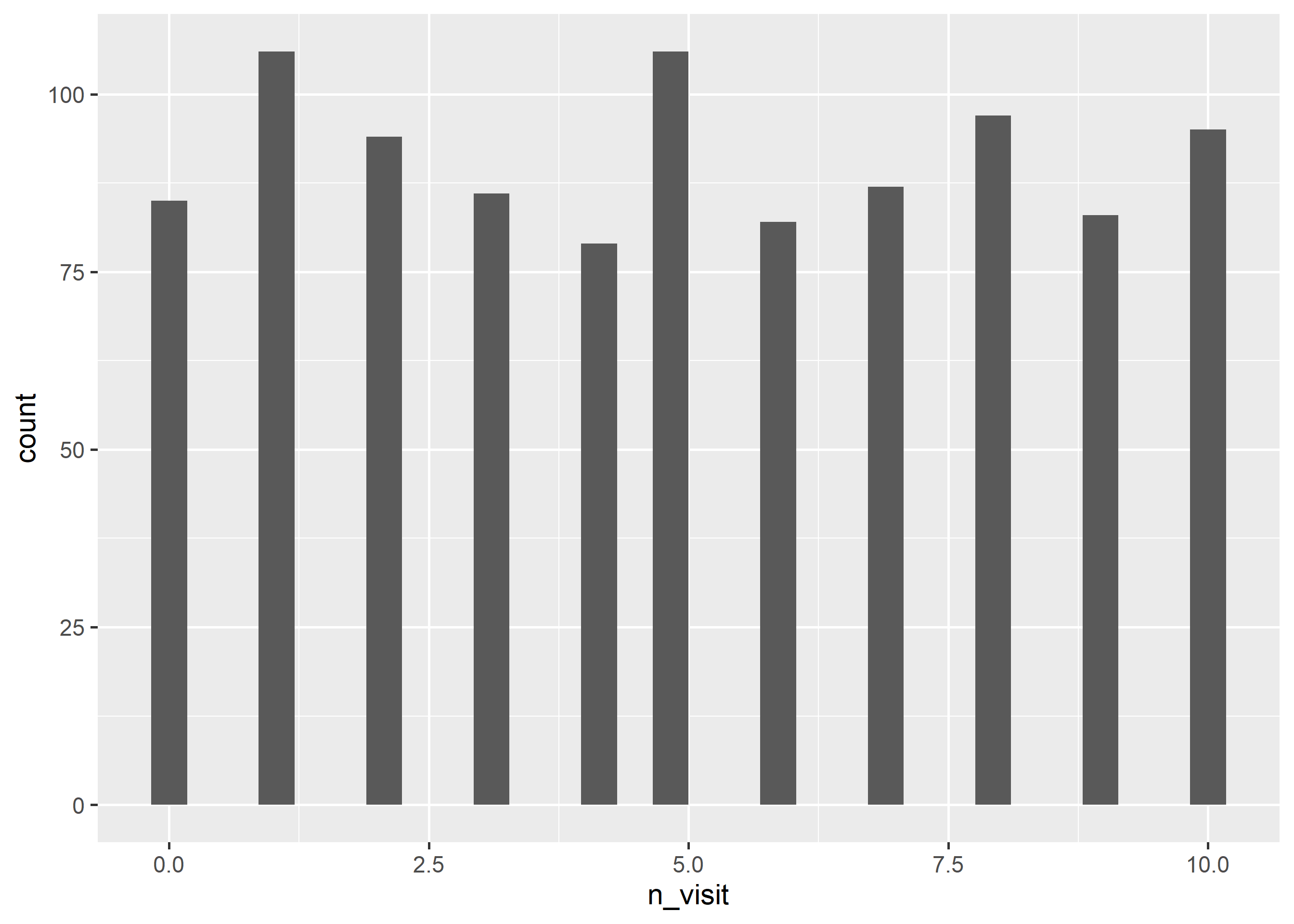
To create a histogram, we will use geom_histogram() and specify the variable name within aes(). In the below example, we create histogram of the variable n_visit.
ggplot(ecom) +geom_histogram(aes(n_visit))
10.3.1 Specify Bins
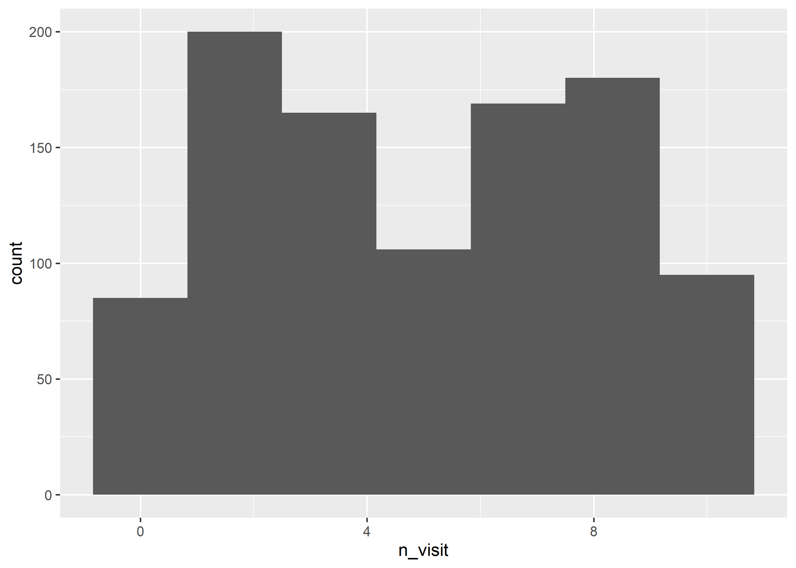
The default number of bins in ggplot2 is 30. You can modify the number of bins using the bins argument. In the below example, we create a histogram with 7 bins.
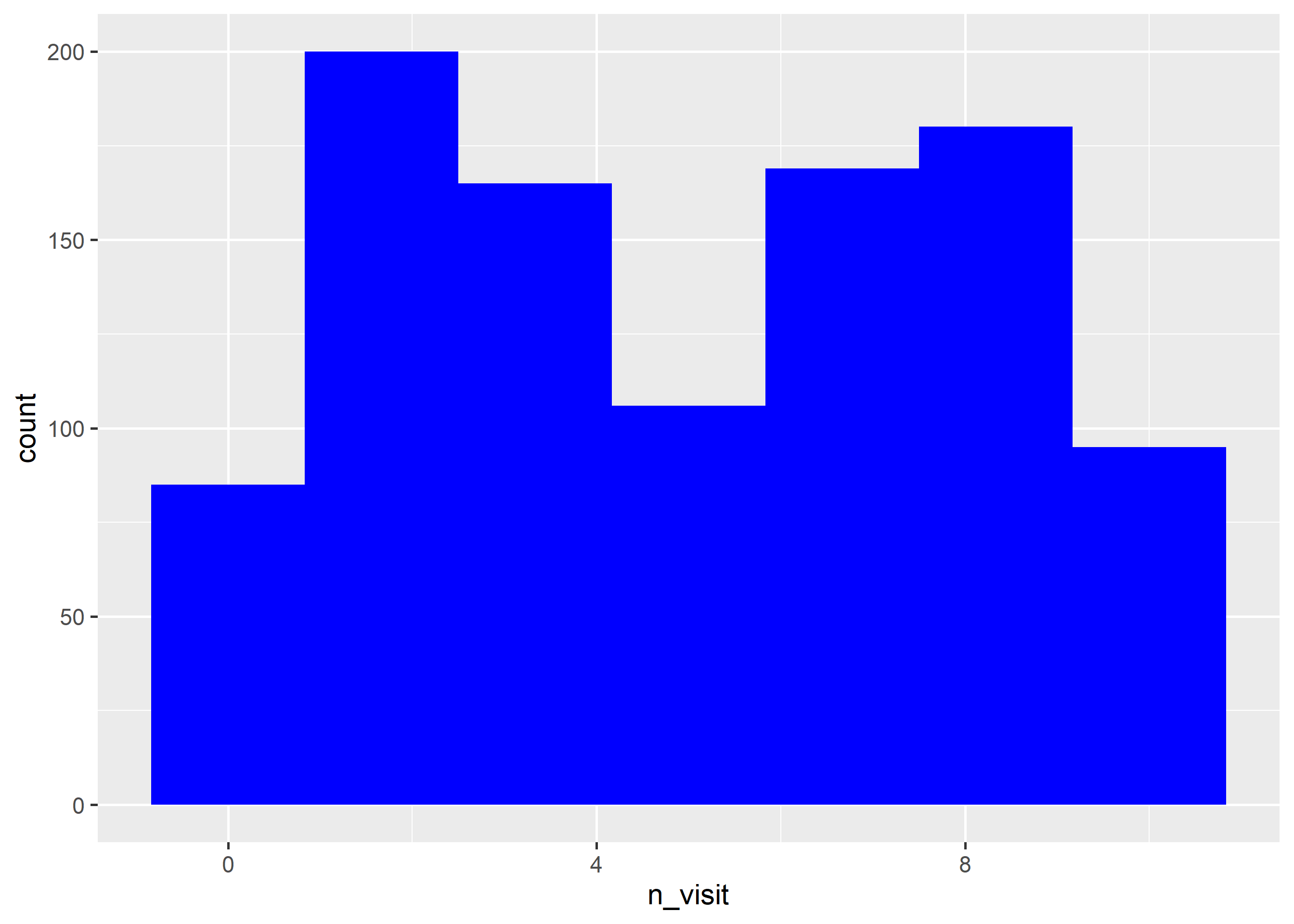
Now that we know how to create a histogram, let us learn to modify its appearance. We will begin with the background color. Use the fill argument to modify the background color of the histogram. In the below case, we change the color of the histogram to ‘blue’.
ggplot(ecom) +geom_histogram(aes(n_visit), bins =7, fill ='blue')
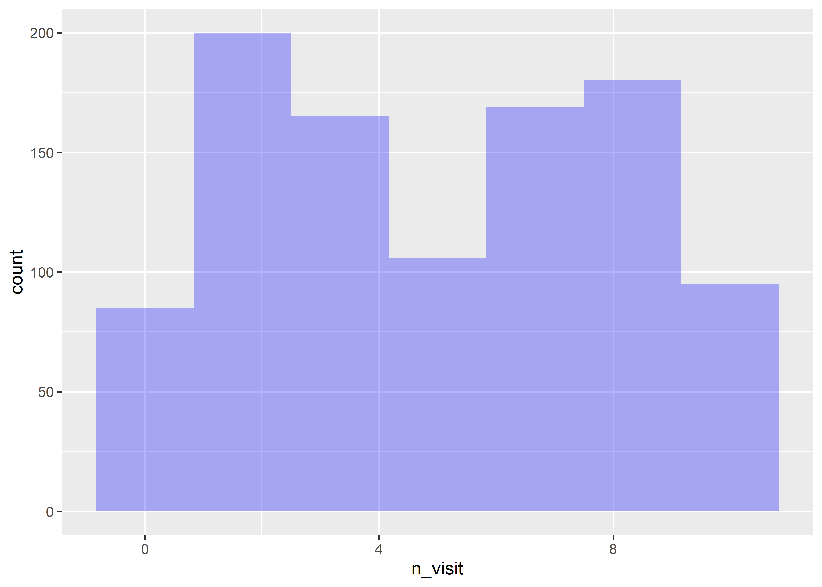
As we have learnt before, the transparency of the background color can be modified using the alpha argument. It can take any value between 0 and 1.
ggplot(ecom) +geom_histogram(aes(n_visit), bins =7, fill ='blue', alpha =0.3)
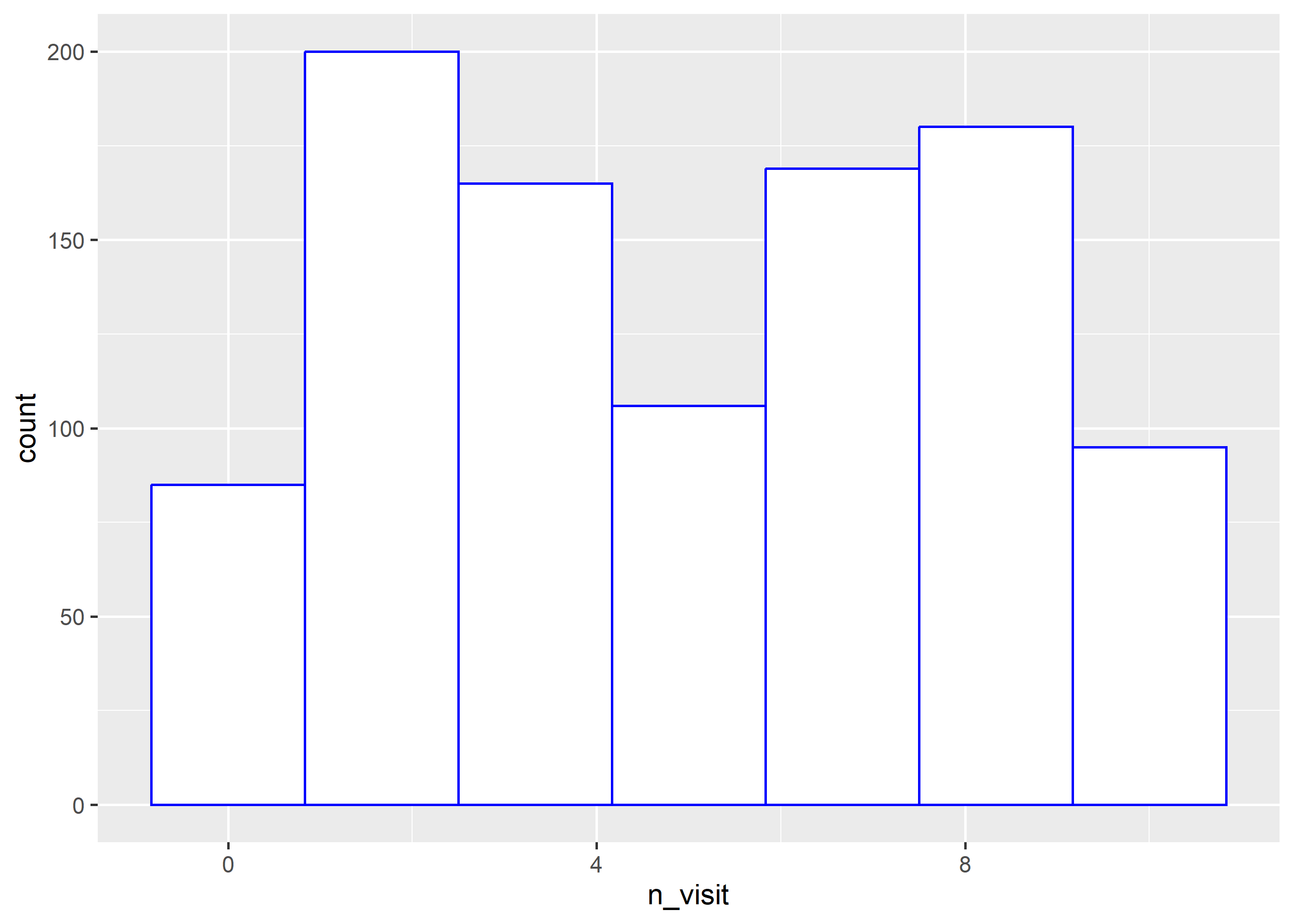
The color of the histogram border can be modified using the color argument. The color can be specified either using its name or the associated hex code.
ggplot(ecom) +geom_histogram(aes(n_visit), bins =7, fill ='white', color ='blue')
10.5 Putting it all together
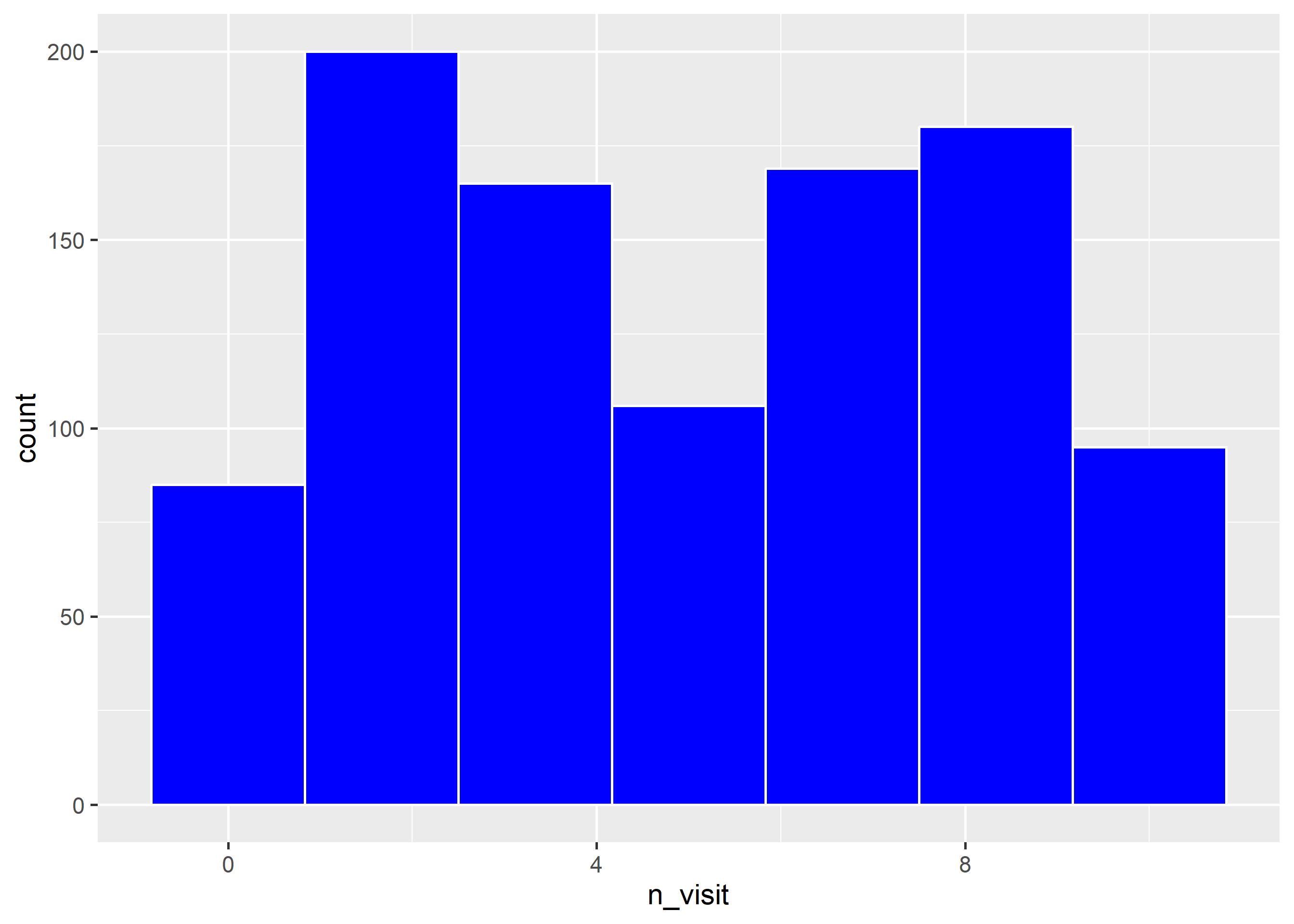
Let us modify the bins, the background and border color of the histogram in the below example.
ggplot(ecom) +geom_histogram(aes(n_visit), bins =7, fill ='blue', color ='white')
10.6 Bin Width
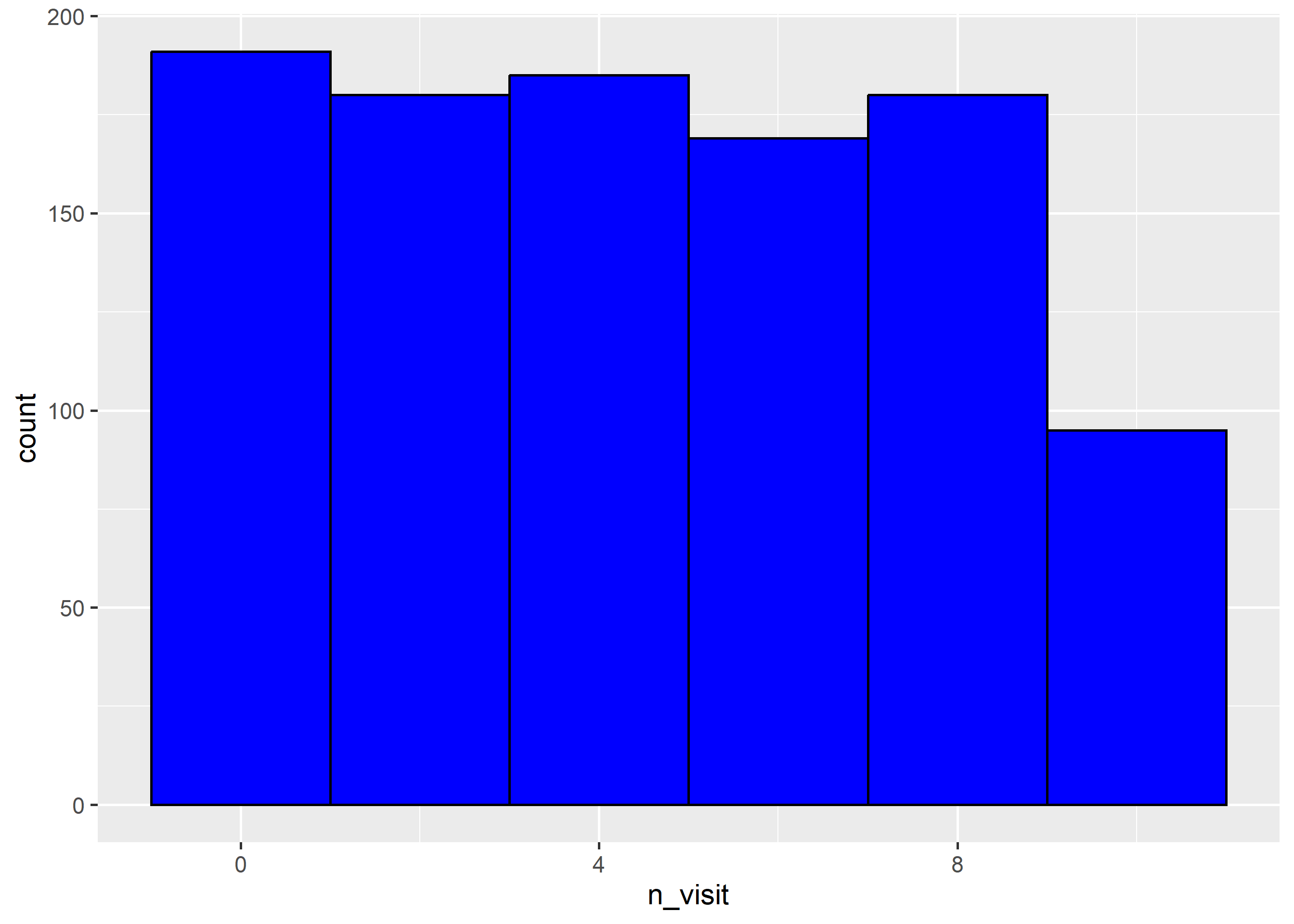
Another way to control the number of bins in a histogram is by using the binwidth argument. In this case, we specify the width of the bins instead of the number of bins. As you can see, in the below example, we do not use the bins argument when using the binwidth argument. You can use either of them but not both.
ggplot(ecom) +geom_histogram(aes(n_visit), binwidth =2, fill ='blue', color ='black')
10.7 Line Type
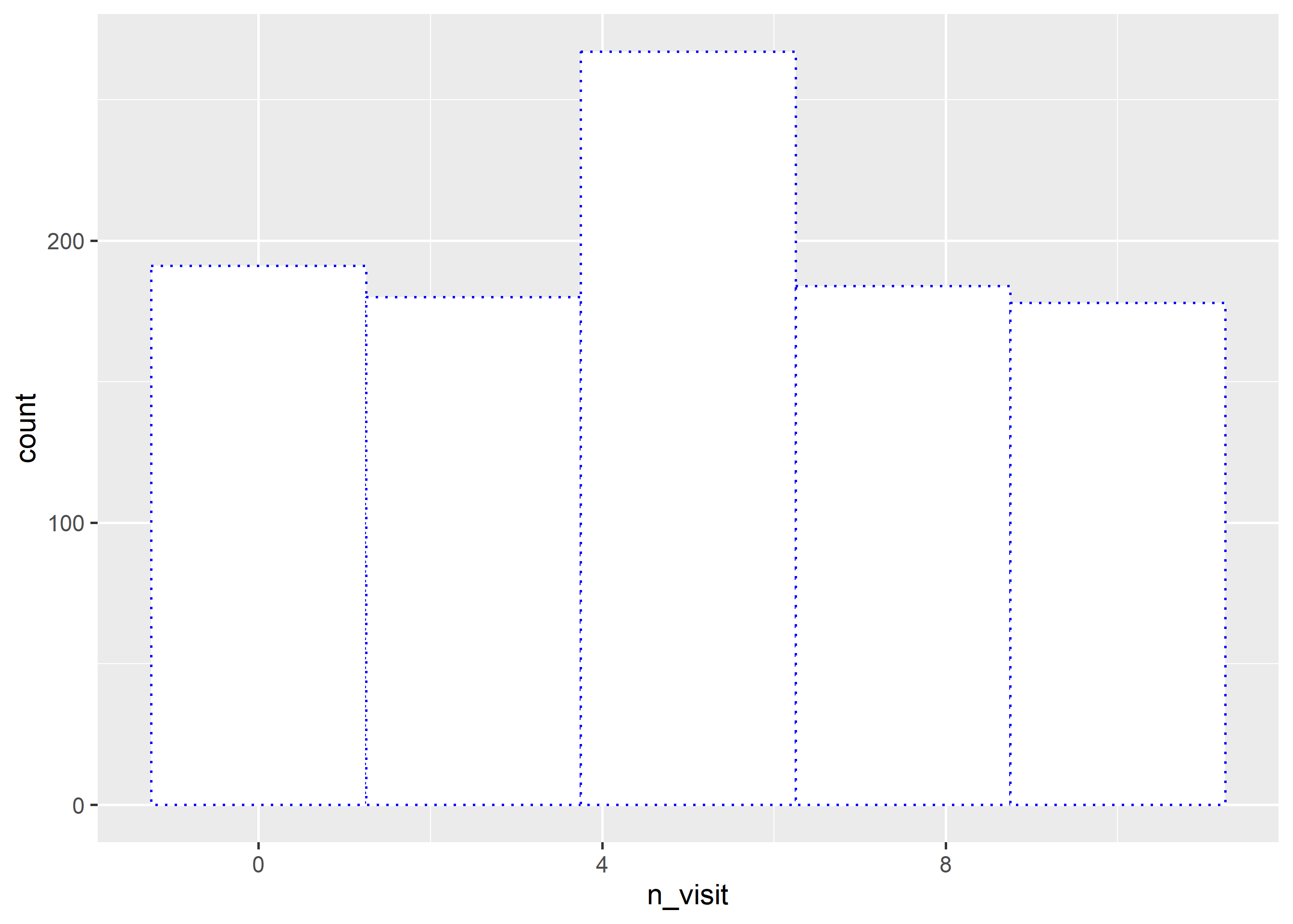
The line type of the histogram border can be modified using the linetype argument. It can take any integer value between 0 and 6.
ggplot(ecom) +geom_histogram(aes(n_visit), bins =5, fill ='white', color ='blue', linetype =3)
10.8 Line Size
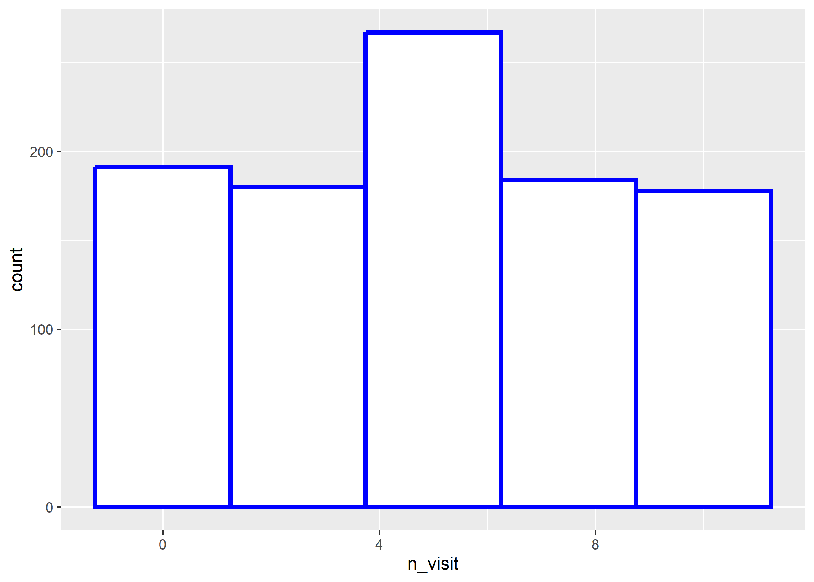
Use the linewidth argument to modify the width of the border of the histogram bins. It can take any value greater than 0.
ggplot(ecom) +geom_histogram(aes(n_visit), bins =5, fill ='white', color ='blue', linewidth =1.25)
10.9 Map Variables
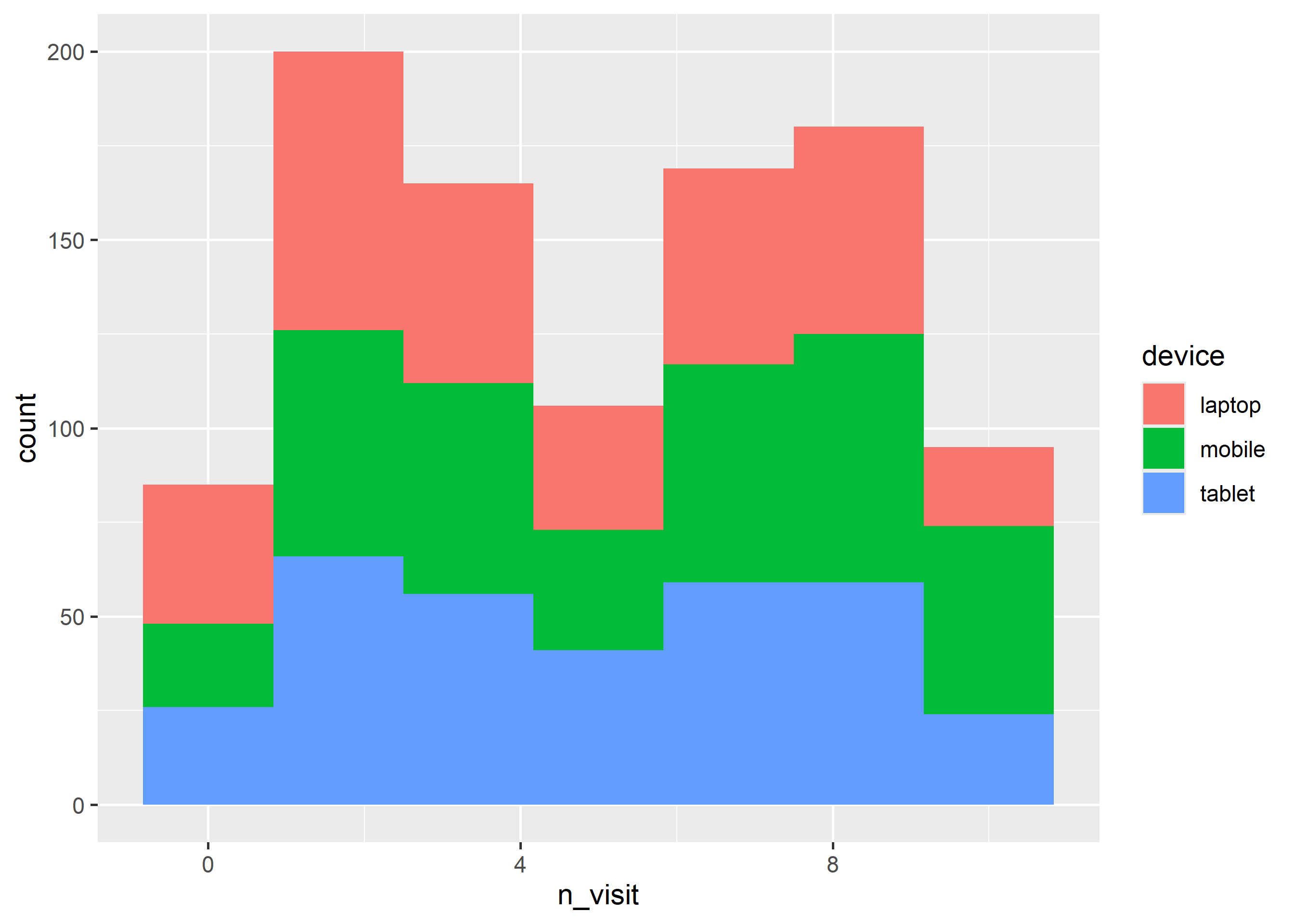
You can map the aesthetics to variables as well. In the below example, we map fill to the device variable. You can try mapping color, linetype and linewidth to variables as well.
ggplot(ecom) +geom_histogram(aes(n_visit, fill = device), bins =7)
10.10 Exercises
Draw the mpg distribution from mtcars with 10 bins.
Map density instead of counts using after_stat().
Rewrite the plot with a message-first title and labeled axes.
Worked solutions in solutions/histogram.md (attempt first).
Where to go next
ggplot2 book (ggplot2-book.org) for theory behind this layer
Claus Wilke, Fundamentals of Data Visualization, for perception guidance