Aesthetics map variables to position, color, size and shape so patterns pop out.
WarningCommon pitfall
Putting a constant inside aes() (e.g. aes(color=‘red’)) creates a bogus legend; constants belong outside aes().
In this chapter, we will focus on the aesthetics i.e. color, shape, size, alpha, line type, line width etc. We can map these to variables or specify values for them. If we want to map the above to variables, we have to specify them within the aes() function. We will look at both methods in the following sections.
Explore aesthetics such as
color
shape
size
fill
alpha
width
3.2 Libraries, Code & Data
We will use the following libraries in this chapter:
# A tibble: 1,000 × 11
      id referrer device bouncers n_visit n_pages duration country      purchase
   <dbl> <chr>    <chr>  <lgl>      <dbl>   <dbl>    <dbl> <chr>        <lgl>
 1     1 google   laptop TRUE          10       1      693 Czech Repub… FALSE
 2     2 yahoo    tablet TRUE           9       1      459 Yemen        FALSE
 3     3 direct   laptop TRUE           0       1      996 Brazil       FALSE
 4     4 bing     tablet FALSE          3      18      468 China        TRUE
 5     5 yahoo    mobile TRUE           9       1      955 Poland       FALSE
 6     6 yahoo    laptop FALSE          5       5      135 South Africa FALSE
 7     7 yahoo    mobile TRUE          10       1       75 Bangladesh   FALSE
 8     8 direct   mobile TRUE          10       1      908 Indonesia    FALSE
 9     9 bing     mobile FALSE          3      19      209 Netherlands  FALSE
10    10 google   mobile TRUE           6       1      208 Czech Repub… FALSE
# ℹ 990 more rows
# ℹ 2 more variables: order_items <dbl>, order_value <dbl>
3.2.2 Data Dictionary
id: row id
referrer: referrer website/search engine
device: device used to visit the website
bouncers: whether the visit bounced (single page viewed)
n_visit: number of visits
n_pages: number of pages visited
duration: time spent on the website (in seconds)
country: country of origin
purchase: whether visitor purchased
order_items: number of items ordered
order_value: order value of visitor (in dollars)
3.3 Color
In ggplot2, when we mention color or colour, it usually refers to the color of the geoms. The fill argument is used to specify the color of the shapes in certain cases. In this first section, we will see how we can specify the color for the different geoms we learnt in the previous chapter.
3.3.1 Point
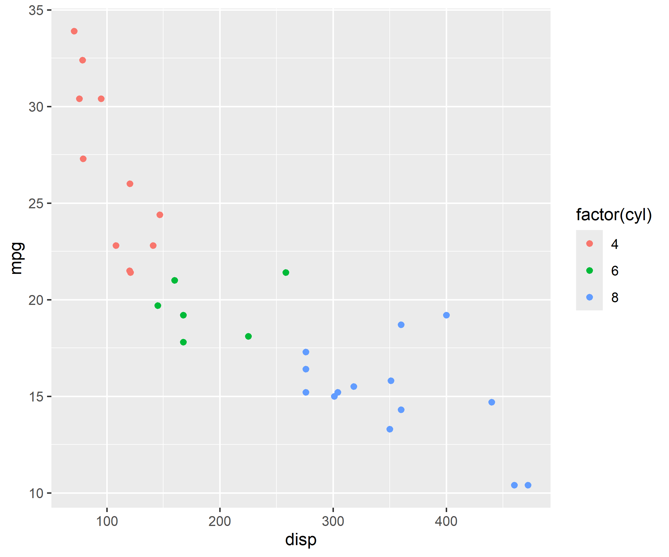
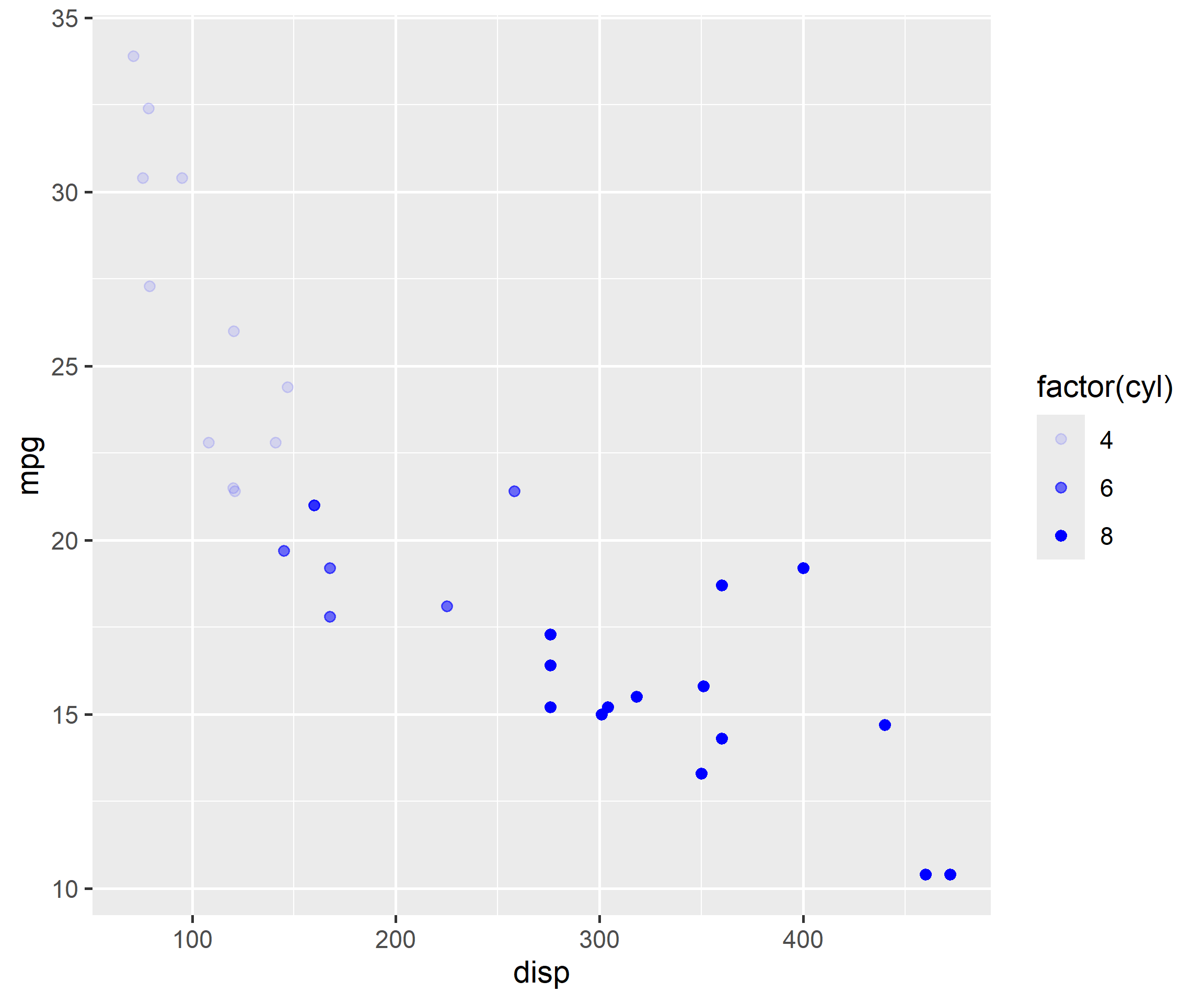
For points, the color argument specifies the color of the point for certain shapes and border for others. The fill argument is used to specify the background for some shapes and will not work with other shapes. Let us look at an example:
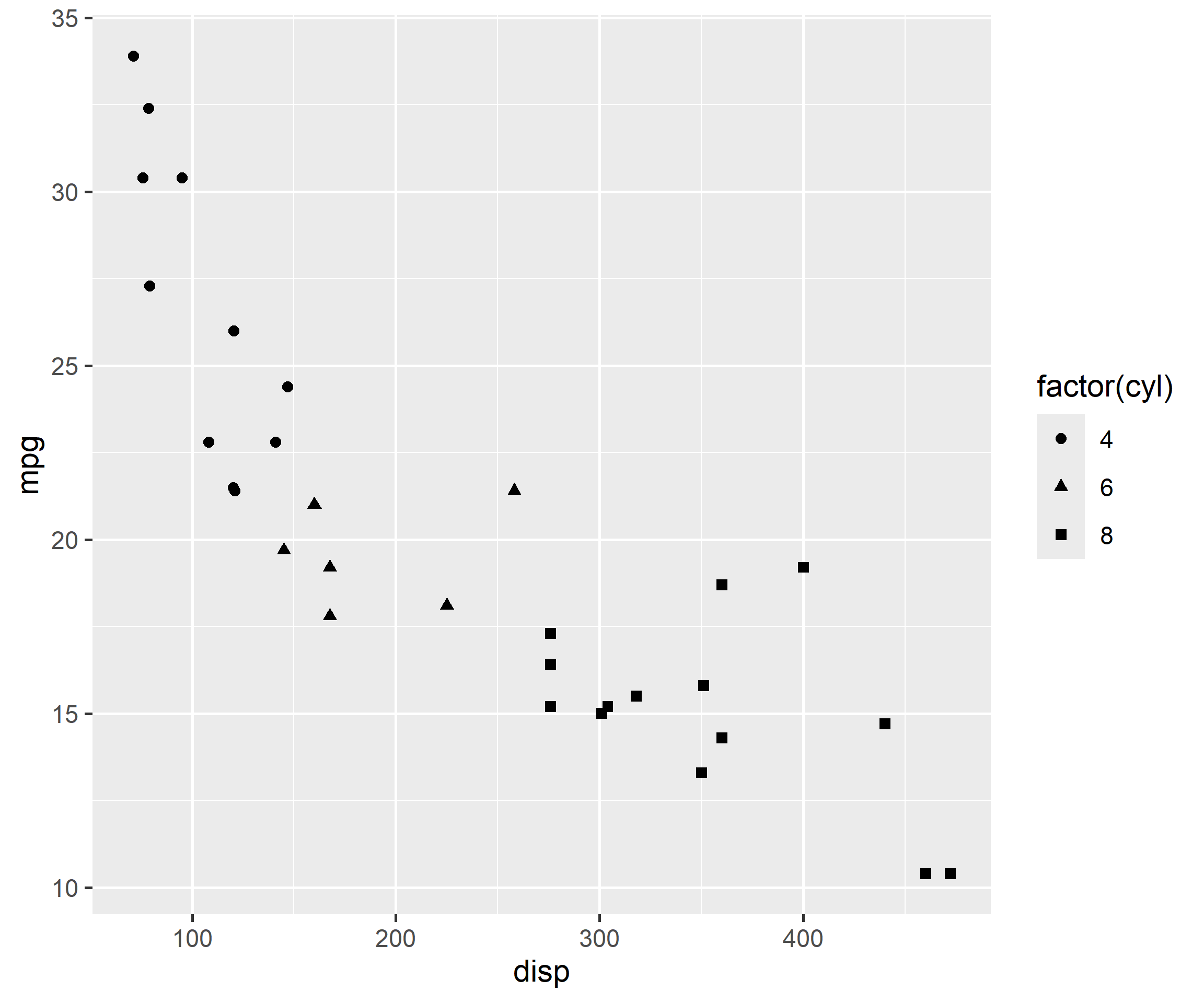
ggplot(mtcars, aes(x = disp, y = mpg, color =factor(cyl))) +geom_point()
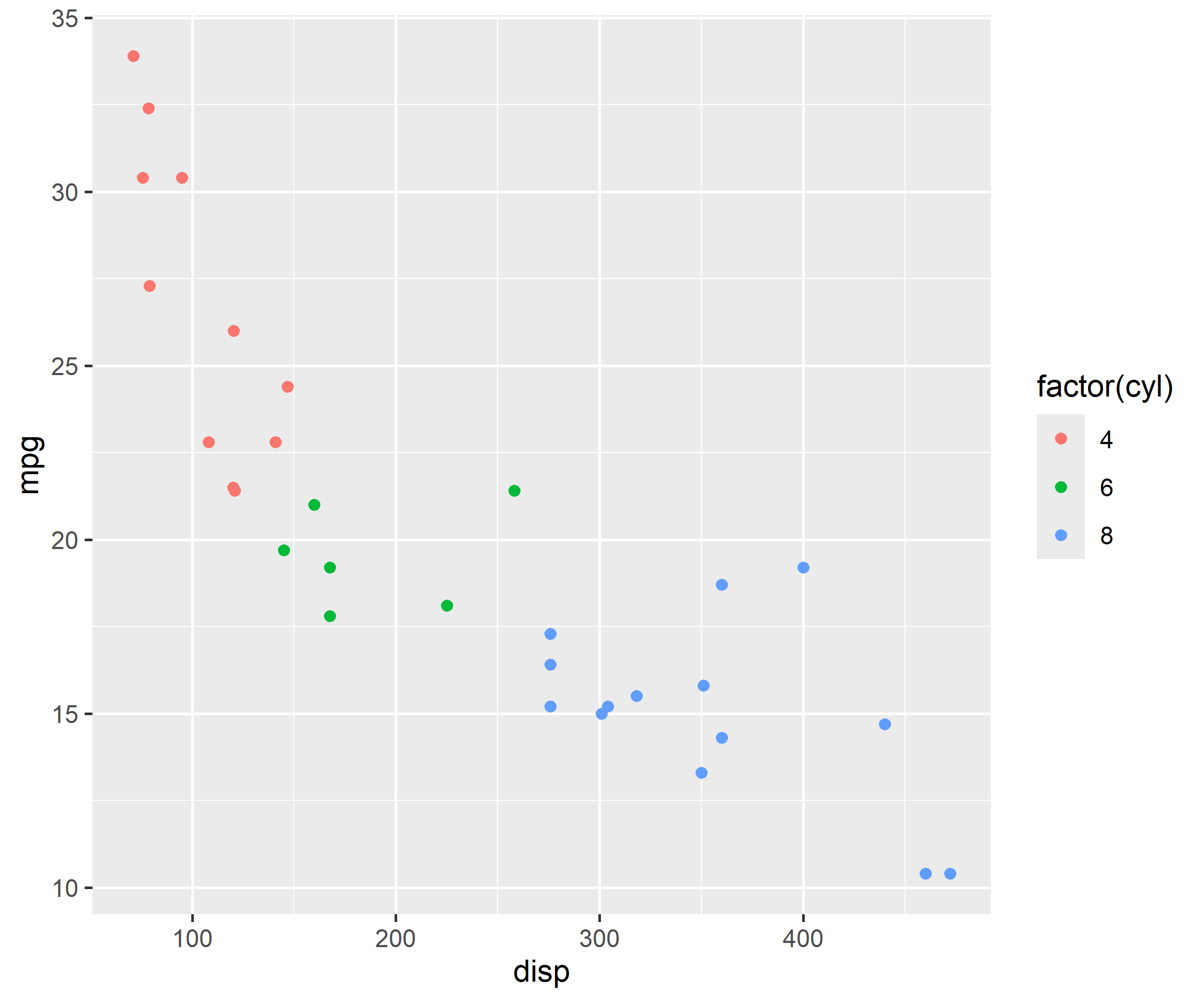
We can map the variable to color in the geom_point() function as well since it inherits the data from the ggplot() function.
ggplot(mtcars, aes(x = disp, y = mpg)) +geom_point(aes(color =factor(cyl)))
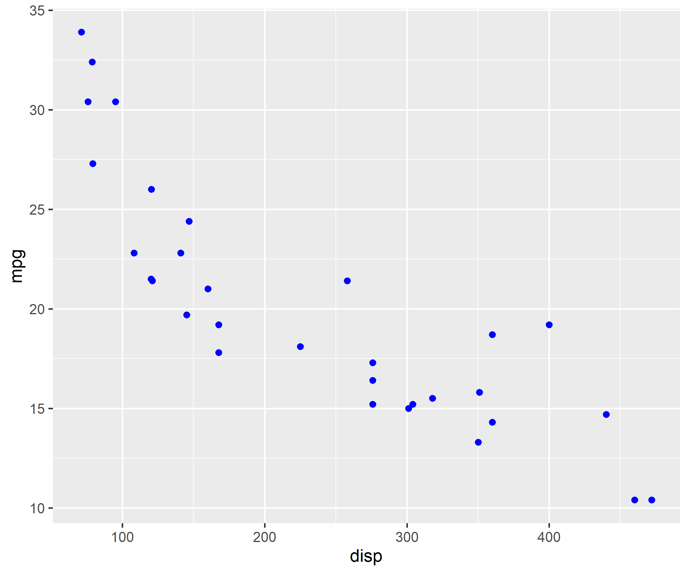
If you do not want to map a variable to color, you can specify it separately using the color argument but in this case it should be outside the aes() function.
ggplot(mtcars, aes(x = disp, y = mpg)) +geom_point(color ='blue')
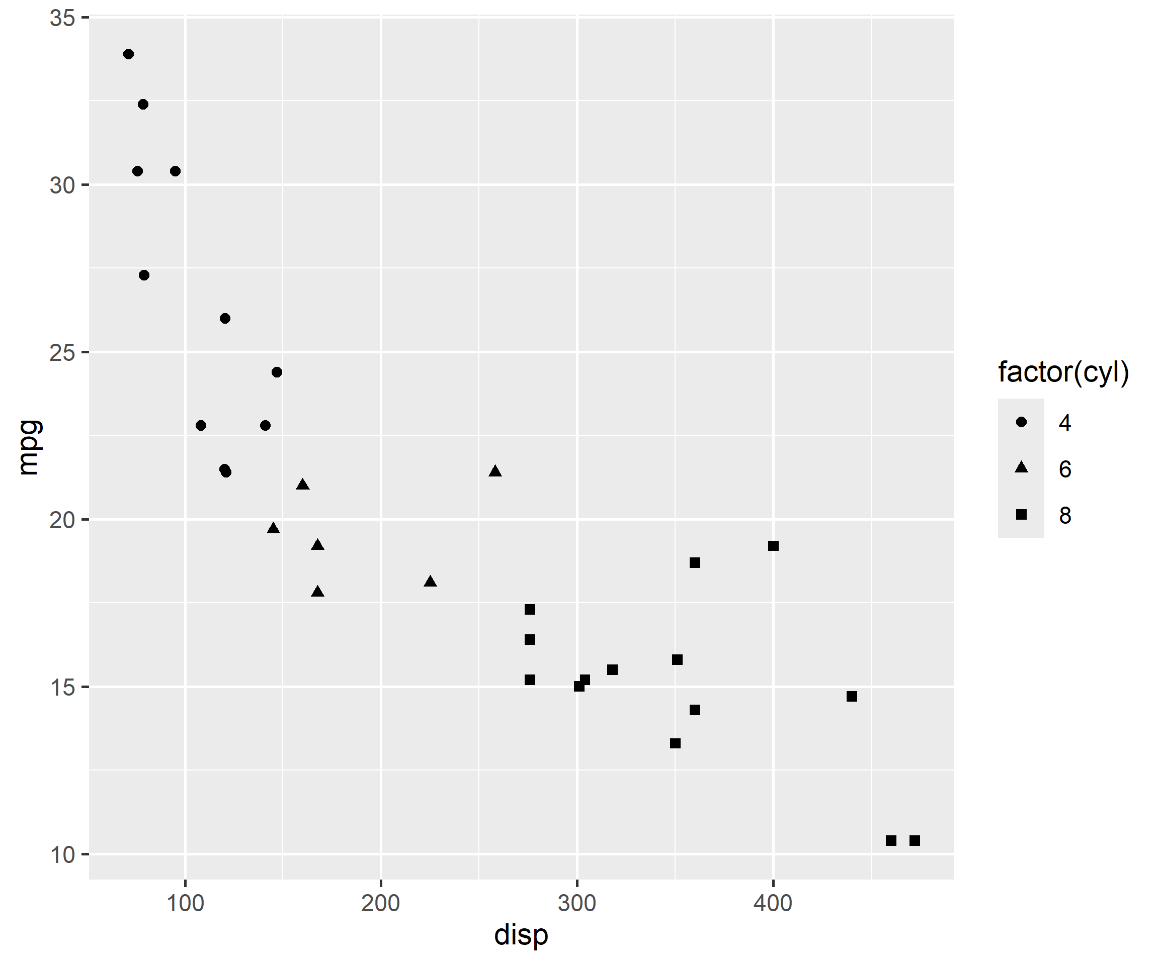
Now we will change the shape of the points to understand the difference between color and fill arguments. It can be again mapped to variables or values. Let us map shape to variables.
ggplot(mtcars, aes(x = disp, y = mpg, shape =factor(cyl))) +geom_point()
Let us map shape to cyl in the geom_point() function. Remember, when you are mapping an aesthetic to a variable, it must be inside aes().
ggplot(mtcars, aes(x = disp, y = mpg)) +geom_point(aes(shape =factor(cyl)))
Instead of mapping shape to a variable, let us specify a value for shape. In this case, shape is not wrapped inside aes() as we are not mapping it to a variable.
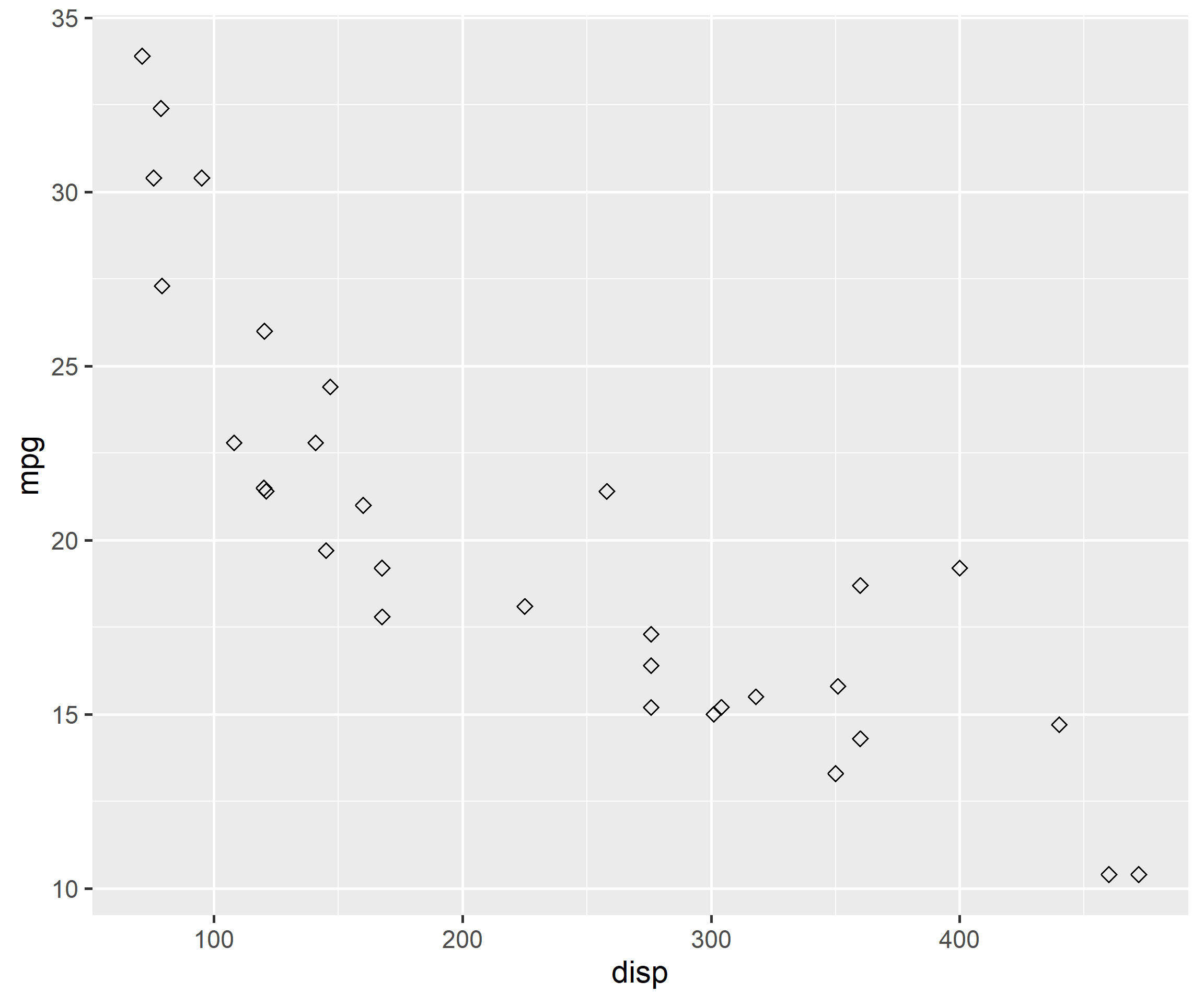
ggplot(mtcars, aes(x = disp, y = mpg)) +geom_point(shape =5)
Let us specify a color for the point using color argument.
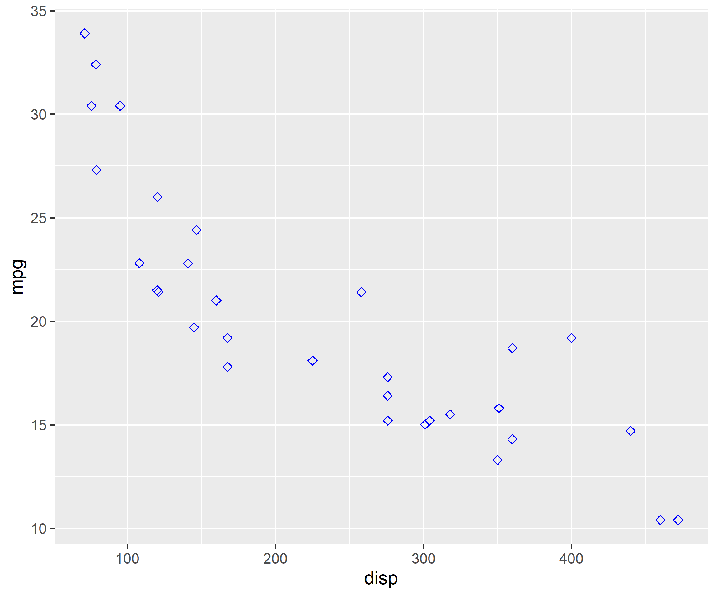
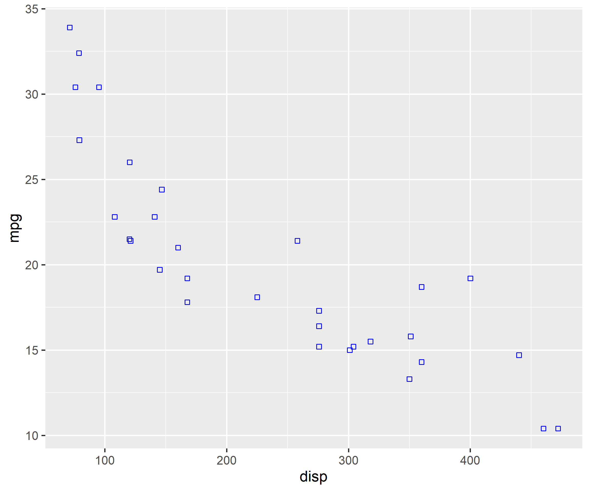
ggplot(mtcars, aes(x = disp, y = mpg)) +geom_point(shape =5, color ='blue')
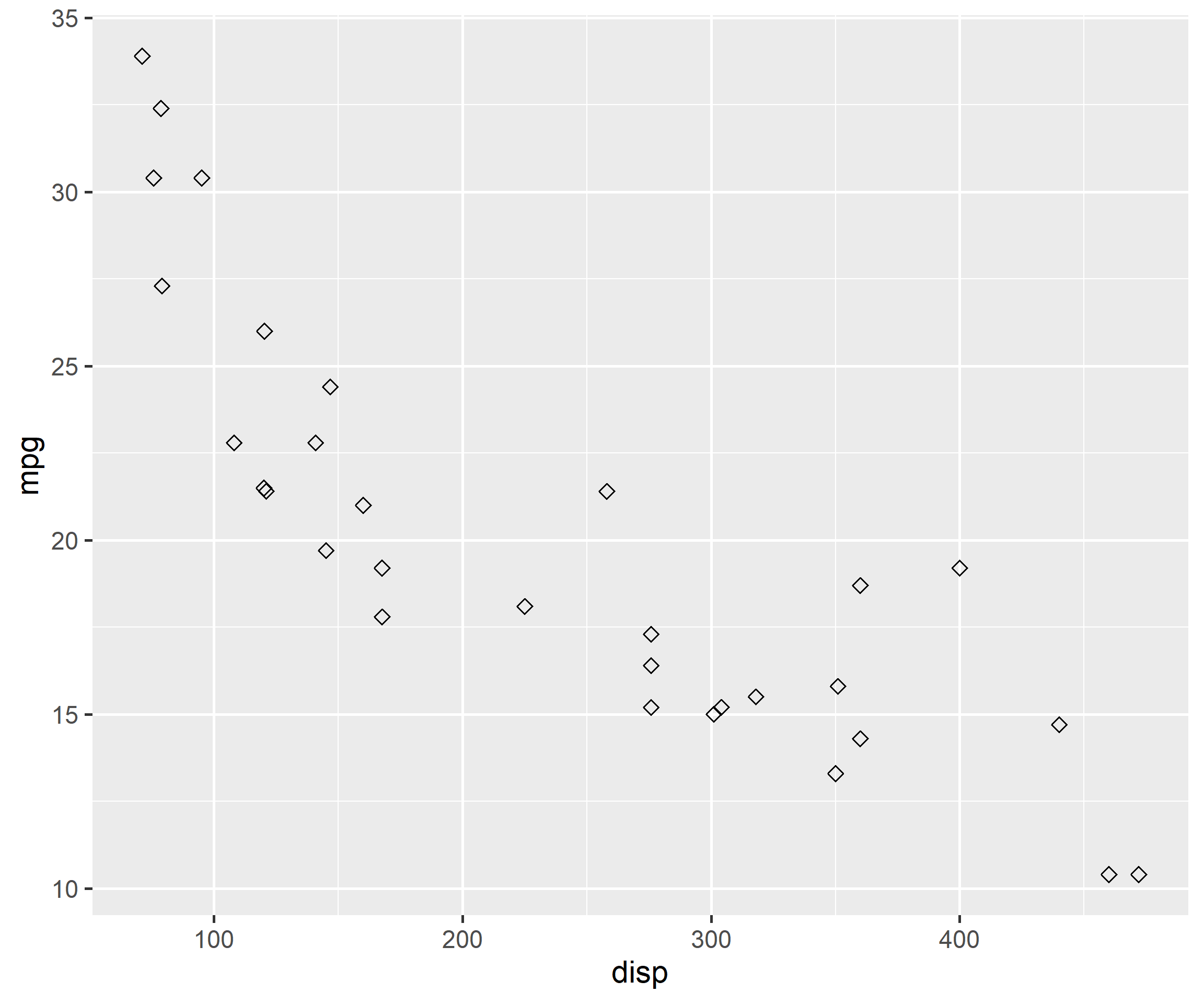
Background color cannot be added for all shapes. In the below example, we try to modify the background color using the fill argument but it does not work.
ggplot(mtcars, aes(x = disp, y = mpg)) +geom_point(shape =5, fill ='blue')
Since the shape number is now greater than 21, fill argument will add background color in the below case.
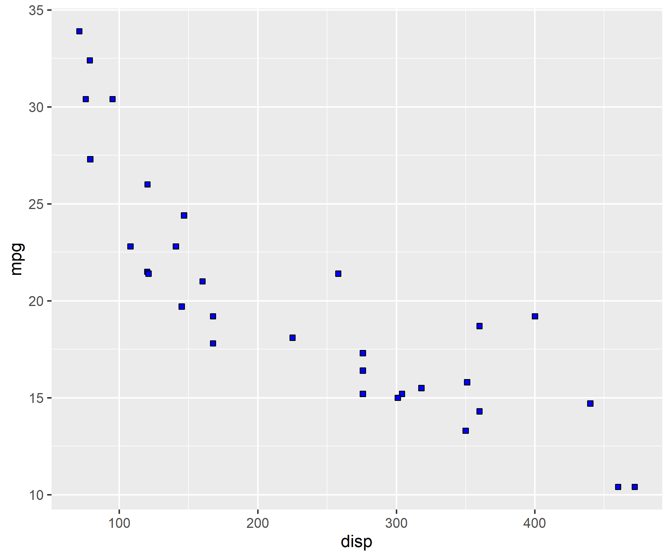
ggplot(mtcars, aes(x = disp, y = mpg)) +geom_point(shape =22, fill ='blue')
In shapes greater than number 21, color argument will modify the border of the shape.
ggplot(mtcars, aes(x = disp, y = mpg)) +geom_point(shape =22, color ='blue')
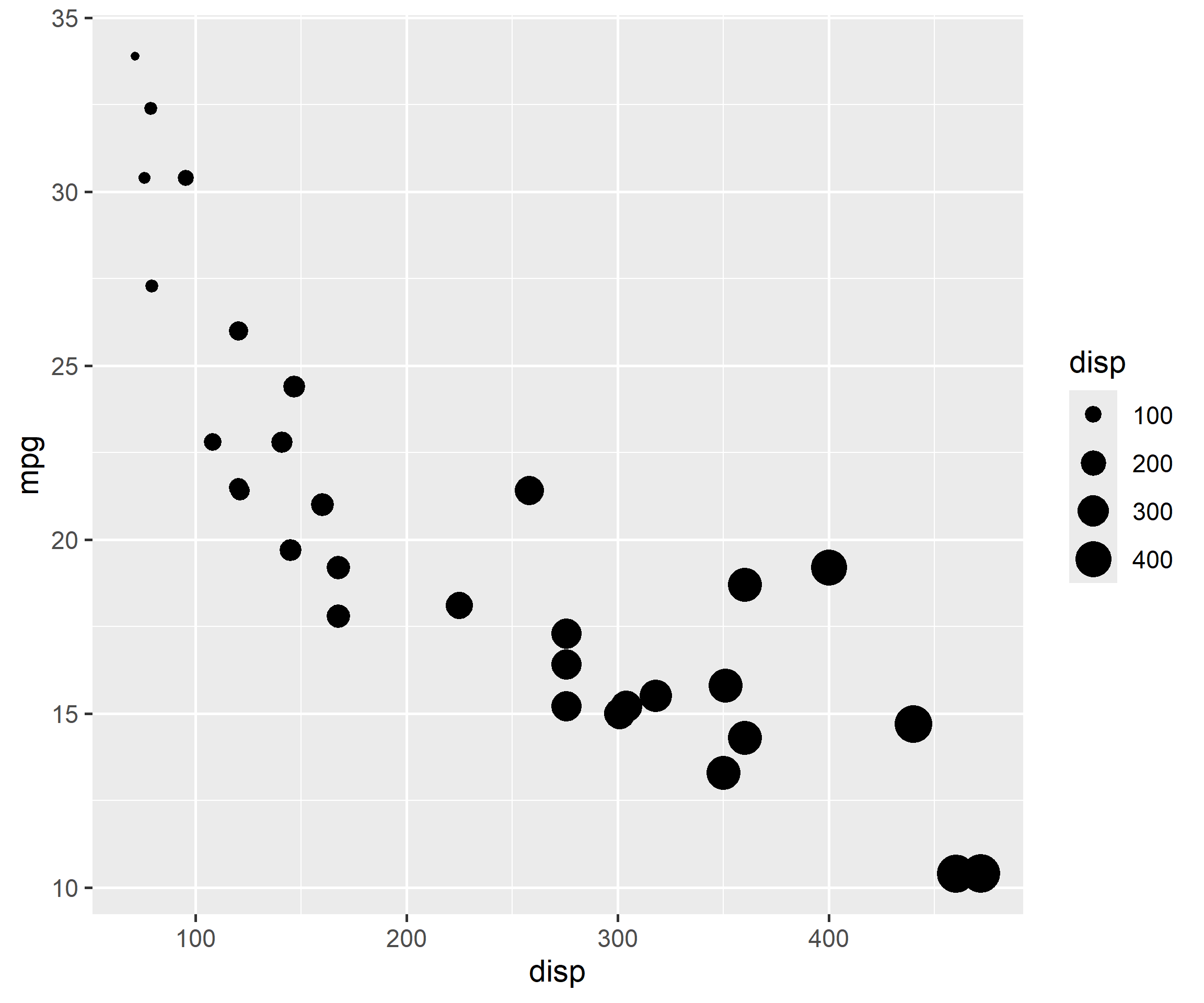
Let us map size of points to a variable. It is advised to map size only to continuous variables and not categorical variables.
If you map size to categorical variables, ggplot2 will throw a warning.
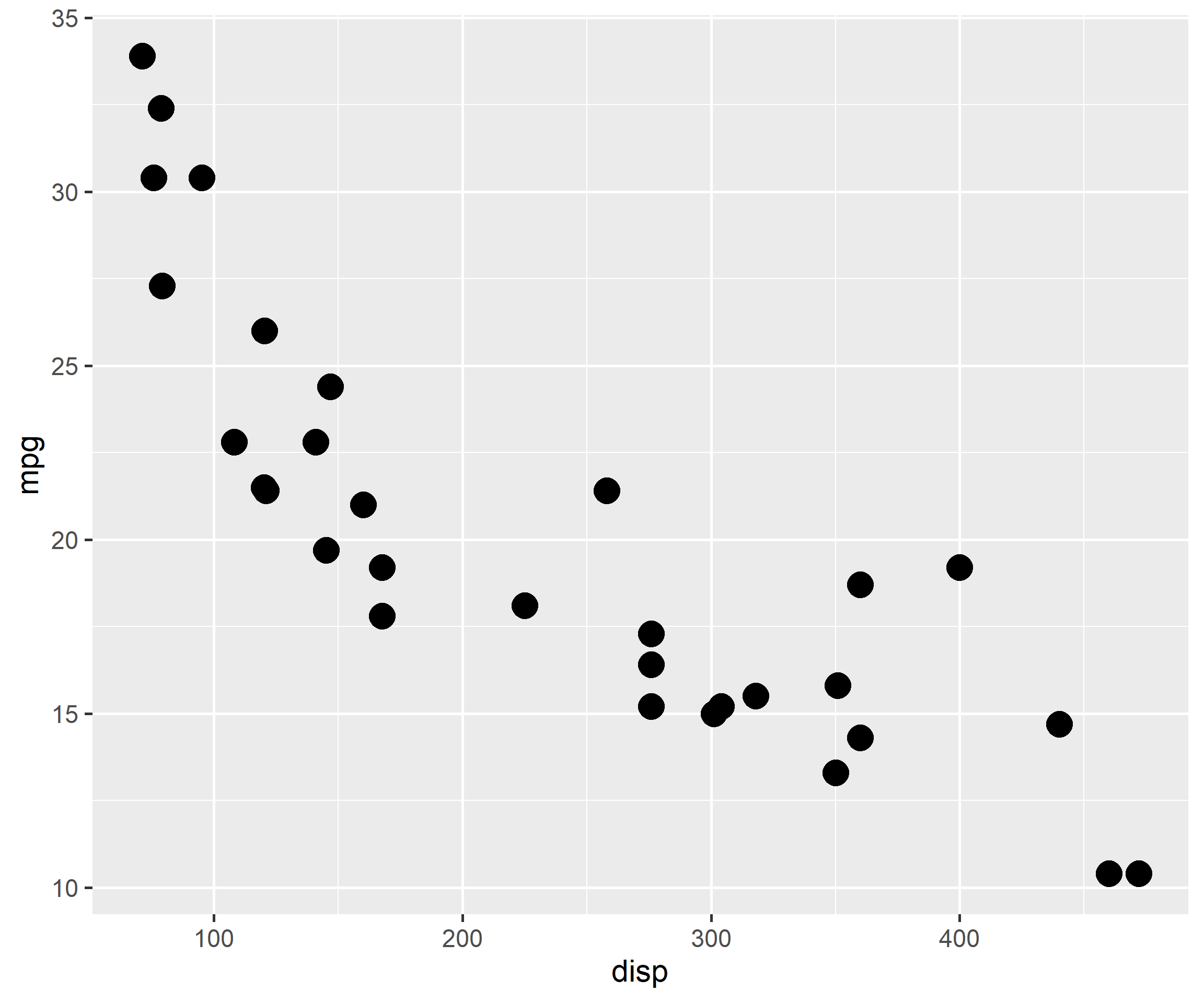
ggplot(mtcars, aes(x = disp, y = mpg)) +geom_point(size =4)
To modify the opacity of the color, use the alpha argument.
ggplot(mtcars, aes(x = disp, y = mpg)) +geom_point(aes(alpha =factor(cyl)), color ='blue')
3.4 Line Chart
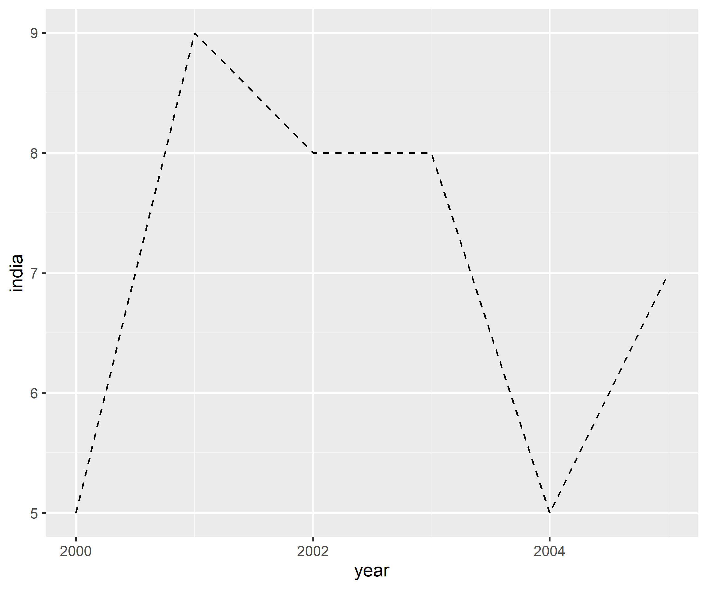
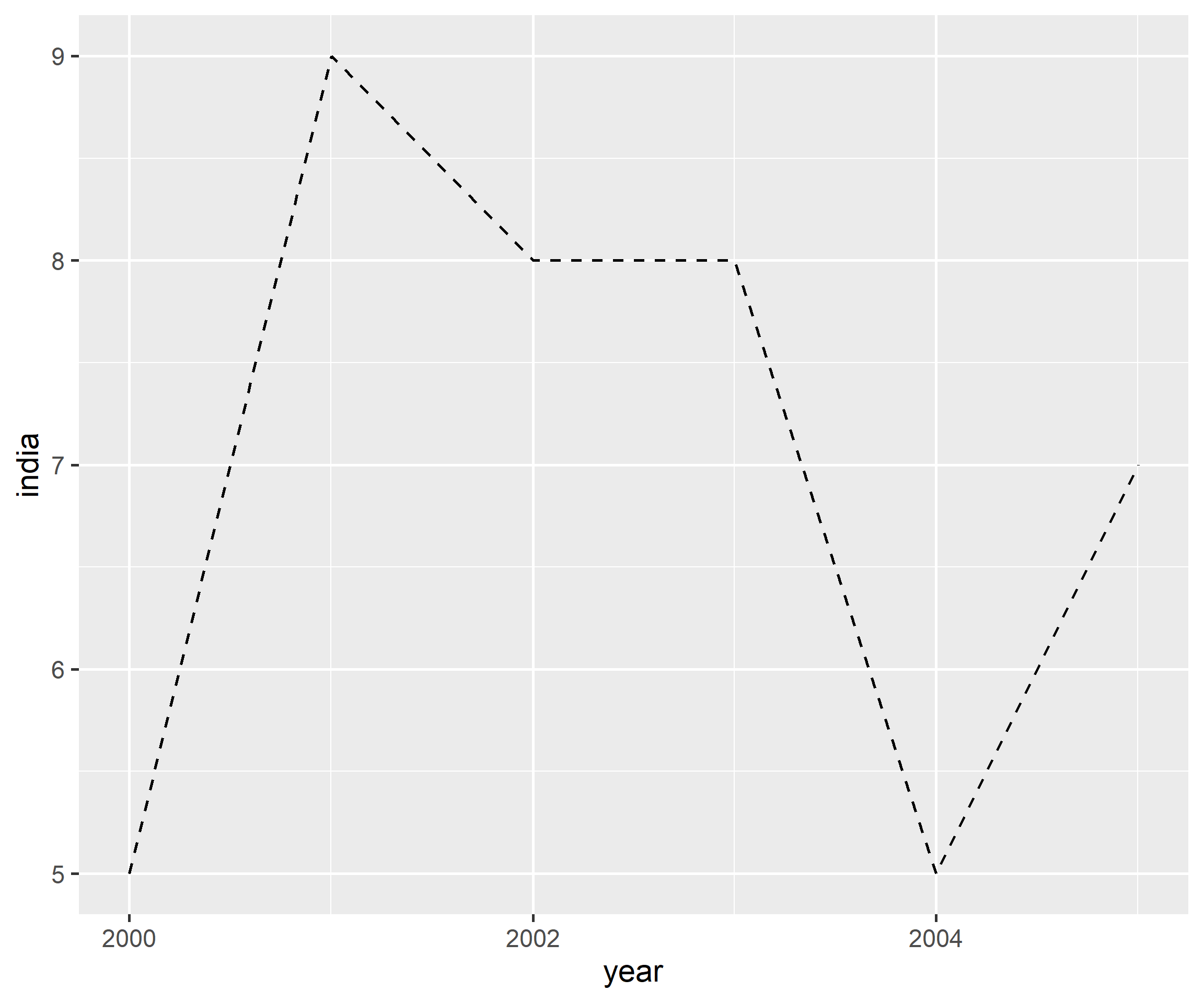
So far we have focussed on geom_point() to learn how to map aesthetics to variables. To explore line type and line width, we will use geom_line(). In the previous chapter, we used geom_line() to build line charts. Now we will modify the appearance of the line. In the section below, we will specify values for color, line type and width. In the next section, we will map the same to variables in the data. We will use a new data set. You can download it from here. It contains GDP (Gross Domestic Product) growth data for the BRICS (Brazil, Russia, India, China, South Africa) for the years 2000 to 2005.
3.4.1 Data
gdp <- readr::read_csv('https://raw.githubusercontent.com/rsquaredacademy/datasets/master/gdp.csv')
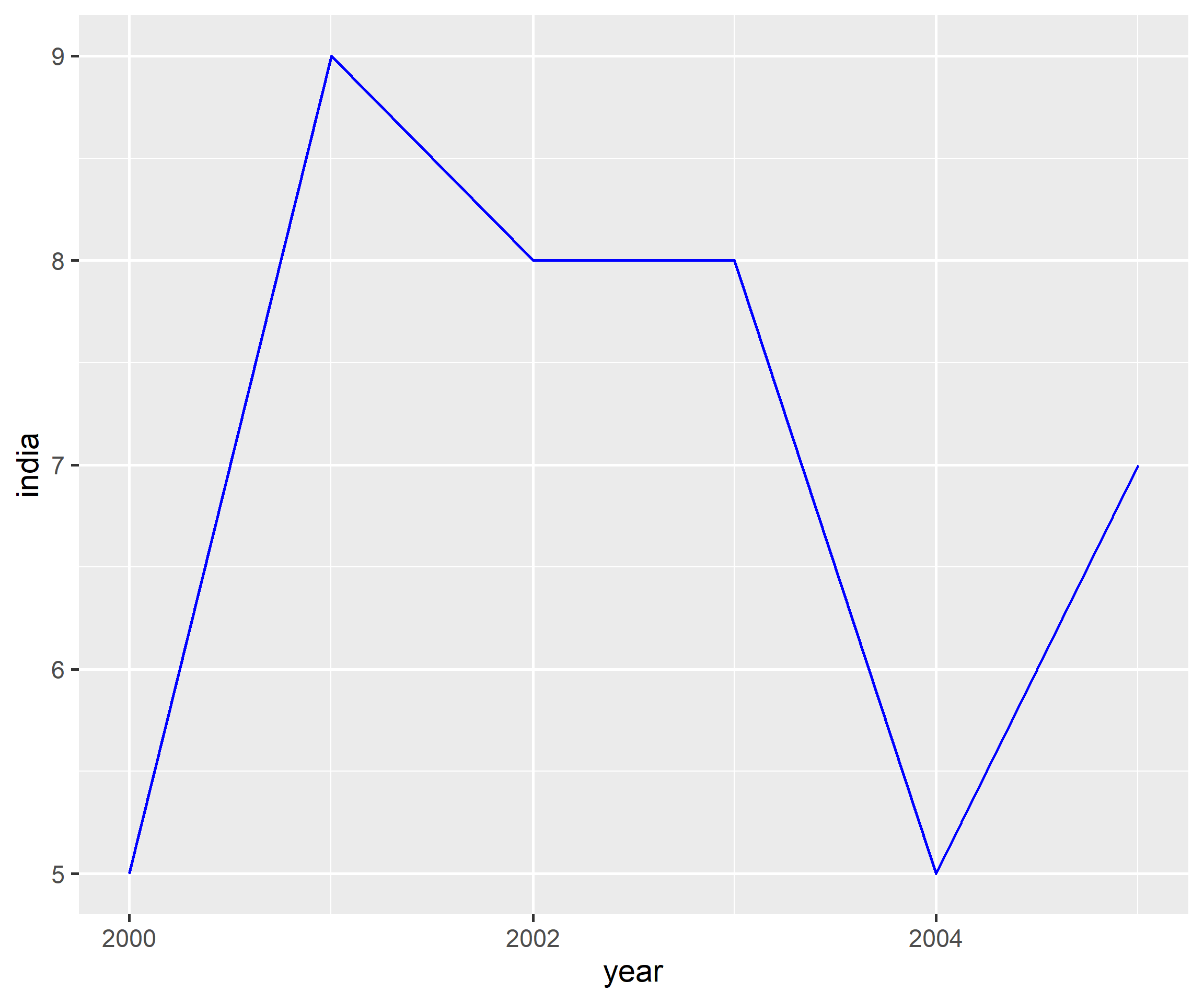
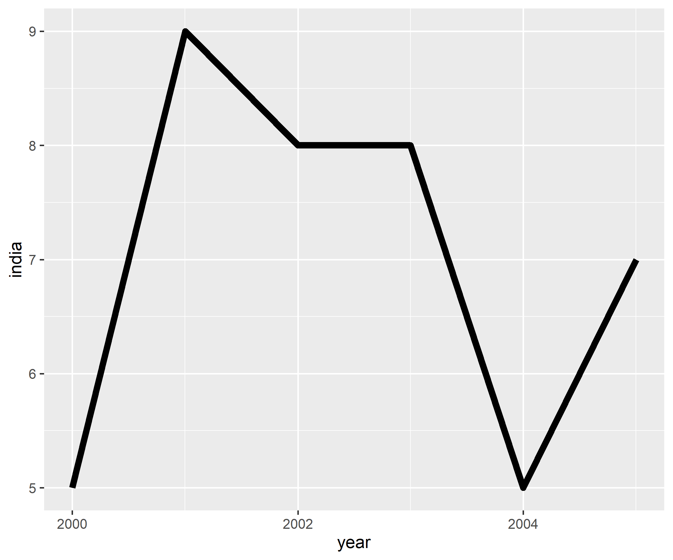
A line chart can be created using geom_line(). In the below example, we examine the GDP trend of India and modify the color of the line to 'blue'.
Now let us map the aesthetics to the variables. The data used in the above example cannot be used as we need a variable with country names. We will use pivot_longer() function from the tidyr package to reshape the data.
gdp2 <- gdp |>select(year, growth, india, china) |> tidyr::pivot_longer(cols =-year, names_to ="country", values_to ="gdp")gdp2
# A tibble: 18 × 3
   year       country   gdp
   <date>     <chr>   <dbl>
 1 2000-01-01 growth      6
 2 2000-01-01 india       5
 3 2000-01-01 china       8
 4 2001-01-01 growth      9
 5 2001-01-01 india       9
 6 2001-01-01 china       5
 7 2002-01-01 growth      8
 8 2002-01-01 india       8
 9 2002-01-01 china       6
10 2003-01-01 growth      9
11 2003-01-01 india       8
12 2003-01-01 china       8
13 2004-01-01 growth      9
14 2004-01-01 india       5
15 2004-01-01 china       9
16 2005-01-01 growth      8
17 2005-01-01 india       7
18 2005-01-01 china       8
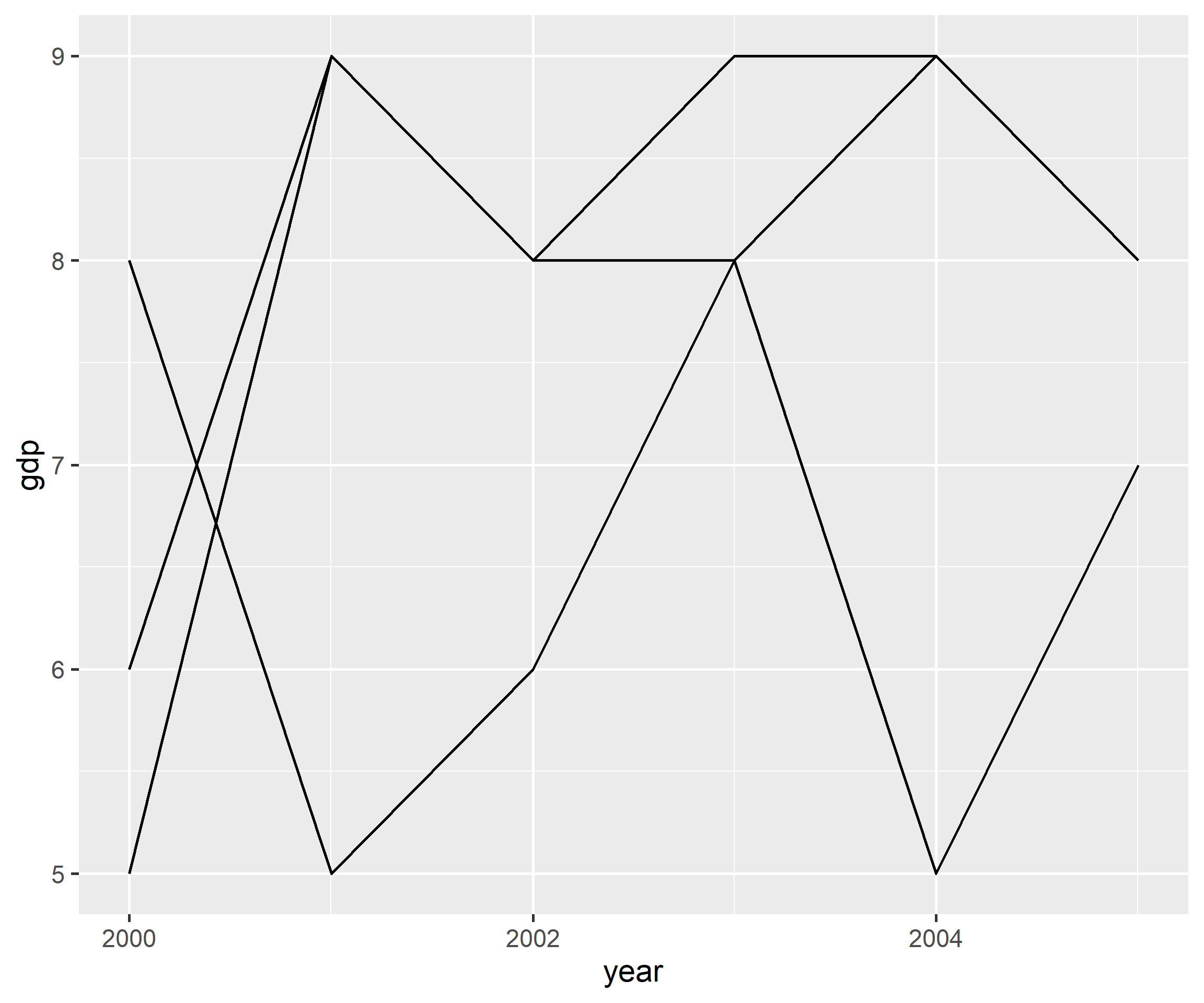
To map the aesthetics to a variable, we must use the group argument. In the below example, we map the aesthetics to country. But we cannot distinguish between the lines as their color, width and line type are the same. We have easily plotted the GDP trend of all countries using the group argument. Now, let us ensure that we can distinguish and identidy them using different aesthetics.
ggplot(gdp2, aes(year, gdp, group = country)) +geom_line()
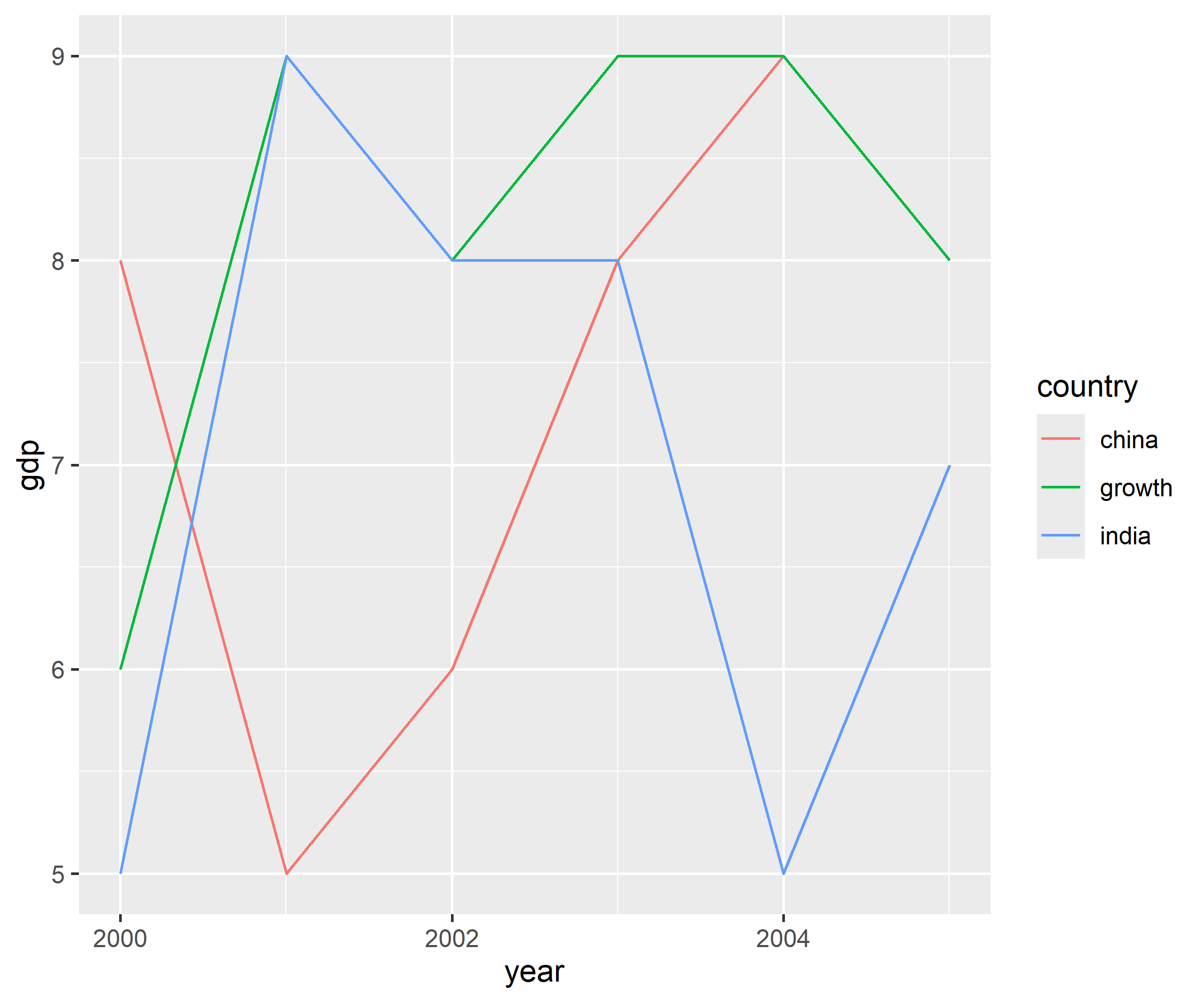
Let us begin by ensuring that the lines have different color using the color argument within aes() and assigning it the variable country.
ggplot(gdp2, aes(year, gdp, group = country)) +geom_line(aes(color = country))
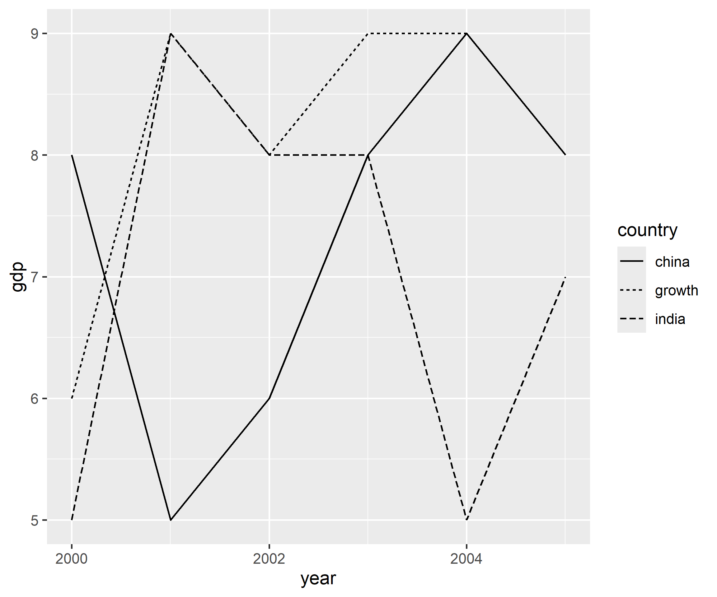
Instead of color, now we modify the line type using the linetype argument.
ggplot(gdp2, aes(year, gdp, group = country)) +geom_line(aes(linetype = country))
In the below instance, we assign different width to the lines using the linewidth argument.
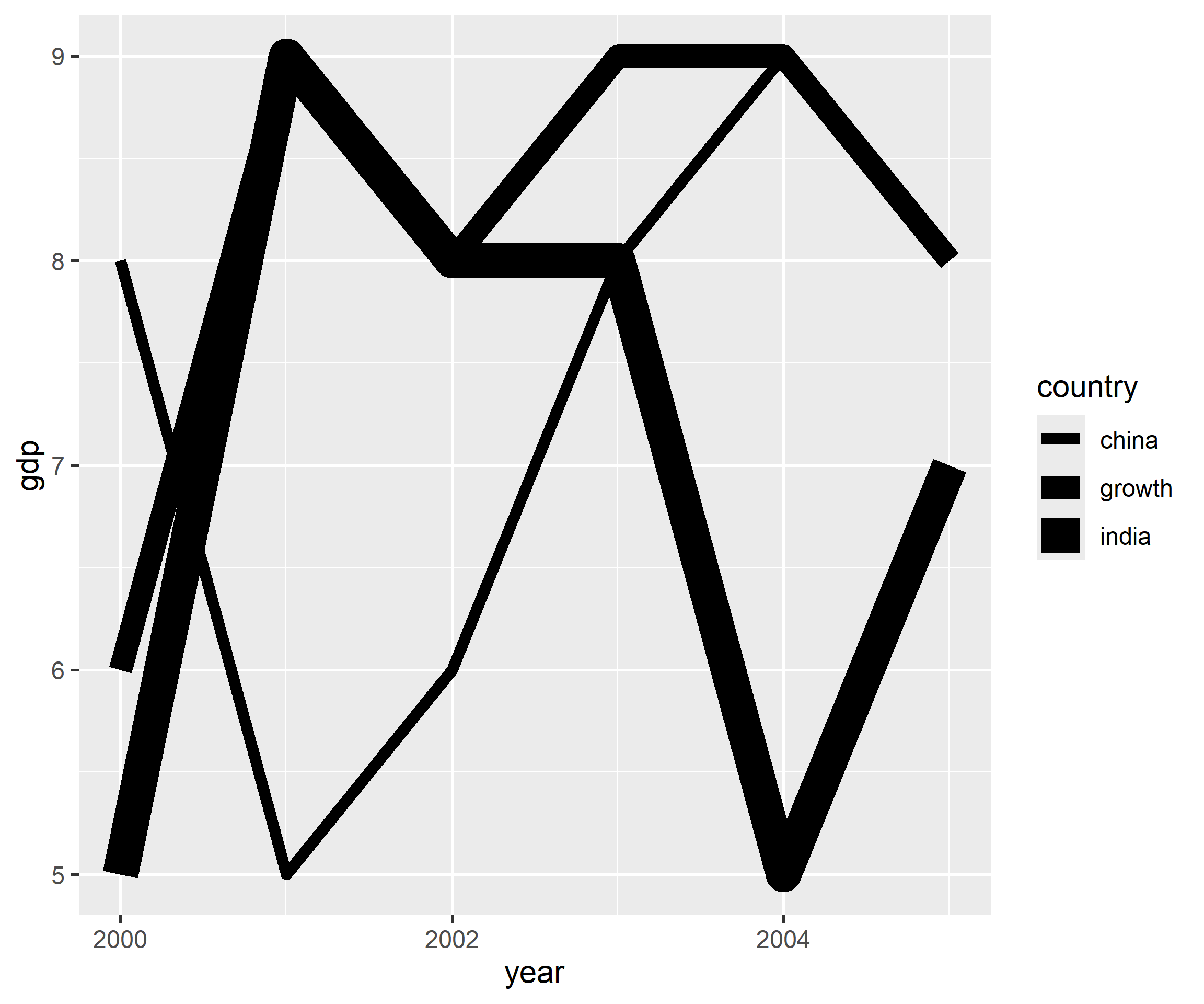
ggplot(gdp2, aes(year, gdp, group = country)) +geom_line(aes(linewidth = country))
Before we wrap up, let us quickly see how we can map aesthetics to variables for different plots.
3.5 Bar Plots
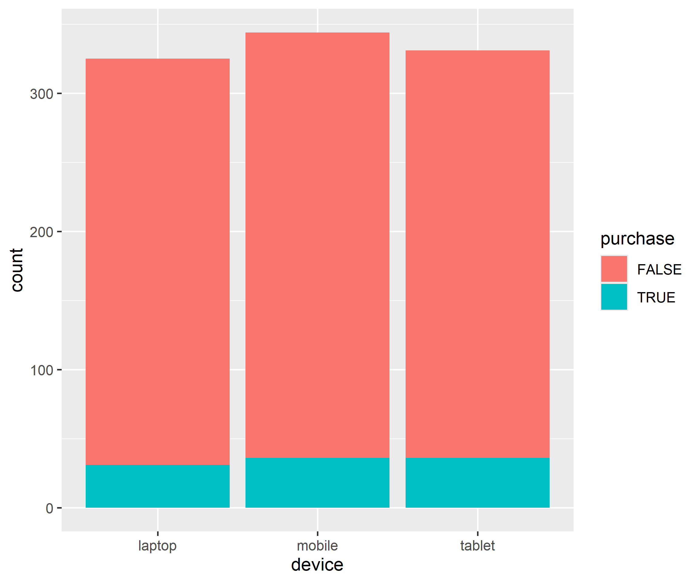
Here we create a stacked bar plot by mapping fill to purchase.
ggplot(ecom, aes(device, fill = purchase)) +geom_bar()
3.6 Histograms
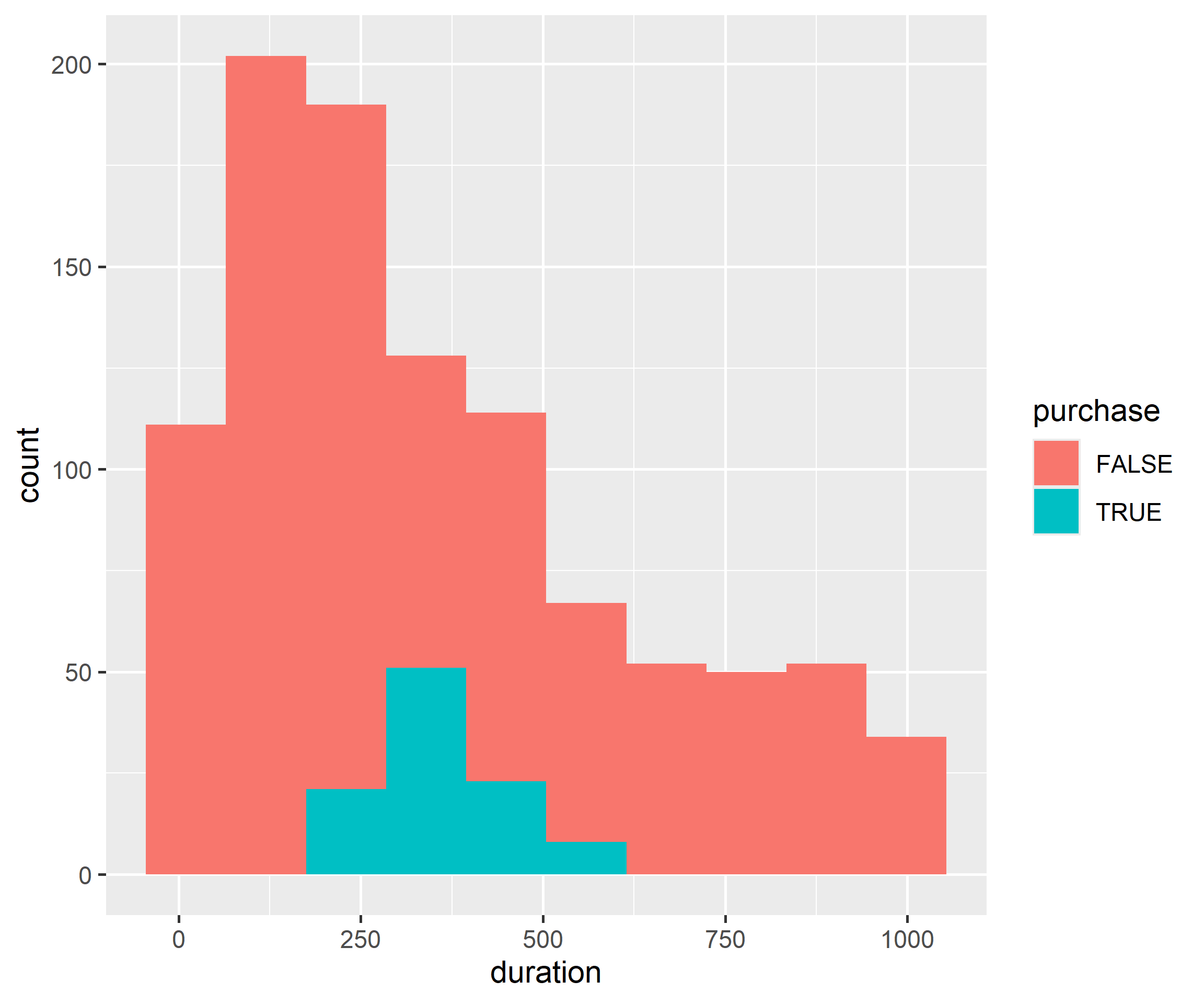
Instead of a bar chart, we create a histogram and again map fill to purchase.
ggplot(ecom) +geom_histogram(aes(duration, fill = purchase), bins =10)
3.7 Box Plots
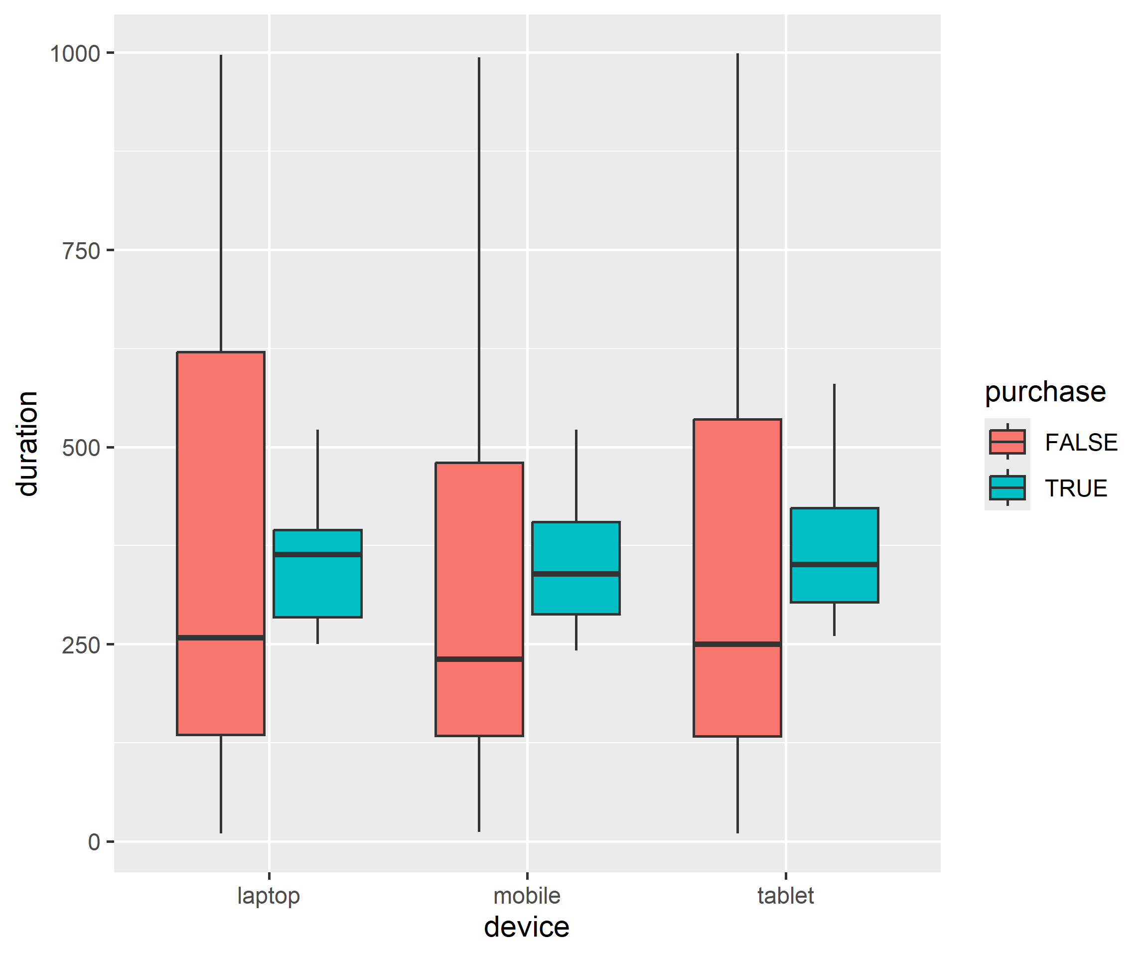
We repeat the same exercise below, but replace the bar plot with a box plot.
ggplot(ecom) +geom_boxplot(aes(device, duration, fill = purchase))
In all the above cases, you can observe that when we are mapping aesthetics such as color, fill, shape, size or linetype to variables, they are all wrapped inside aes().
3.8 Exercises
Map color to cylinders and set a constant point size = 3 outside aes().
Map linewidth (not size) to a line geom and explain the difference.
Reshape a two-column wide table with pivot_longer() and map the key to color.
Worked solutions in solutions/aesthetics.md (attempt first).
Where to go next
ggplot2 book (ggplot2-book.org) for theory behind this layer
Claus Wilke, Fundamentals of Data Visualization, for perception guidance